Design systems establish a baseline visual style that’s an essential dependency. These choices — color, typography, space and more — are robustly specified and expected to stably, predictably change release by release. When an adopter upgrades, a design system shouldn’t break their stuff unexpectedly.
So, ask yourself…
    <div class="escom-pull-quote escom-pull-quote--light">
        <div class="escom-pull-quote__the-quote">
            Can adopters upgrade to a minor release confident that their UI won’t break due to a system’s visual changes?
        </div>


    </div>
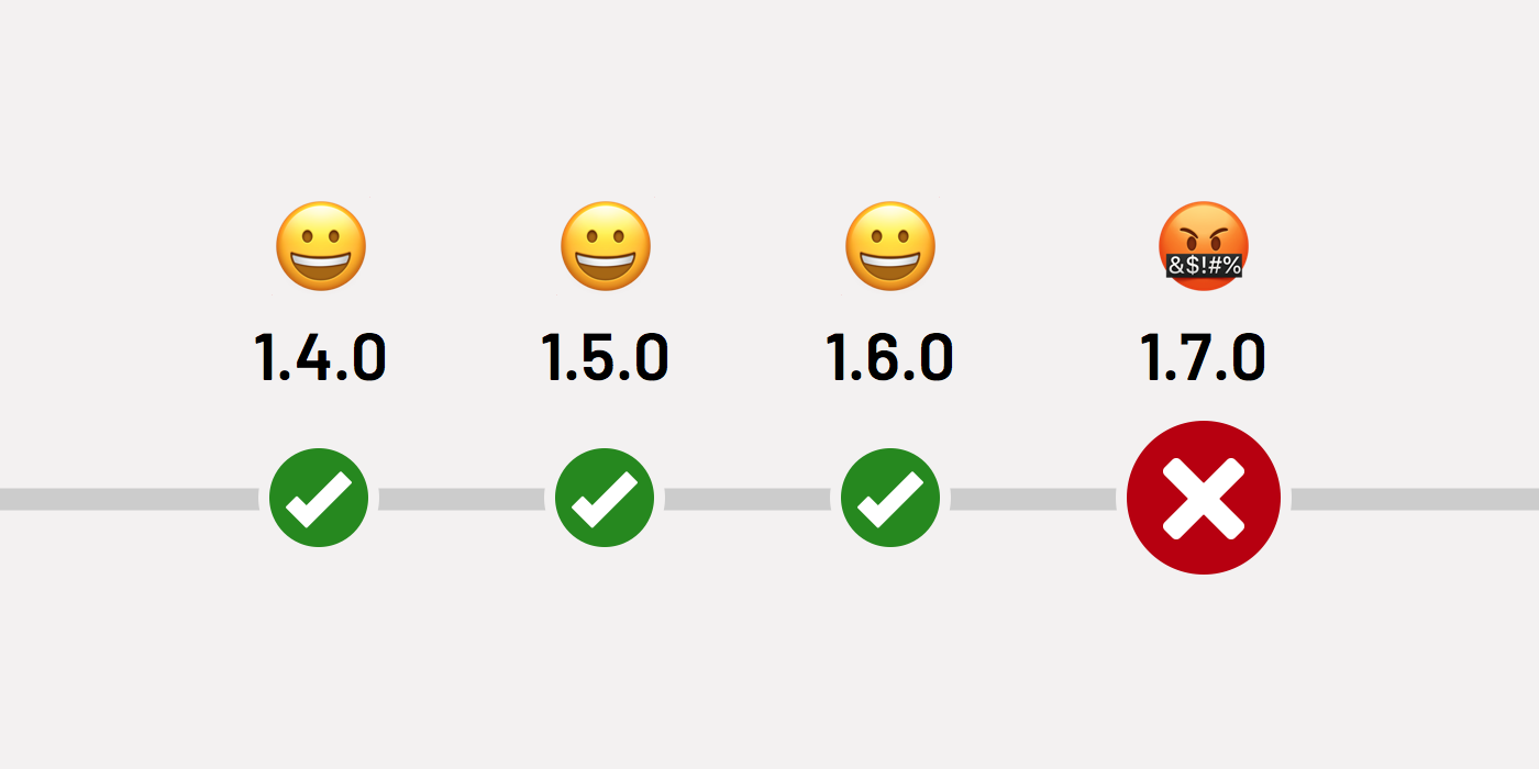
Semantic Versioning (SemVer) offers clear criteria to communicate change across releases using major, minor and patch designations. Every design system I encounter uses SemVer and monitoring change in their package’s application programming interface, or API. This is familiar territory for developers coding JavaScript props and HTML markup. Break your API, and your next version must increment the version to a next major release, such as from 1.4.0 to 2.0.0.
Specifying an interface to compositional visual style eludes us. It’s feels so difficult to define clear, simple rules to monitor style changes. System makers struggle to articulate what or why “Changing this style breaks an adopter’s UI” versus “Changing that style doesn’t.” Few system teams document such criteria. I ask “What specific types of visual changes trigger a major version for you?” Their response: ¯_(ツ)_/¯.
In this article, I propose that at least Color , Typography , and Space warrant criteria that constitute breaking change. There are other properties to consider, too. A design system can define, document and communicate these criteria so that adopters can upgrade release by release with confidence.
Most system teams feel safe in tuning a primary button’s background color. Maybe their motivation is to improve contrast against a usually white text label. “Let’s darken the teal a bit,” they say. “We’ll improve button’s accessible color contrast from a AA to AAA rating.”
Certainly, adopting teams shouldn’t override a standard primary button’s color set. Overriding a system choice severs the connection with a system. At that point, an adopter is on their own. Therefore, adjusting the shade of primary button’s background color is safe and is not a breaking change.
However, changing colors elsewhere may put adopters in peril. Consider the following scenarios.
Imagine a system team fine-tuning interactive blue to improve color contrast. The interactive-blue of v1.4.0 was accessible on a white background but failed on the charcoal background.
So, for v1.5.0, the team adjusted interactive-blue to a lighter, more saturated tone that worked on both white and charcoal.
However, an adopter had used the Ghost button dependent on that color on a light gray background. After the system change, the label's text color contrast is inaccessible. Your system broke their product.
Similarly, imagine a system darkens the Card component’sbackground-color. The Card’s content area includes a "safe" content-container zone where adopters insert whatever content and markup they want.
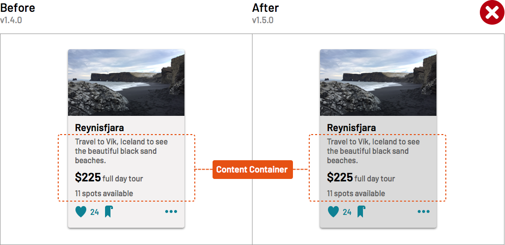
In that presumably safe zone, an adopter added secondary text that, while subtle moderate gray, passed a color contrast test. After the system change, the color contrast is no longer accessible. Your system broke their product.
Imagine your system’s minor release included those adjustments. Backward compatible, you said? No risk in upgrading, they trusted? Nope! Your system broke their product!
Therefore, evaluate changed colors properties to determine if a system changed, such as:
color that could appear above an adopter's background-color, image, or other texture.background-color on which an adopter's text color is overlaid.background-color, border-color, text color, box-shadow, or other property composed beside, above, or below another component's edge or content so as to diminish contrast between elements.Accessibility drove these examples. There’s aesthetic risk as well, in that well-intentioned system changes could disrupt the colorful harmony achieved by a product designer. Color interactions abound throughout UI that a system designer doesn’t control or have visibility into.
Takeaway: Start breaking change conversation with color criteria. It’s easier to convey risk, it’s objectively measurable, and it’s tied to accessibility that stirs passions. Armed with a few criteria, you can move on to other concerns.
Typography is a core facet of any visual style. Teams want to get it just right. And there are so many dials to tune: font-family, font-weight, font-size, text-transform, line-height, letter-spacing, and more.
Not all experiences risk breaking if a system adjusts typography. For content-heavy experiences, each element’s content can be unpredictable, of varying length, and designed to wrap and respond to changes in viewport width.
For denser interfaces, typography must be precise. Designers grind for hours fine-tuning typography, arranging labels to fit in compact areas. If you adjust system typography, their elements may wrap or crop in unexpected ways.
Imagine your system adjusts tab labelfont-weight from normal to bold.
An adopter upgrades. Their existing unresponsive tabs exceed allocated space, so they wrap. Ghastly! Your system broke their product.
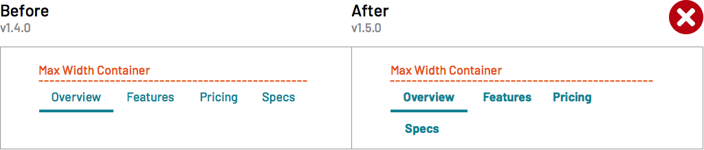
Brand guidelines evolve, yielding new heading hierarchy and style. Thus, your system adapts by increasing each heading’s letter-spacing.
An adopter upgrades their dense, single page radiology app that’s translated into 14 languages, composed of myriad control panels, each chock full of form elements and headings. They upgrade, and the UI is awash with headings unpredictably cropped. They call a crisis meeting. They invite the back-end data engineers, for goodness sakes! Your system broke their product!
Adjusting system typography can be dangerous. To you, it’s a refreshing typographic evolution deployed effortlessly across a library. To them, text begins misbehaving. They blame you. Maybe they flame you in the #system-design Slack channel. Nobody needs that.
Takeaway: Prior to 1.0.0, work diligently to to experiment, refine, and finalize type styles suitable to customer’s variety. Once 1.0.0 passes, sustain a stable base and consider change cautiously. Consider reserving dangerous shifts for the next major release. Until then, incrementally add contained features, such as a Long Form Text component for styling just article copy.
At least you can see color and typography. Space and size? Those are harder to define as concretely reusable, let alone monitor for breaking change.
In HTML, when you change a component’s box model properties — padding, margin, width, height, display, box-sizing, position, left, right, top, bottom — you risk impacting layout composition that arranges that component with other page elements.
Your system team decides to remove vertical spacing applied form controls in the form of margin-bottom. This impacts <input>, <select>, <label>, microcopy and other elements.
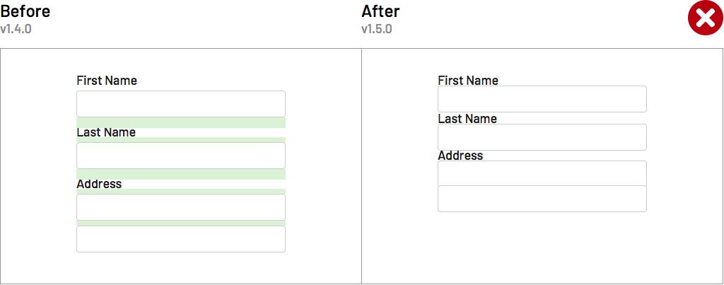
An adopter had laid out 38 different forms relying upon that spacing. After the system change, all their forms no longer vertically separate elements. Your system broke their product.
After extensive design community debate, your system concedes to expand a Card’s content block’s padding.
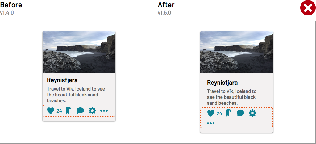
An adopter had arranged and sized Cards based on their customer’s hardware settings. They’d also added an icon-only toolbar in the bottom row. After the system change, the icons wrap to two rows. Your system broke their product.
Takeaway: First, avoid spatial rules (usually margin) outside a component’s boundary. Second, make spatial adjustments very, very cautiously. Degrading an adopter’s layout is a surefire way to create friction, diminish trust, and result in justifiable bad PR across a community.
Some spatial change doesn’t impact adjacent elements or page composition. For example, tightening or expanding the inset padding or stacked margin between items in a Menu would not be a breaking change because these adjustments are contained within a block that's completely specified by the system, includes no other customizable elements, and is layered in a manner that doesn’t otherwise impact page layout when opened and closed.
In general, changes in visual style could be specified as changes to a bevy of CSS properties, the range of which is exemplified by design token collections in Salesforce Lightning, Morningstar, REI, and Open Table.
What other properties could you monitor beyond those of color, typography, space, and size described above? z-index applied across components like Popovers, Dialogs, Modals, and Tooltips is central to composition in the third, layered dimension of a layout. opacity applied widely to semi-transparent layers (such as under a Modal) also seem a strong candidate. Even subtle changes like a border-bottom have an impact.
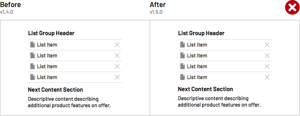
border-bottom of a vertical list's last item transparent. An adopter had positioned that list snugly above another block, relying on the line to create contrast. After the system change, the block's header blends with the label of the list's last item in a manner not obvious to distinguish.
If so, your system broke their product.But what of adjusting box-shadow? Or fine tuning border-radius? Cue designer ambivalence. It'd be hard to convince that those adjustments would break an adopter's experience.
Takeaway: Review the vast collection of possible CSS properties and discuss the consequences of candidate properties with your team. A working session will fruitfully reveal the group’s tolerance for protecting adopters and drive towards documenting how far you’ll go.
At this point, are you thinking: does this really matter? Shouldn’t we use our system to control our visual language? Are adopters really going to care?
Engineers may care. Designers DEFINITELY care. They spend hours fine-tuning layouts, annotating, and communicating detail to collaborating devs. Therefore, a design system should describe how it changes. And, each time it changes, if it’s going to be a change that degrades their design.
In conversations with design system colleagues, sentiments are:
In our work on the Morningstar Design System, we’ve documented what changes are considered major, minor, and patch. Our team asserts opinions confidently in critique discussions, comments on pull requests, and in our discussions with adopting and upgrading teams.
Our field will adapt to versioning as it deeply engrains in our practice. We’ll do what we can to communicate well with and protect our adopters.
#3. Versioning ← Previous | Next → #5. Dependencies
Design systems establish a baseline visual style that’s an essential dependency. These choices — color, typography, space and more — are robustly specified and expected to stably, predictably change release by release. When an adopter upgrades, a design system shouldn’t break their stuff unexpectedly.
So, ask yourself…
    <div class="escom-pull-quote escom-pull-quote--light">
        <div class="escom-pull-quote__the-quote">
            Can adopters upgrade to a minor release confident that their UI won’t break due to a system’s visual changes?
        </div>


    </div>
Semantic Versioning (SemVer) offers clear criteria to communicate change across releases using major, minor and patch designations. Every design system I encounter uses SemVer and monitoring change in their package’s application programming interface, or API. This is familiar territory for developers coding JavaScript props and HTML markup. Break your API, and your next version must increment the version to a next major release, such as from 1.4.0 to 2.0.0.
Specifying an interface to compositional visual style eludes us. It’s feels so difficult to define clear, simple rules to monitor style changes. System makers struggle to articulate what or why “Changing this style breaks an adopter’s UI” versus “Changing that style doesn’t.” Few system teams document such criteria. I ask “What specific types of visual changes trigger a major version for you?” Their response: ¯_(ツ)_/¯.
In this article, I propose that at least Color , Typography , and Space warrant criteria that constitute breaking change. There are other properties to consider, too. A design system can define, document and communicate these criteria so that adopters can upgrade release by release with confidence.
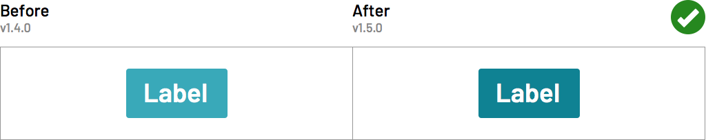
Most system teams feel safe in tuning a primary button’s background color. Maybe their motivation is to improve contrast against a usually white text label. “Let’s darken the teal a bit,” they say. “We’ll improve button’s accessible color contrast from a AA to AAA rating.”
Certainly, adopting teams shouldn’t override a standard primary button’s color set. Overriding a system choice severs the connection with a system. At that point, an adopter is on their own. Therefore, adjusting the shade of primary button’s background color is safe and is not a breaking change.
However, changing colors elsewhere may put adopters in peril. Consider the following scenarios.
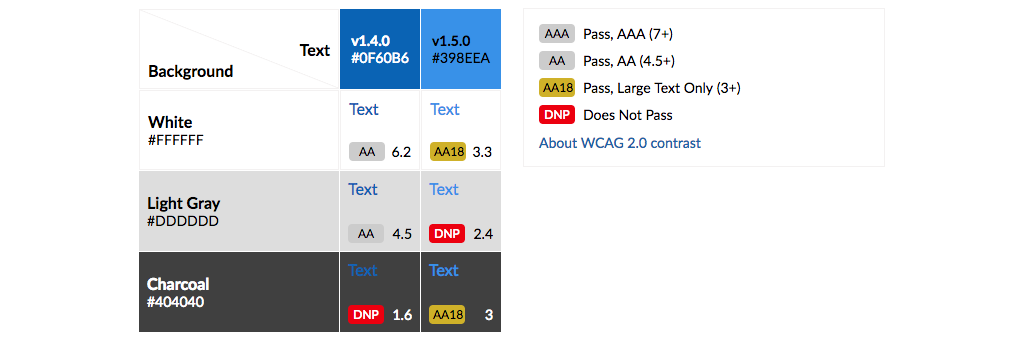
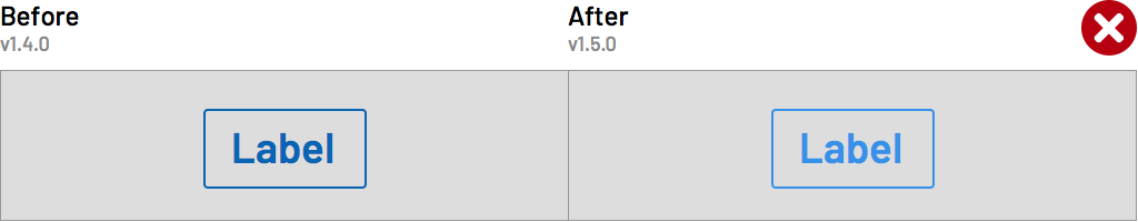
Imagine a system team fine-tuning interactive blue to improve color contrast. The interactive-blue of v1.4.0 was accessible on a white background but failed on the charcoal background.
So, for v1.5.0, the team adjusted interactive-blue to a lighter, more saturated tone that worked on both white and charcoal.
However, an adopter had used the Ghost button dependent on that color on a light gray background. After the system change, the label's text color contrast is inaccessible. Your system broke their product.
Similarly, imagine a system darkens the Card component’sbackground-color. The Card’s content area includes a "safe" content-container zone where adopters insert whatever content and markup they want.
In that presumably safe zone, an adopter added secondary text that, while subtle moderate gray, passed a color contrast test. After the system change, the color contrast is no longer accessible. Your system broke their product.
Imagine your system’s minor release included those adjustments. Backward compatible, you said? No risk in upgrading, they trusted? Nope! Your system broke their product!
Therefore, evaluate changed colors properties to determine if a system changed, such as:
color that could appear above an adopter's background-color, image, or other texture.background-color on which an adopter's text color is overlaid.background-color, border-color, text color, box-shadow, or other property composed beside, above, or below another component's edge or content so as to diminish contrast between elements.Accessibility drove these examples. There’s aesthetic risk as well, in that well-intentioned system changes could disrupt the colorful harmony achieved by a product designer. Color interactions abound throughout UI that a system designer doesn’t control or have visibility into.
Takeaway: Start breaking change conversation with color criteria. It’s easier to convey risk, it’s objectively measurable, and it’s tied to accessibility that stirs passions. Armed with a few criteria, you can move on to other concerns.
Typography is a core facet of any visual style. Teams want to get it just right. And there are so many dials to tune: font-family, font-weight, font-size, text-transform, line-height, letter-spacing, and more.
Not all experiences risk breaking if a system adjusts typography. For content-heavy experiences, each element’s content can be unpredictable, of varying length, and designed to wrap and respond to changes in viewport width.
For denser interfaces, typography must be precise. Designers grind for hours fine-tuning typography, arranging labels to fit in compact areas. If you adjust system typography, their elements may wrap or crop in unexpected ways.
Imagine your system adjusts tab labelfont-weight from normal to bold.
An adopter upgrades. Their existing unresponsive tabs exceed allocated space, so they wrap. Ghastly! Your system broke their product.
Brand guidelines evolve, yielding new heading hierarchy and style. Thus, your system adapts by increasing each heading’s letter-spacing.
An adopter upgrades their dense, single page radiology app that’s translated into 14 languages, composed of myriad control panels, each chock full of form elements and headings. They upgrade, and the UI is awash with headings unpredictably cropped. They call a crisis meeting. They invite the back-end data engineers, for goodness sakes! Your system broke their product!
Adjusting system typography can be dangerous. To you, it’s a refreshing typographic evolution deployed effortlessly across a library. To them, text begins misbehaving. They blame you. Maybe they flame you in the #system-design Slack channel. Nobody needs that.
Takeaway: Prior to 1.0.0, work diligently to to experiment, refine, and finalize type styles suitable to customer’s variety. Once 1.0.0 passes, sustain a stable base and consider change cautiously. Consider reserving dangerous shifts for the next major release. Until then, incrementally add contained features, such as a Long Form Text component for styling just article copy.
At least you can see color and typography. Space and size? Those are harder to define as concretely reusable, let alone monitor for breaking change.
In HTML, when you change a component’s box model properties — padding, margin, width, height, display, box-sizing, position, left, right, top, bottom — you risk impacting layout composition that arranges that component with other page elements.
Your system team decides to remove vertical spacing applied form controls in the form of margin-bottom. This impacts <input>, <select>, <label>, microcopy and other elements.
An adopter had laid out 38 different forms relying upon that spacing. After the system change, all their forms no longer vertically separate elements. Your system broke their product.
After extensive design community debate, your system concedes to expand a Card’s content block’s padding.
An adopter had arranged and sized Cards based on their customer’s hardware settings. They’d also added an icon-only toolbar in the bottom row. After the system change, the icons wrap to two rows. Your system broke their product.
Takeaway: First, avoid spatial rules (usually margin) outside a component’s boundary. Second, make spatial adjustments very, very cautiously. Degrading an adopter’s layout is a surefire way to create friction, diminish trust, and result in justifiable bad PR across a community.
Some spatial change doesn’t impact adjacent elements or page composition. For example, tightening or expanding the inset padding or stacked margin between items in a Menu would not be a breaking change because these adjustments are contained within a block that's completely specified by the system, includes no other customizable elements, and is layered in a manner that doesn’t otherwise impact page layout when opened and closed.
In general, changes in visual style could be specified as changes to a bevy of CSS properties, the range of which is exemplified by design token collections in Salesforce Lightning, Morningstar, REI, and Open Table.
What other properties could you monitor beyond those of color, typography, space, and size described above? z-index applied across components like Popovers, Dialogs, Modals, and Tooltips is central to composition in the third, layered dimension of a layout. opacity applied widely to semi-transparent layers (such as under a Modal) also seem a strong candidate. Even subtle changes like a border-bottom have an impact.
border-bottom of a vertical list's last item transparent. An adopter had positioned that list snugly above another block, relying on the line to create contrast. After the system change, the block's header blends with the label of the list's last item in a manner not obvious to distinguish.
If so, your system broke their product.But what of adjusting box-shadow? Or fine tuning border-radius? Cue designer ambivalence. It'd be hard to convince that those adjustments would break an adopter's experience.
Takeaway: Review the vast collection of possible CSS properties and discuss the consequences of candidate properties with your team. A working session will fruitfully reveal the group’s tolerance for protecting adopters and drive towards documenting how far you’ll go.
At this point, are you thinking: does this really matter? Shouldn’t we use our system to control our visual language? Are adopters really going to care?
Engineers may care. Designers DEFINITELY care. They spend hours fine-tuning layouts, annotating, and communicating detail to collaborating devs. Therefore, a design system should describe how it changes. And, each time it changes, if it’s going to be a change that degrades their design.
In conversations with design system colleagues, sentiments are:
In our work on the Morningstar Design System, we’ve documented what changes are considered major, minor, and patch. Our team asserts opinions confidently in critique discussions, comments on pull requests, and in our discussions with adopting and upgrading teams.
Our field will adapt to versioning as it deeply engrains in our practice. We’ll do what we can to communicate well with and protect our adopters.
#3. Versioning ← Previous | Next → #5. Dependencies
EightShapes can energize your efforts to coach, workshop, assess or partner with you to design, code, document and manage a system.