
If you’ve worked on a design system spanning a portfolio, you may have experienced the genuine partnership formed across product teams. Except one. You know, that product. The one that rules the rest. The big one (or two, or few). The favored child. The 800 pound gorilla.
Take, for example, an often insanely sweeping attention placed on propagating a .com homepage’s design throughout remaining products. Brand or marketing owns it, right? The CEO’s paying attention, right? All other products — a purchase path, account management, loyalty programs that are a business’ engine— must derive visual language from a single page with a massive ephemeral banner, ignorable corporate communications, and a few illustrations you can’t reuse. Influence flows from above, by site map as much as organization hierarchy, to constrain design with rules that can’t bend.
Or suppose you work the product pages, but are destabilized by a powerful search and checkout team. Their decisions dominate decision-making, biasing convention towards their product. They can break from and reform system decisions with impunity, all driven by their metric: conversion.
Single products can bias or even dominate decision-making no matter the lip-service to consistency.
However, what’s missing from these scenarios?
Other platforms like iOS, Android, and Windows, that’s what!
I’ve seen it happen. A web designer releases a gorgeous living style guide, shares with an org, and is befuddled when everyone else shrugs. They forgot to address a simple question: What’s in it for us? Does it even work on our platform?
In that headlong rush to create a mini-Bootstrap-for-me, it’s easy and right to focus on what’s most important to other product teams.
Things can get uncomfortable — or downright unproductive — when the mini-Bootstrap is propped up as the solution to the enterprise’s design system problem. Sure, there’s dissonance between a site’s layouts and interactive complexities of related apps. But that’s peanuts relative to the the competing conventions of another platform.
Offering that guide as a foundation for products of other platforms can go nowhere, fast. Those teams rightly respond with “You built this for web. We’re [Windows/iOS/Android/etc]. What’s in it for us? How do we know such a design system even works in our context?”
To apply a design system beyond “just web,” you’ve gotta involve designers from the other relevant platforms, especially in a formative period.
Got a few iOS apps? Make sure at least one iOS designer is involved.
Half your products Windows-based? Inject a Windows-based UI designer (or developer extraordinaire) into that web-centric committee of five. Or inject two. Because, seriously, it’s half your portfolio.
Reducing platform bias also means teams spend more time on the fundamental design language (particularly color, iconography, typography) and elements (especially buttons and form input controls) everyone shares, at the expense of platform-specific components and layout systems.
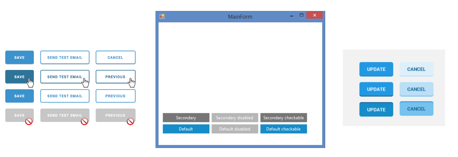
Yes, now’s the time to nip that short-sighted belief that a moderate gray secondary button (for Cancel) is a good idea. It won’t work well everywhere, looks disabled, and — newsflash — it’s not accessible anyway.
A stronger focus on fundamentals yields deeper thinking around core properties (such as color across contexts) and states. Suddenly, teams are provoking each other to resolve basic problems before they spread.
A focus on basic properties can crystallize a shared vocabulary and structure those decisions.
One such success story is the Salesforce UX team’s distribution of decisions across platforms. They’ve garnered considerable attention to their recent Lightning Design System launch, with announcements, big presentations and relevant articles. I’ll admit, I’ve got a crush on what they’ve put together.
What gets me most excited isn’t that the library is polished; actually, it’s parts are familiar. It’s not even that they’ve organized their fundamentals in an impressive collection of design tokens. What gets me is that they’ve automated how to integrate tokens by transforming them into many, maintainable platform-specific collections.
Such evidence convinces me — and, I hope, their collaborators — of their belief in supporting the system thoroughly across platforms. Delightful!
Another positive signal of a system’s convergence across 2+ platforms is how conversations shift from how design is the same to how the design is different and how teams draw boundaries around such exceptions.
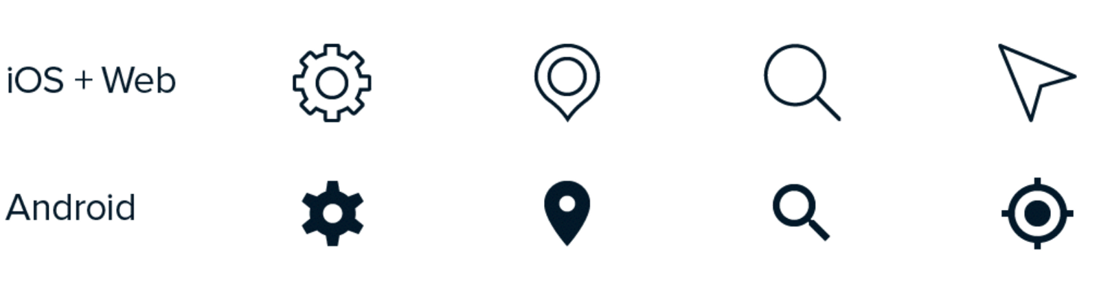
One team I worked with spanned web, iOS & Android. For iconography, they discussed adopting an icon library like IcoMoon, Streamline, or Font Awesome, or building their own from scratch. Ultimately, they chose Streamline. Subsequent work yielded a shared subset of 30 to 40 customized Streamline icons everyone shared: person icon (for profile), magnifying glass (for search), pin (for maps), and more.
Trouble is: the Android platform has established icons for many concepts, like the map pin. The Android designers reasonably justified that the design system shouldn’t project a Streamline-based icon set unaltered onto that platform. So the system’s iconography genius and an Android designer paired and established a parallel Android set.
This small success demonstrated the system’s posture towards justified flexibility, a willingness to adapt, and capability to support forks in the road narrowly bounded one part (iconography) on one platform (Android).
Each of these concepts — fundamentals, tokenization, adaptability — helps designers deal with the challenges of a system. As platform continue diversify and designers commit to addressing them, we’ll need such tools to deal with the complexity.
EightShapes can energize your efforts to coach, workshop, assess or partner with you to design, code, document and manage a system.