Higher density drives efficiency. Frequently used interfaces show you more and offer more diverse tasks via many interactive paths all without scrolling. On the other hand, a deep marketing message warrants a lengthy webpage that drives to a dominant call-to-action in a far less compact density. Yet, “rich app vs marketing webpage” is an incomplete contrast. Density can vary in the same product, page, or even component (such as for responsiveness).
The higher density you go, the more you risk hiding critical detail amid many contrasting signals, increasing interaction difficulty (Fitt’s Law), or even overwhelming a user with too much to process. So, density involves tradeoffs, and thus density involves judgment.
As enterprises scale design systems across teams, density creates friction. Roots of this opposition often trace to density: type too large, space too generous, elements too big. Teams designing data-rich analyst apps chafe at using components made for marketing content. When components don’t fit, they want to quit — or not even start with — a system.
A system plays a role in guiding and tooling density, starting with harmoniously applied sizes per component. This article describes how consider density using component size and height. Next, it describes how to unify size across components step-by-step. To conclude, lessons learned season perspectives of those adding size to a system.
Interface density results from a tapestry of typography and spatial choices — paddings, margins, columns, gutters, etc— applied to everything from outer layout containers to primitive elements including components offered from a design system.
A UI component control what’s inside its boundary, unless it also adds margin that risk neighborly conflict, which I like to avoid. There are many properties in play, including font-size, font-weight, line-height, padding and, if relevant, border. These properties blend together, impact density, and — vitally — result in a size.
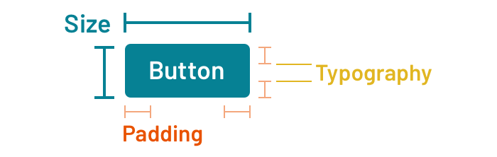
Make no mistake: density ≠ size. But size impacts density and varying density can correlate strongly with tuning size. Increase or decrease font-size and padding, and the button gets larger or smaller, respectively.
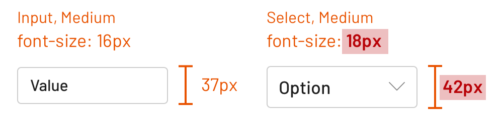
Yet, many component libraries size components inconsistently. Sizes do exist, mind you. There’s a small input here. There’s a small and large button there. There may even be extra large or even a “puffy” button (yes, that’s happened). Upon inspection, small input and small button aren’t the same small.

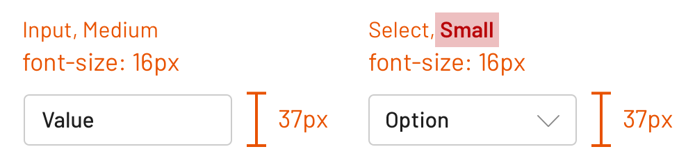
To build consistently and efficiently to varying densities using a system, adopters need a consistent component sizing model executed across a catalog. From both a visual and technical perspective, consistent sizing corresponds to a combination of it’s width and height. Width is often dictated by both context and content. On the other hand, consistent height is a realistic and desirable objective when arranging core components horizontally and vertically.
As a result, we’ve begun to approach unifying component size as a step-by-step process that includes typography, space, and height from the inside out.
Achieving consistent size across the component catalog grounded required a few steps: establish a scale, identify atomic components, determine a target height, and tune properties per component to achieve that height.
For some teams, one is enough. Otherwise, how many sizes do we need?

Some trend towards (1) Default versus (2) High density. The former serves most adopters with a sensible starting point. The latter offers those designing denser interfaces the compression appropriate for their customer needs.
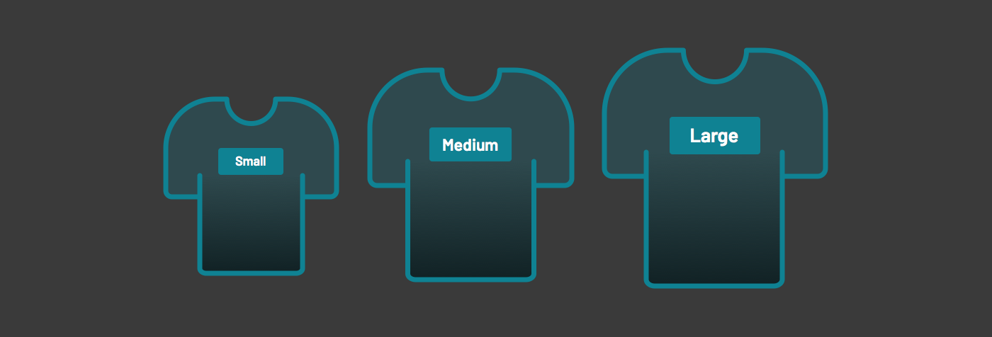
Two alternatives may not be enough. More often, we’ll see small, medium (the default) and large variants, serving experiences like:

One may be tempted to offer more discrete stops along a scale like XS, XL, XXL, and so on. But why stop there? A continuous scale entices us. We could build a system that maths up any stop you want! Start with a baseline 16, and tune up (to 19.4!) or down (to 14.263975!)! Really? Where’s the harmony, maintainability, and consistency in that? I’m not convinced, at least for now.
Takeaway: A component library likely requires two or (at most) three sizes. Avoid greater complexity, so that a systems offer choices that balance flexibility with continuity across a catalog.
Designing size across component starts with a small set of atomic elements. Not every component will implement every size (more on that later), and many components won’t be sized at all. Exclusions can be obvious (example: the invisible truncate), based on lack of demand (example: pagination), or unwarranted (who needs a large and medium footnote?).
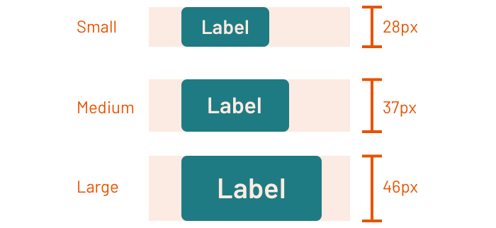
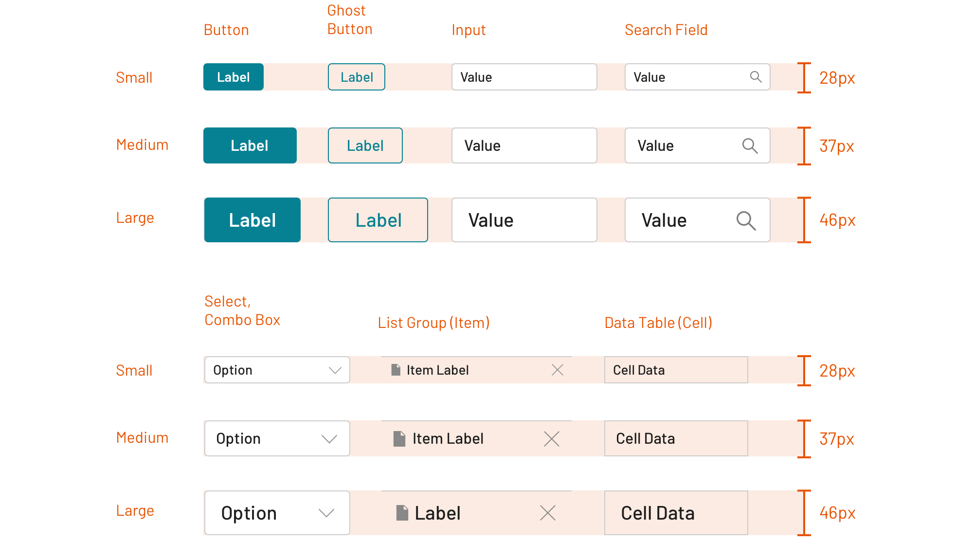
Common components across which height is unified
Takeaway: Avoid the temptation to solve all components across all sizes from the outset. Instead, initiate work on a core component set to ground the foundation to density, and go from there.
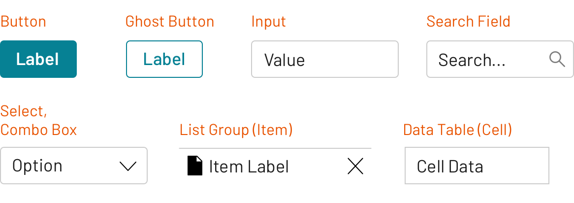
Once the components are identified and work begins, conventions emerge across components sizes. Work may start with the input or button.
As button size stabilize, other elements follow suit: search field (a specialized input), select, combo box, list group item, and table cell.
Typography starts with font-size, although size variants can also trigger shifts in font-weight, line-height, and other properties. Models emerge and become embedded in cross-component tools that vary style based on a size property.
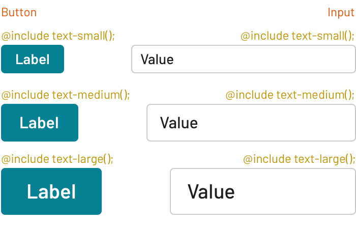
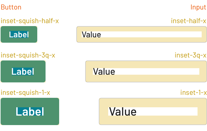
Similarly, a spatial model can govern how elements are inset within a component block, as described in Space in Design Systems. Small, medium, and large component sizes often apply a complementary mapping of insets across a scale, leveraged via design tokens.
Less often, incrementing sizes can also result in other changes, such as thickening a border, changing a border-radius, or shifting icon weight.
Takeaway: Normalizing size will either trigger or build upon cross-component tooling like mixins and design tokens. Embed conventions in such tooling, and leaving the fine-tuning per component for the next step.
To unify height, one could specify height and then override the typography and space of the contained elements. Alternatively, component height can arise automatically from the blend of well-modeled type and spatial properties and other content (particularly, images). We choose the latter. Thus our approach overrides per component to achieve consistent height.
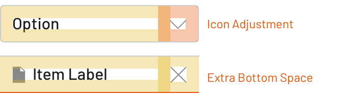
Component-specific extensions and overrides included things like:
padding-left or -right due to the presence of an icon to the left or right of a button label or list item.padding-left and padding-right for outer data table cells.border-top to a list item, reducing or expanding an inset’s padding-top and/or -bottom.Takeaway: Aligning size requires conventions shared across components, but also nuance and adjustments per component. Count me among those that build both — convention, then configuration, in that order — into how style is propagated through a collection.
Implementing Component by Component Leads to Inconsistency
Teams building components incrementally often apply space, per component, as each component is implemented. Many teams lack a sizing strategy, happening on sizes per component by accident, and realizing later that “Oh, yeah, these size names and visual properties aren’t aligned at all.”
Two components named the same size (Medium and Medium) yet have different typography and spacing values and, thus, different size.
Two components named different sizes (Medium and Small) yet share typography and spacing and, thus, are the same size.
Two components should be offered at the same size, yet only one’s available.
Takeaway: Anticipate and reduce the impacts of drift by establishing concepts, building tools (such as mixins and tokens), and expecting tools to evolve.
Many design system teams I’ve worked with has found themselves with an established library after a year that nonetheless lacked a consistently applied sizing model. It wasn’t some huge surprise. They’d seen it emerge over time.
At Morningstar, we prioritized unifying size across all components in the third half-year of the program. The team conducted an audit, established target component heights per size level and then — led by Adam Rowe, the team’s Senior Designer — cranked through components, one by one.
Takeaway: If a catalog lacks size continuity, consider a pass across the entire catalog as an objective that is more epic/quarter/semi-annual in length. Take on the challenge holistically, and align it with a major or generational update so adopters can similarly cope with the visual breaking change.
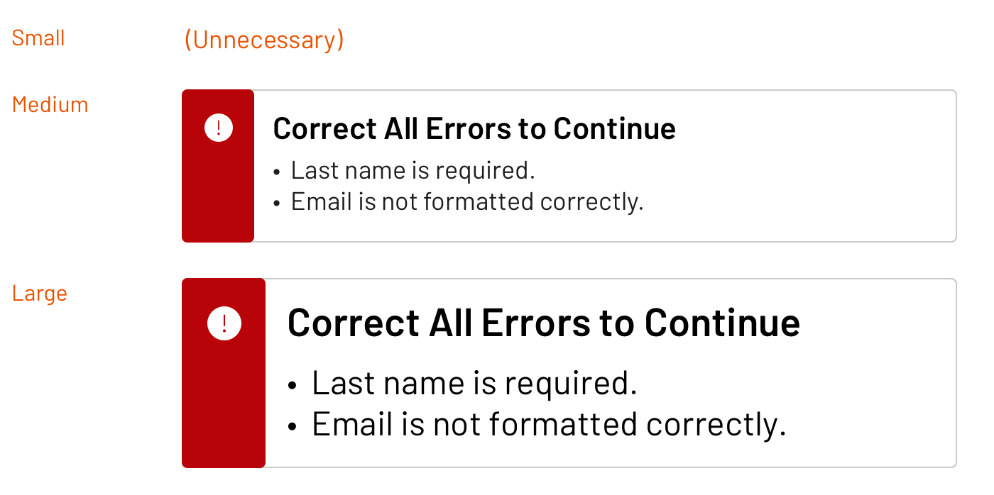
The patterned use of some UI components runs counter to the intent of some stops on a sizing scale. Alerts, notifications, and other in-your-face cues must capture your attention, either by modally dominating a screen or presented so prominently that it can’t be missed. Offering a small variant runs counter to that mission.
On the other hand, a tag component denoting an attribute’s value revels in compact subtlety. It works well at small or medium sizes regardless of display. Offering a large variant doesn’t make sense.
Although the library may have changed since, at one point the Morningstar Design System offered sizes depending on component:
Takeaway: Component purpose may run counter to an possible size. In such cases, avoid unnecessary variants and offer the size that suits the intent.
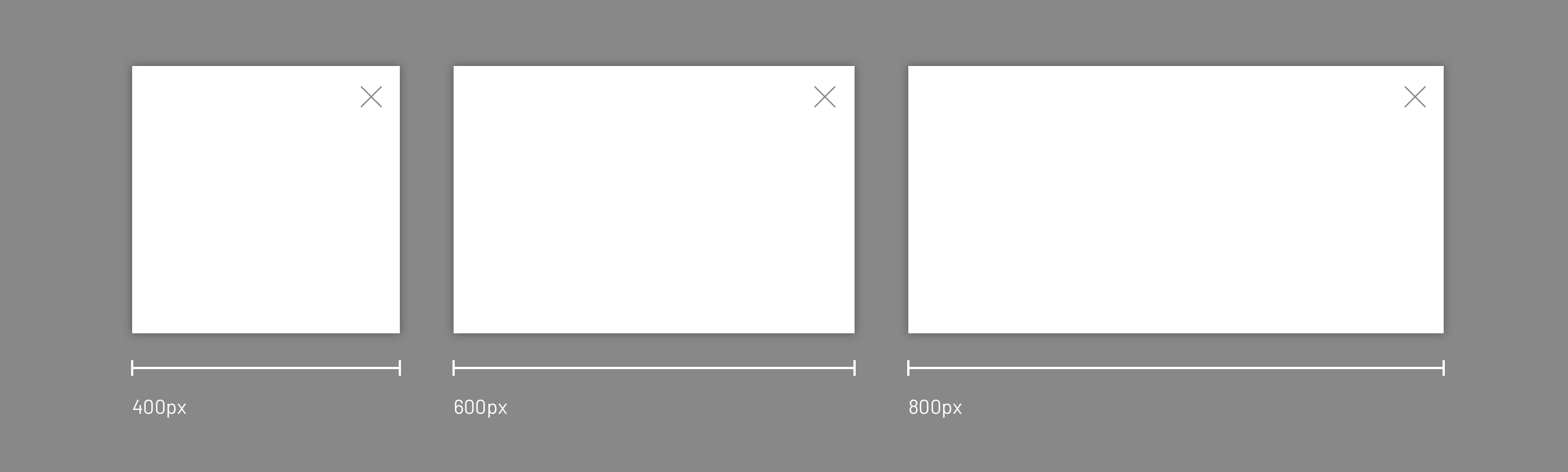
While most sizing models concentrate on height, width can also vary per component with a set of discrete options. For example, a modal may be recommended at three discrete widths:400px, 600px, or 800px.
On the other hand, dialog may offer 300px and500px variants, and a popover 200px and 300px variants.
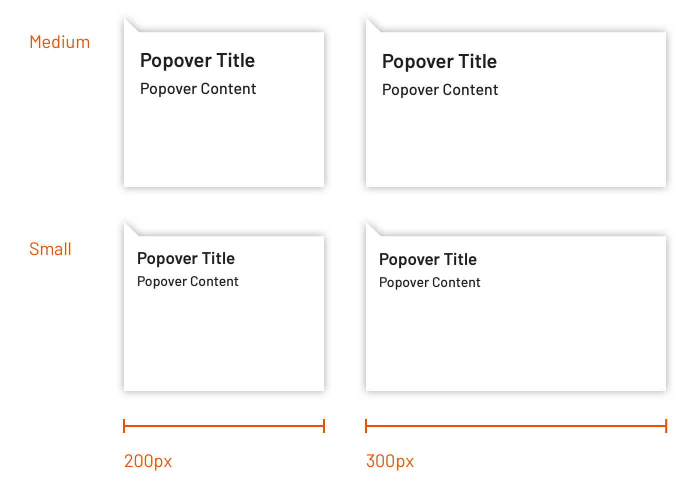
In this case, it could be tempting to apply S/M/L, S/M, and S/M names to the modal, dialog, and popover variants respectively. However, at least dialogs and popovers may also have variants applying typography and spacing rules similar to those above. Similarly, a component like modal may add 1000px as another variant, begging the question: is that ML? Me-rge? La-dium?
Takeaway: Avoid using a T-Shirt size model (S/M/L) that correspond to a single quantity like width, since such naming isn’t resilient to additions and the component sizing otherwise may already use T-Shirt sizing. Instead, consider naming the options based on explicit values, such as modal--width-500 and modal--width-700.
Oh, those headings, their scale, and the hierarchy they create across the page. It’s a challenge, I know. This gets exasperated when component size is introduced as an dimension orthogonal to heading level. How so?
It’s common for design systems to offer up to 9 heading levels. As typography is woven through a catalog, those headings are applied to components including accordions, tiles and alerts. As each of those components are varied via size, teams discover that the heading levels too vary by size. Therefore, a system can take one of two approaches.
A system could offer a long list of heading sizes (such as 1–5) and apply levels consistently across components per size:
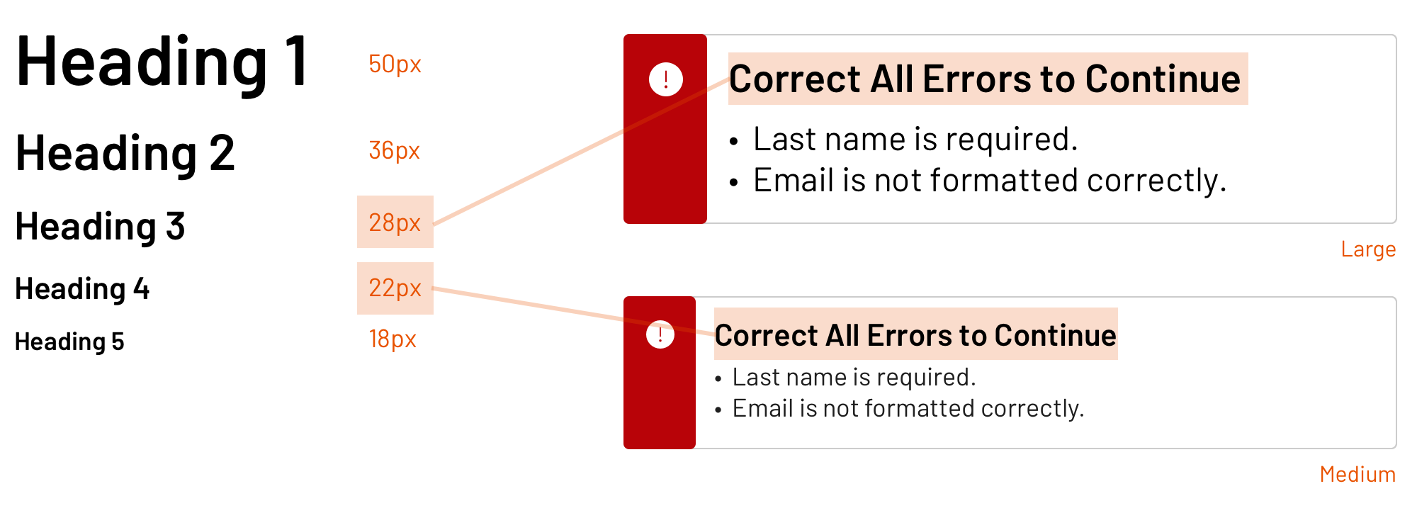
Alternatively, a system could offer a more limited set of heading levels, and specify font-size and other properties per size level:
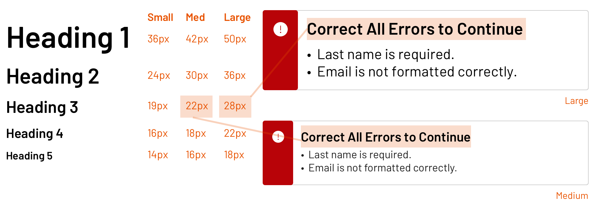
Takeaway: As a component collection implements sizing, it’s not only critical to standardize how heading styles are applied across components, but also how that model varies an element’s heading level for each size offered.
You’ve got small, medium and large elemental components. So naturally, as you compose more sophisticated components, they’ll include components only from the same sizing scale, right? Stay in your size lane, so to speak?
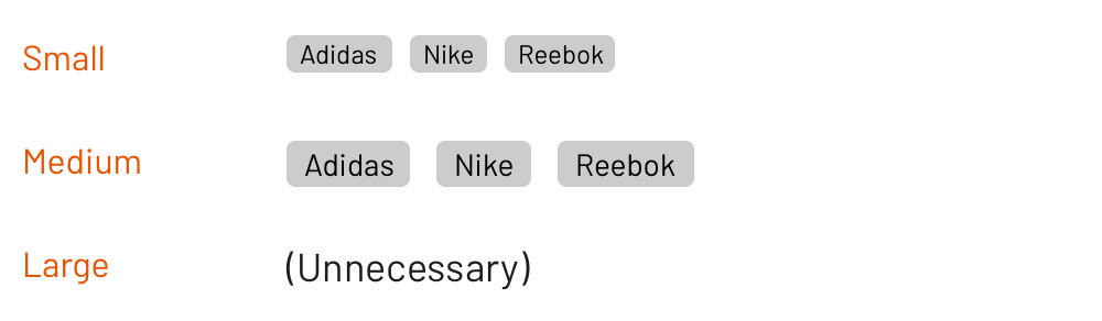
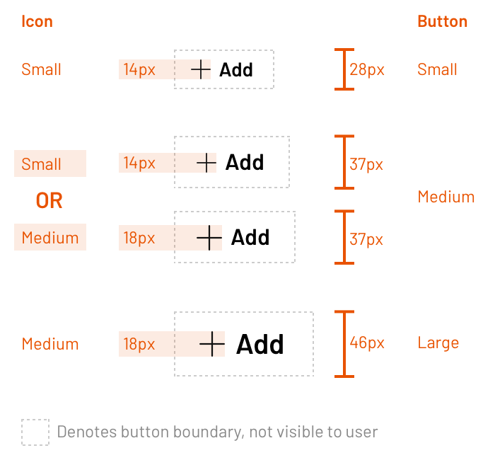
When it comes to composition, that’s not a given, and you may find justification in your very first component composition: icon into button. The Morningstar Design System team advises that small and medium buttons apply small icons, whereas a large button applied a medium icon.
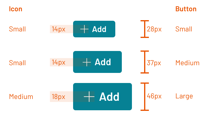
More surprisingly, their flat button worked well with a small icon in some cases and a medium icon in other cases. Therefore, the system offered a mds-button--flat-icon-m modifier empowering adopting teams to choose.
The lesson here? Mixing and matching of component sizes has validity even in the most atomic of cases: button and icon. Therefore, be prepared for justifiable cases of mixing and matching at any level of UI composition up to a full page layout with many, many components. Adopting teams mold pieces together to create contrast, solve their problems, and optimize an experience.
A design system plays a role in density by guiding use and providing tools. Consistent sizes is a place to start. Level up your models for typography and space, and begin to unify your catalog along dimensions of height and more.
Happy sizing!
EightShapes can energize your efforts to coach, workshop, assess or partner with you to design, code, document and manage a system.