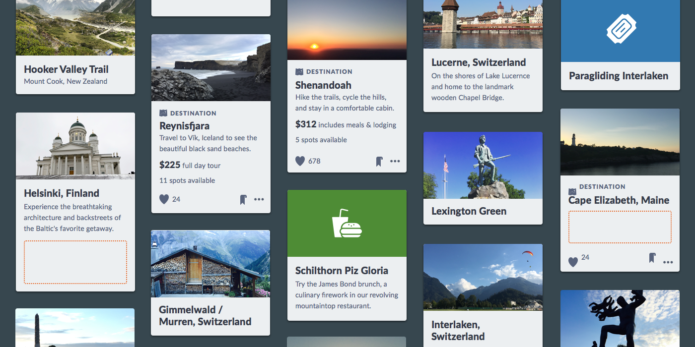
I’m a sucker for a card component. It takes me back nostalgically to my adolescence when baseball cards introduced me to information design. I collected and organized thousands, each exhibiting a hero’s photo, team as theme, positions as identity. My brain engaged with the design, data, and in-depth inquiry they fostered.
Today’s digital card serves the same purpose. More than just a generic container, a card is a scannable snapshot of an object’s vitals. It previews enough to identify. It invites us to learn more and interact, in that order.
Often, the card also signals a pivot in the growth of a component library. Unlike primitives like button and input, a card requires composition. It relates many elements (some already in our library) and as content flows into each. Also, cards are almost always shown as a set, siblings side by side. Composition triggers higher-order thinking critical to system design.
Hardening a composition like card forces a system to mature. Sometimes, a system solves the challenges, increasing library complexity. Other times, a system’s burgeoning maturity steers away from complexity, keeping things simple. These challenges take the form of structure , content , style and behavior. May the lessons here inspire your system compositions to come.
Libraries start with primitives—input, heading, checkbox, radio-button, label, icon—to serve as building blocks. A button’s composability is fairly mundane: an icon to the left or right of a label, maybe a split bar or animation. Thenbutton-group combines button, forcing sibling relationships. These are low-level challenges. Things get more interesting when composing components like card with many elements.
A composable component starts with essential core of required elements, so you’ll want to ask: What elements are required of each and every display? What happens if a required element is missing?
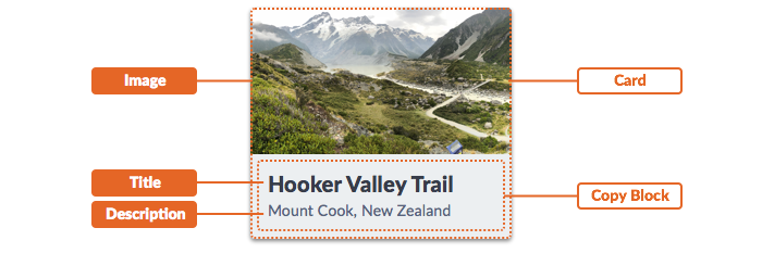
card often requires:
heading), maybe supplemented with a…Cast the discovery net wide across many products. Inventory each example. Analysis should yield a growing diversity of cases and elements should inform a design and guidance useful for later documentation.
card may include buttons or icons for actions, but never both.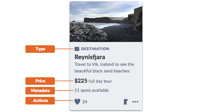
cards serve varying needs across many moments of an experiences, and can include a range of other content types:
tag or an icon/label pair.button(s), icon(s), or both.A composable component’s many elements raise questions of order, combinations, groups, and more:
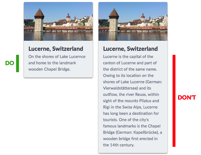
For many cards, the stacked order is fixed: image then title then actions. In other systems, more flexible needs may suggest reordering elements. For example, Morningstar Design System’s card enables users to place an image above or below a title.
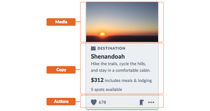
Like a modal and dialog, card could identify zones for a header, main and footer or media, copy, and actions to firmly identify content relationships.
The bigger the component, the more likely it offers a region that welcomes, well, whatever an system user wants to put there. The region’s content can be as innocuous as a paragraph or bulleted list.
But that region opens a dangerous door. Maybe an adopter adds a legend… under a chart… with an adjoining four column data table… in the content portion of a card. Hint: that’s not what a card is for.
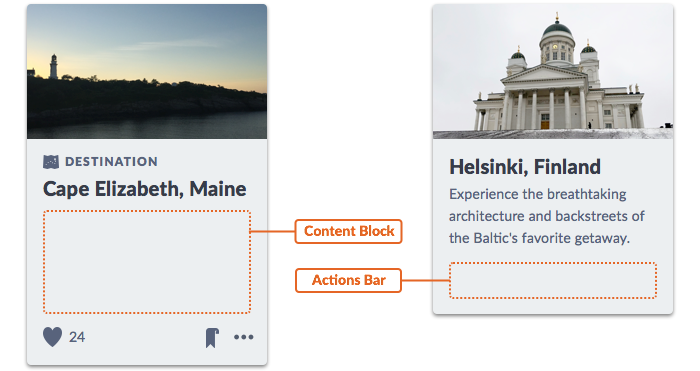
Regions offer flexibility but invite abuse. Nobody argues opening up a modal’s main content area to uncertain markup. For a card, an action bar zone could include button, icon, and menu. However, it’s not up to card to hard wire every case. Some components may need to offer regions and relinquish control of and responsibility for what’s goes inside.
Takeaway: With great container power comes great responsibility of adopting teams. Don’t fool yourself to believe you can predict, build, test, or doc every possible case. If a region is intended for a few expected variants, do adopters a favor and create examples exhibiting each one.
Titles, prose, metadata, pricing. An image that packs a powerful punch. No matter the elements you include, a card requires thoughtful consideration of media and copy. Unlike primitives you handled yourself, composable components require collaboration with those that know content best.
An image above text. It’s simple, right? Not always. The image’s aspect ratio is pivotal not just for visual harmony, but content production too.
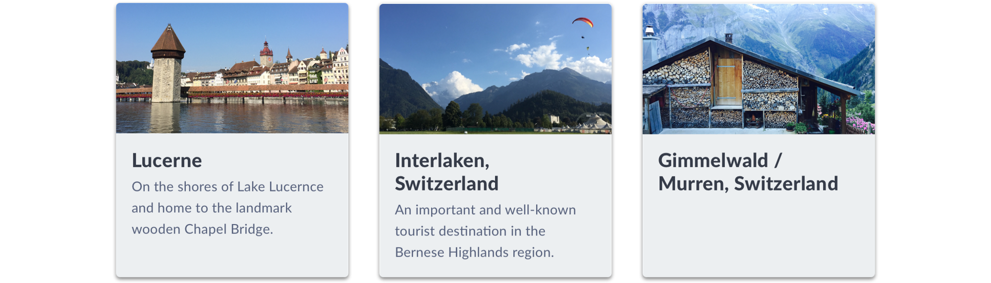
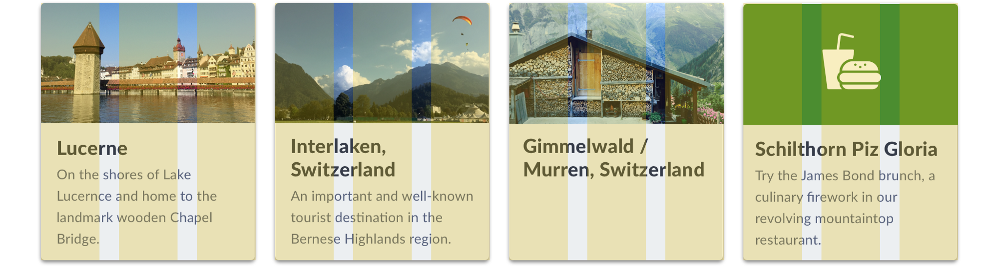
At one client, we analyzed existing inconsistent cards across products. It was a treasure trove of real content. Except: yikes, the aspect ratios of images varied wildly! Some products rocked a 16x9 or 3x2 ratio. Others only squared images. Search presented the gamut, including exceedingly tall portraits.
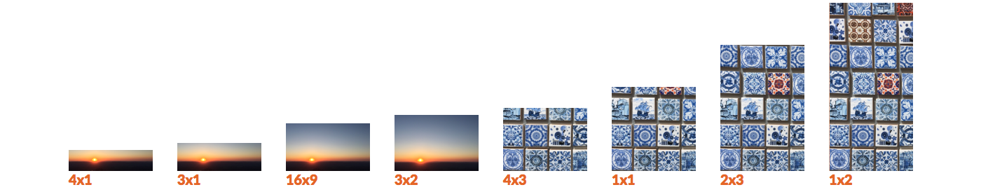
Content experts were understandably fatigued by years of design flip flop. To them, the system was an opportunity to end image size conversation. A standard aspect ratio would not just improve display consistency, but also vastly simplify their vendor requirements and image delivery.
As a result, card settled on a 16x9 landscape ratio, augmented by a square alternative. This process also yielded code to solve ratio-specific display on the front-end. As a result, composability led to a thumbnailcomponent useful for other components too.
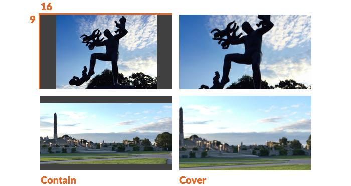
To address legacy content, card offered a prop to contain images (using the background-size CSS property) within the 16x9 space. Designers achieved visual grid harmony in search results, while producers adjusted displays per card to address undesirable photograph crops.
Takeaway: The more composable a component, the more vital that you incorporate content considerations. Stress test design and builds with real content. Engage those that cope with the content that flows into your components every day. You may become their new best friend.
While images dominate a display, copy also plays a critical role in headings, descriptions, and metadata. But it’s a card, not an opus, so copy can’t go wild.
Longer titles and descriptions are bound to wrap once or — if you can stomach it — twice. So design for margins and line height. But if copy lengthens, card effectiveness diminishes fast.
Truncation provides an escape hatch, protecting against copy length that we can’t predict. Truncation divides opinion: some clients loathe truncation, while others release a truncate utility in a first component batch. Truncate a card title or even subtitle or description, and you risk damaging context and understanding. In composable components, defer to priorities: truncate a description before title, or after three lines instead of two, amid an appearance that sufficiently flexes.

It’s not just copy wrapping, either. Consider rows of actions like a horizontal button and icon list that could collide when settings get narrow.

Takeaway: Copy length maximums and truncation appeal to our sense of control over flowed content. As components complexity grows, strengthen editorial opinion and code control on copy length, line measure, and impacts of fluid card width. If you offer utilities, do so as moderation not a crutch.
On the other hand, sometimes content is unavailable. Card content often reaches into the depths, plucking this related article or that legacy profile for display. Is your card ready for the absence of a description, metadata or even image? No image, oh, the scandal! What do you do?

The most opinionated of us say: Never! Want to use a card? Include required elements or don’t bother. Yet, that’s harsh. Often unrealistic. Elegant composable components should bend but not break as the content flows.
In the absence of copy, card composition relies upon solid stackable space, considerate of the many combinations you may or may not expect.
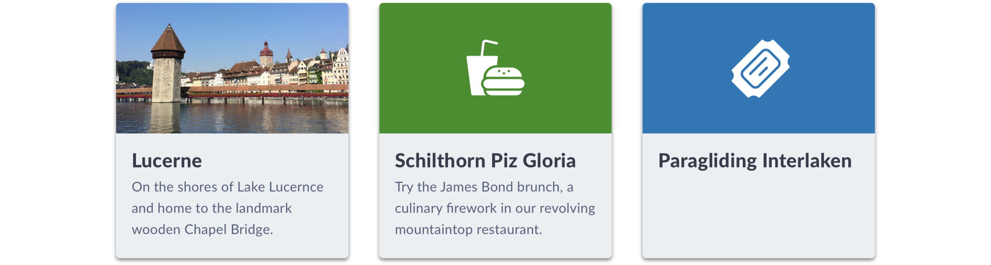
In the absence of image, we’ve got options. You could attractively distinguish types via a flat color, a site’s overlaid identity mark, or even an icon/color combo for type (asset format? activity type? content channel?).
Styling atomic elements is easier (elements require fewer decisions) and harder (those decisions carry foundational impact). However, card raises challenges and expands our style choices as elements interact in tight spaces.
My experience suggests that components like card trigger incremental conversation about system conventions of modular shape and layering. Conversations can steer towards border-radius, shadow, and subtleties of background-color contrast between the object and canvas below.

Takeaway: A composed component sets a tone for the shape of many designs to come, both in a library and for those working projects. Such decisions bleed into the experience in unimaginable ways both dangerous and delightful.
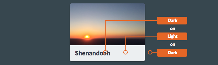
A card evokes color relationships, beginning with contrast against the canvas below. Some opt for simplicity: only white card on a white canvas, no alternative backgrounds, and use other properties like shadow for contrast.
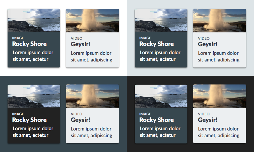
Richer visual environments solve for foreground/background combos in light and dark settings. Discovery Education’s Comet system offers many backgrounds, often displayed in concert in a single page. Therefore, the system offered light and dark cards across each by way of mixins and tokens. Such cards create another level of hierarchy: text on component background on canvas background.
Takeaway: Composability challenges your tolerance for visual complexity. Powerful, opinionated components tempt a system team to solve every combination in hopes of saving collaborator time. But complex, well modeled solutions invoke a higher cost of creation and maintenance. “Just enough” complexity is not always clear cut.
Separation, often via margin, also plays a role. A card layout can leverage a layout_grid or define its own to arrange many cards in a row or grid. While grid mechanics are straightforward, card layout raises more questions:
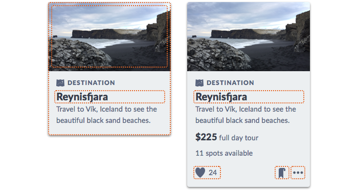
The card’s primary purpose is as gateway to deeper detail somewhere else. A card also elevate subtle interactions, too. The former isn’t up for debate. The latter can lead to contentious discussions about “What’s clickable?”
As an entryway, a card’s navigation is simplest when the entire card is clickable. In that case, the whole card can respond to cursor events like :hover and :focus to trigger an image or block to zoom, title to recolor, and shadow to darken. If a card won’t contain more specific interactions, making the entire block afford a single interaction simplifies these concerns.
On the other hand, a composed component like card can include many interactive zones—title, image, button, icon, link— that impact both markup, style, and behavior. Do your engineer a favor and discuss these during design iteration and handoff, before changing the implementation becomes painful.
EightShapes can energize your efforts to coach, workshop, assess or partner with you to design, code, document and manage a system.