Every system needs button, checkbox, and typographic headings. But beyond an obvious core, curating a system’s scope requires balancing disparate features, tradeoffs, and an uncertain boundary of how much is too much.
Upon a 1.0 release, a system can be inundated with contribution inquiries:
Designers and engineers always confront challenges the system doesn’t solve. And then, they’ll solve it. Through blood, sweat and tears, they’ll develop fervent belief about the solution’s value. The system is their path to amplify that value. But is the system the right place for it?
Where and how do we — collaborators chatting, a systems team reviewing proposals, squads planning a release, or a community of practice charting a path — decide what belongs in the system and convey what work remains?
Systems are never the repository for every style, component, and feature designed and built for every product ever. Instead, a system should include what’s shared across many products and omit what’s not.
By asking a contributor a few simple questions, you can probe how realistic and valuable a contribution can be. Each question need not elicit an emphatic “Yes!” (except the first one). However, they frame discussion between contributors and system representatives to decide whether or not to move forward.
For example, a toast error message could be relevant to an entire app ecosystem. On the other hand, a souped-up data grid with toolbars unique to their product may be irrelevant to everyone else. I’ll use a scale:
If relevance isn’t clear yet contributor passions persist, direct them to their community to validate assumptions and strengthen their case.
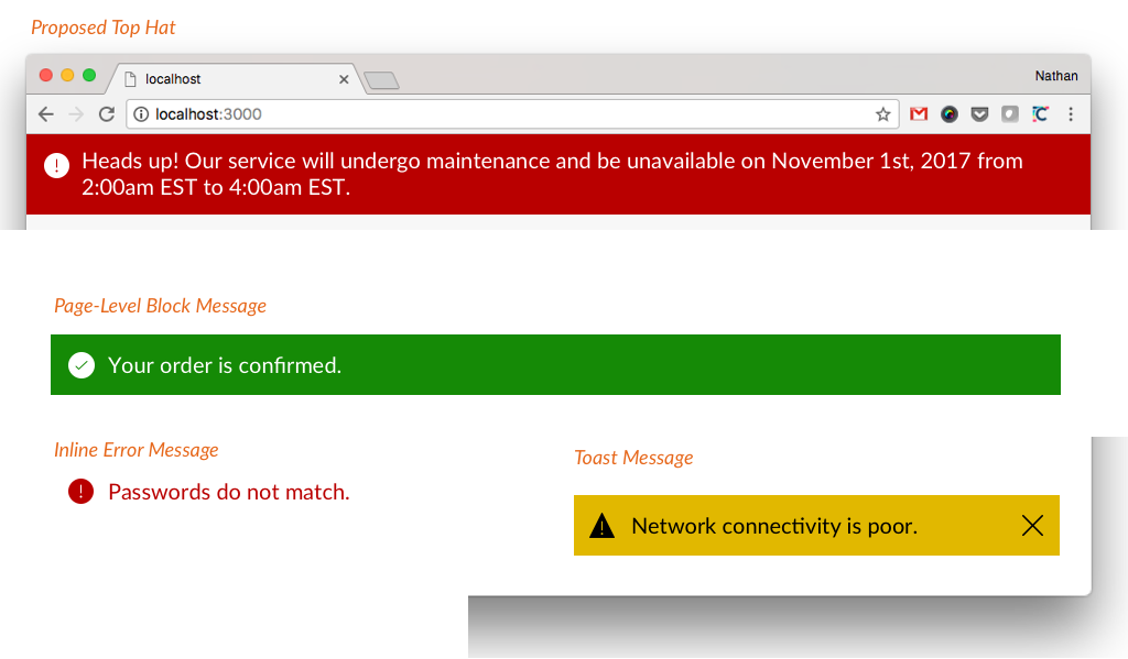
If your system already sports page-, inline-, and toast messages, a “top hat” for system outages and other announcements could fit nicely into the set of messaging components*.*
On the other hand, imagine a library of framework-independent HTML and CSS. Then, a contributor proposes a complex, React-based component. That would trigger a repository refactor, implies a framework commitment, and expands the practice to an entirely new testing workflow. The system isn’t meant for that.
Few want or even tolerate a bunch of random parts bolted onto edges of a system. Instead, grow a collection deliberately and expand into concerns like editorial, brand, and accessibility when it makes sense.
Got a primitive pill that needs a few varied colors? Easy. Proposing a complex, multi-panel calendar date picker? Let’s take a breath.
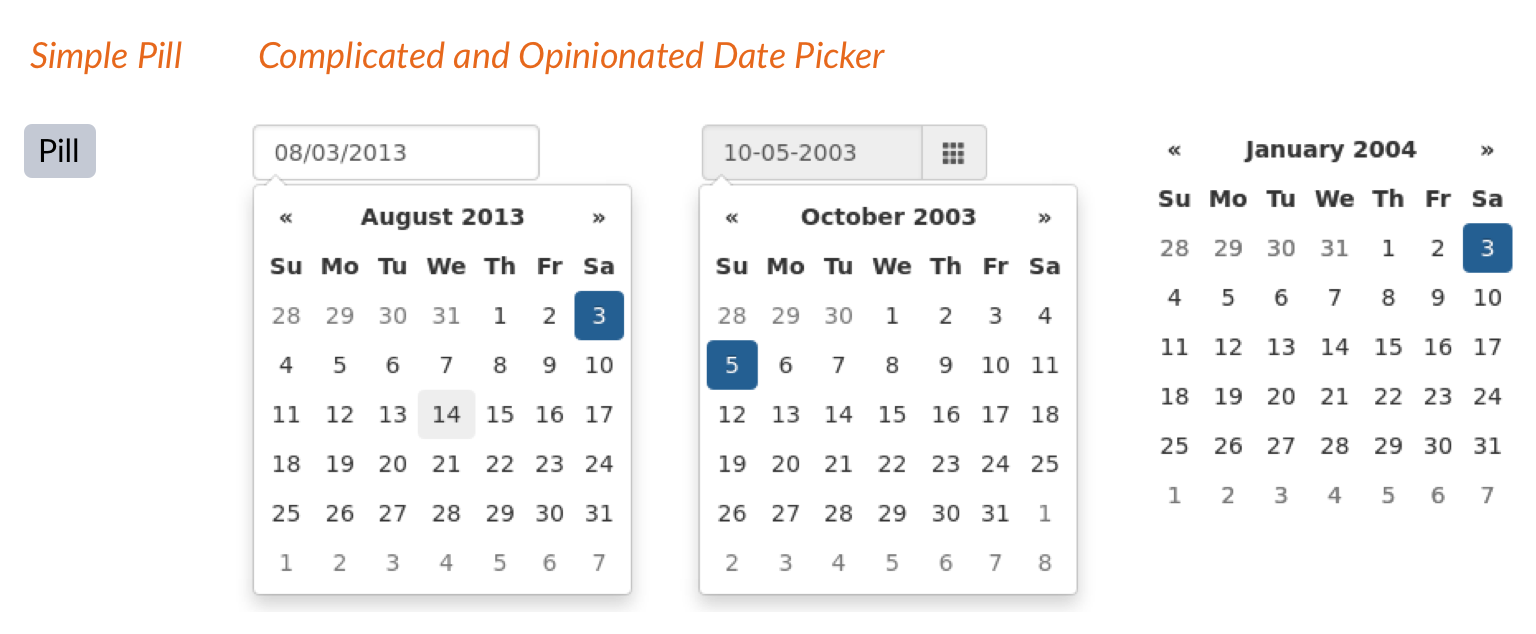
Date Pickers are a wonderful example. Many products use a Date Picker. However, most need their specific version of a Date Picker. Not only is it complex and expensive, but it’s nearly impossible to build one that meets every product’s nuanced needs and contexts. Instead, adopters gripe about all the overrides and extensions they have to do, effortfully stripping out the features you built thinking they worked for everyone. Avoid complex things made for everyone but fit no one.
A system team can’t take a burgeoning library in every direction at once. If your team is focused on areas like error messaging and notifications, a Tooltip contribution could trigger growth elsewhere.
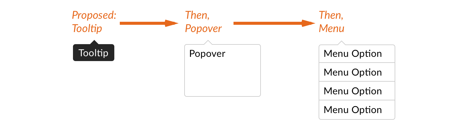
Solving for Tooltips includes z-index layering and shadows, JavaScript events, and aligning notches to all sides. Compositionally, such properties extend to Popover and Menus that follow. I’ll bias towards contributions that spur development in directions useful to everyone.
Adam Rowe, a recent system collaborator, came up with this productive and reasonable challenge question:
If your contributor struggles to articulate ideas and you don’t know either, maybe the feature isn’t mature or ready for broad distribution. However, what if your contributor quickly cites scenarios of use, rattles off do and don’ts, and itemizes editorial and style considerations? Now we’re talking!
Ultimately, a contribution conversation must zero in on timing. Does your system team’s release cycle and roadmap have space for this now or later? Does this feature pair well with other current developments?
Just as important, does your contributor have enough time to complete the work to be done? It’s often tough for a contributor to answer. First, they may not control their time and would need to get space from their manager or product owner. Plus, they may not have a grasp of the work that remains.
In my 10+ years of system work, I’ve never seen a contribution complete enough to be immediately merged into the system. Instead, there’s work to fine tune the contribution to:
You can’t add half-baked features to a library. Premature and simplistic solutions risk inconsistent interpretations per product that you meant to eradicate. Even worse, adding features later risks triggers breaking changes that can alienate adopters.
For example, a proposed Card may appear simple: image and title. Done, right? Not so fast! A system-worthy grid may require opinions on card description, type, photo aspect ratio, interactions, and more.
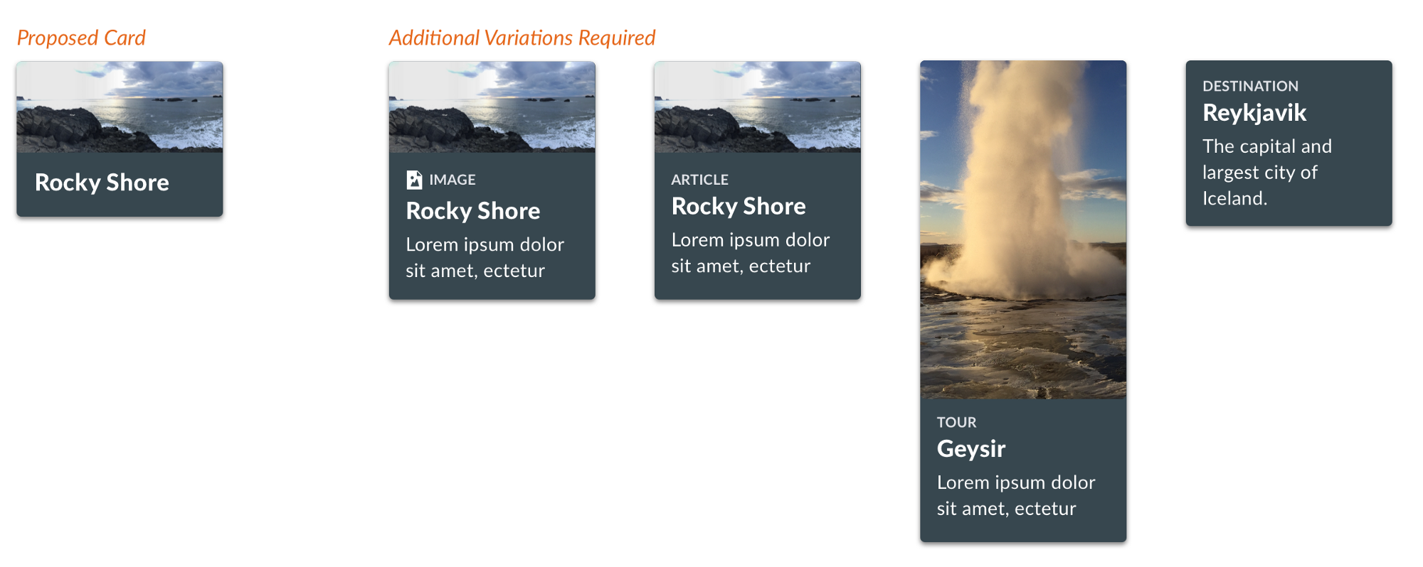
What’s left to be done? Resolve what features to have — Description or not? Tall photo or not? Photo optional? — and verify the solution with across the product community that’ll adopt it.
Who does the work? This is a tough one. A contributor’s passion may diffuse into apathy when forced to engage a large community to define requirements and finalize design. Be upfront on the time commitment and discern if the contributor is up to the task.
The contribution may also need to reduce scope to a relevant essence useful across products. Consider an already arduous collaboration across three flagship products to unify a Card component design.
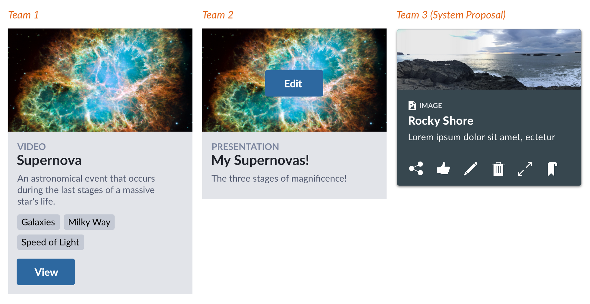
Headings, descriptions, and images are fairly similar, and we quickly achieved consensus on thumbnail aspect ratio. But interactions are all over the place! Conversations on button and icon arrangements swirled into oblivion. Argh, c’mon, can’t we all get along?

Actually, you already get along! A system’s Card can include agreed features — thumbnail, copy heading styles, descriptions — and omit contentious items. This is especially true if a library also offers other primitives—here, button and _icons — _so that product teams can customize the contentious stuff themselves. Problem solved, move on.
What’s left to be done? Review proposed features and prune unessential items lacking consensus. This may also yield other components (here, thumbnail) reusable in future components too (like media object and content tiles).
Who does the work? Reduction is often driven by a system expert acting as connector and negotiator across a community, probing and challenging designs effectively, and biasing collaboration towards consensus.
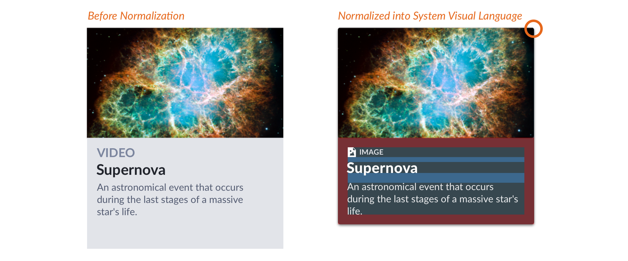
Perhaps a design include myriad non-system colors, wacky spatial choices, and product-specific icons. Or, maybe contributed HTML markup is crude, CSS is unorganized across files, and — gasp! — uses Stylus instead of the system’s Sass. Without a doubt, contributions always lack every text / background combo, size option and theming construct the system offers.
What’s left to be done? Each contribution must be normalized into system standards. The system promises robust and accessible features of high visual quality and resilient to varied content, dependent on a shared — and perhaps tokenized — visual language. The system’s code aligns with repository standards to ease per-item and cross-library maintenance. So, the contribution has to get there.
Who does the work? For seasoned contributors, this step is familiar and completed with relative ease. However, the system rep must balance the time needed to deeply educate a contributor, suffer exhausting iterative reviews, and risk still having to complete the task themselves anyway. More often than not, a system rep volunteers for this production.
EightShapes can energize your efforts to coach, workshop, assess or partner with you to design, code, document and manage a system.