#1 of 6 of the series Documenting Components: Overview | Intros | Examples | Design | Code | Authoring
High-quality component documentation is a hallmark of an effective library. We describe each UI component robustly, aiming to drive effective design decisions and speed development. Good doc isn’t free. It takes planning, effort, and process to make examples and guidelines that make a difference.
Starting here, this collection of six articles spans the story of documenting components. I begin with the strategy of audience, content, and architecture. Next, I expand article by article on introductions, examples, and guidance on design and code, and conclude with process. The tips reflect what I’ve learned over years and am inspired by what our community shares publicly today.
And so I begin by asking the question: what audiences is this doc for, what content do they need, and how do we optimally architect pages to convey it?
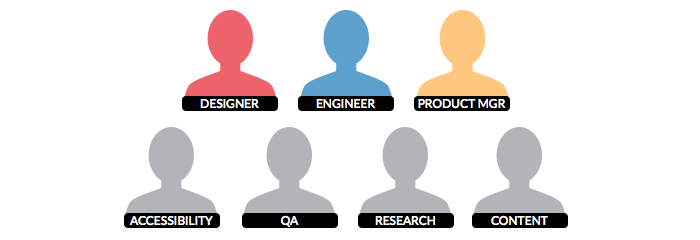
First things first: who it is this for? And since the answer usually spans more than one discipline, who’s more important?
When a library offers code, engineers are an audience. Obviously. If a library is only code, should doc serve designers too? If doc only offers design guidance without code (e.g., Google Material), do engineers care?
In my opinion, in both cases, yes. Absolutely, yes. Component documentation must serve both audiences, always, to varying degrees.
Beyond that, is it for anyone else? Possibly, especially as a system entrenches itself into how teams get things done. Powerful, pithy intros sensitize product managers. Examples expose states to QA specialists. Style, behavior, and editorial concerns guide researchers and content strategists alike. Accessibility practitioners can revel in a place their guidelines calls home.
Many system teams also publish a system as publicly visible to a community. While intrinsically they seek to share, extrinsically they justify a visible site as a recruiting tool. The system shall expose rigor and quality, craft and collaboration, practices elevated so that a talented recruit sees strength.
The documentation’s primary goal remains: equips practitioners — engineers, designers, and everyone else — to use a system efficiently and effectively. As it grows, it can serve many despite their varying needs and frequency of use.
Takeaway: The arc of design systems bends towards collaboration across disciplines not limited to designers and engineers. If you intend to scale, advocate for content that serves a widening audience.
Serving everyone doesn’t mean serving each equally. Engineers may visit doc 5, 10, or even more times daily. It may even be an open window adjacent to their code editor! A designer may visit less frequently, comparing this to that and occasionally absorbing details. A content strategist or researcher may visit rarely to support a decision.
So, who’s most important? My experience suggests a clear starting point: systems are first made of, by, and for engineers and designers. While others welcomely contribute and benefit, they are secondary. Serving secondary audiences less than optimally may be a necessary tradeoff. If we skimp on engineers or designers, it’s a problem. A big problem.
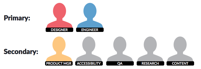
What about engineers versus designers? Every system I’ve worked recently serves both, guiding both design and code. Some doc I observe from other orgs reflects a strong bias towards one or the other, or separates destinations for each (more on that later). There are many dimensions to consider: your objectives, their frequency of use, content depth, quality, cost of content production, and relevance to their work.

I’m a designer. But I’m also a pragmatist. If I had to choose one, without any context, I’d favor engineers. Getting 50 engineers to code well-designed components is more likely to result in cohesive, efficiently built experiences compared to 50 designers reading tomes of guidance about decisions already built into that code.
Takeaway: Audience priority depends on many factors. Expect designer and engineer needs to collide, and attempt to optimize for both. If you can’t, orient tradeoffs towards those using the material closest to the final product, usually code. That means engineers first, designers second.
Component doc connects the your audience with content you can provide. The content takes many forms, they don’t all cost the same, and it’s up to you to weave them together.
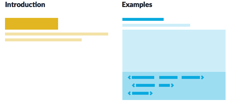
At a high level, component doc usually includes these four types:
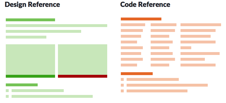
The cost of each varies. An Introduction should be quick and cheap, riffing off an example to write a sentence or two. Well-organized Examples are an essential investment, over time becoming predictably produced. Code references should emerge via straightforward if tedious templates that engineers use to fill in the blanks.
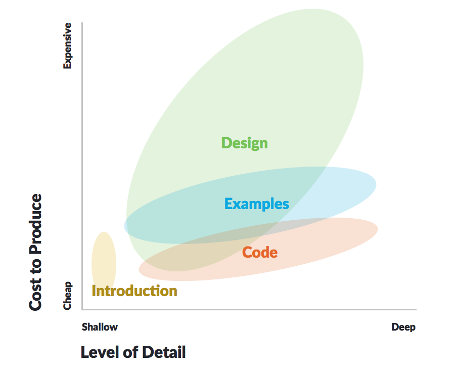
But, take a deep breath. Effective Design reference can be very costly, skimped to achieve only basics, or skipped altogether. Design narratives depend on a system’s goals, team capacity and talent, and a community’s appetite.
Takeaway: Component doc can include a wide variety of content. So start discussions at the top to evoke a team’s values and discuss authoring types designers and engineers may distinguish (code vs. design reference), overlap (intro), or share (examples, including naming, content and order).
In practice, component doc can emerge from both deliberate choices and unfavorable constraints (“get it out there!”). Often, component doc ends up a split story: designers publish for designers here, engineers publish for engineers there. This fragmentation can occur by accident, design, or both. As a result, discuss a component page’s information architecture early.
Google Material’s doc ecosystem illustrates fragmentation. Material’s design foundation arose prior to its implementations, from Material Design Lite and the Polymer Project to Android Developer’s design section and Material UI (built for React). These implementations reference loosely link to their design parent, which remains unencumbered by code concerns.
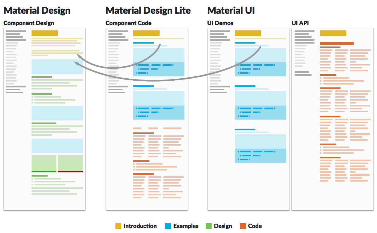
This fragmentation isn’t just essential, it’s meaningful and justified. Material’s spread across frameworks, teams, platforms, and—let’s be honest—the world exceeds every other design system in practice today. Newsflash: we all aren’t aiming to be Google Material!
For the rest of us, a design goes here engineering goes there mentality is common. This intent focuses content by discipline, optimizing a reading experience for each audience separately.
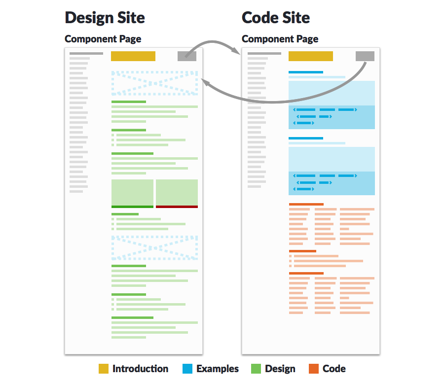
A design/code separation carries risks, too. Over time, sites fall out of sync as:
loader & spinner).The lack of agreement feels ok. The stories are separate, right? Well, they are conveniently separate for an author’s workflow, at least.
Yet adopters yearn for a single source-of-truth. Those interested in both stories find themselves in a tennis rally, back and forth, back and forth. Useful details exist in both places, architected distinctly as narratives adopters must knit together themselves.
Takeaway: Be wary of a design & code split. While convenient to author and publish early on, long term risks may outweigh benefits. Sibling sites can indicate of a corrosive divide between design and engineering, too.
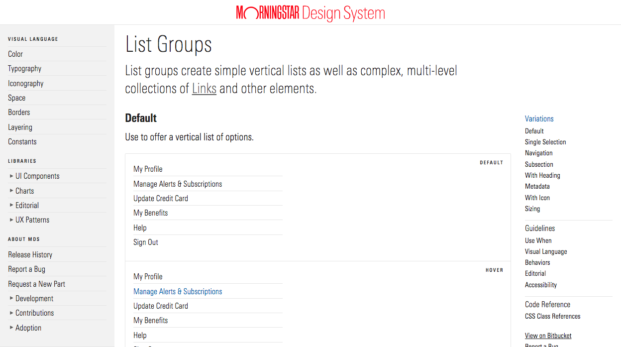
In many systems programs I’ve led in recent years, such as the Morningstar Design System, we’ve thread design and code together. Adopters find unified names, guidance, and narratives on how to use variations and features.
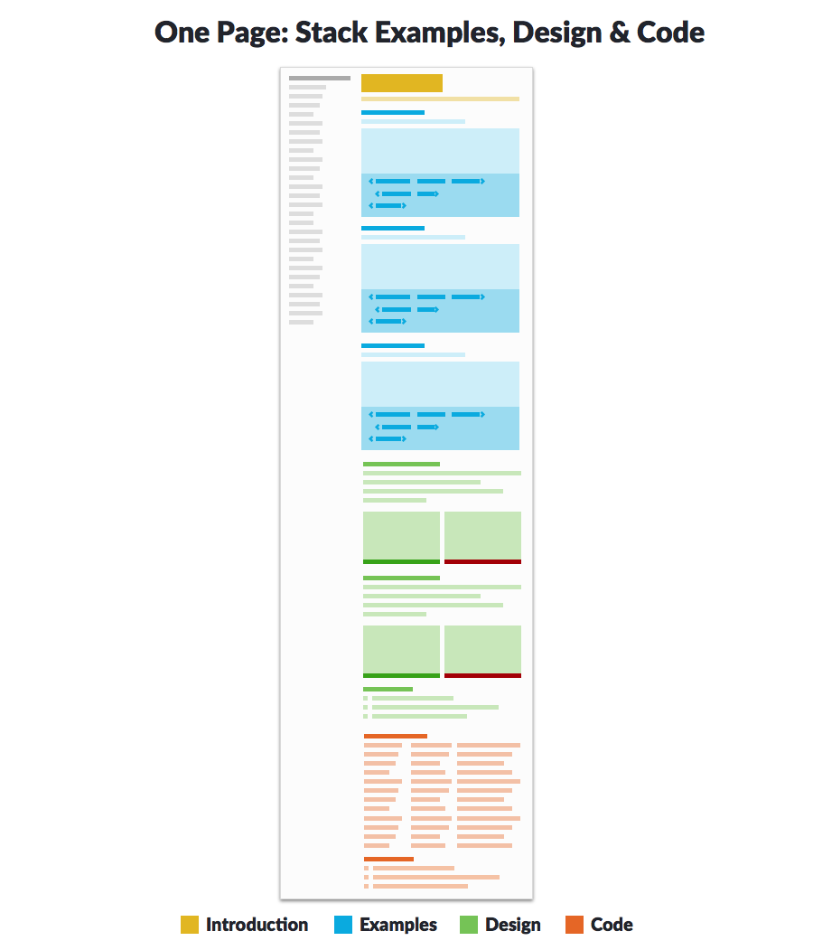
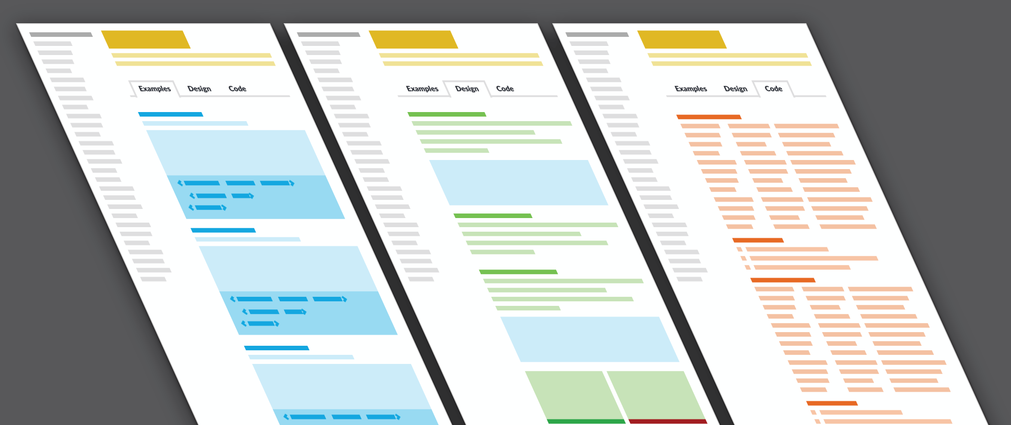
A threaded page comes with tradeoffs: it runs longer with content varyingly relevant per discipline. As an alternative, other systems follow an introduction with content organized into tabs.
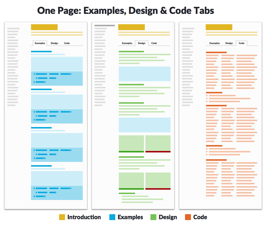
Takeaway: Blend design and code is possible, and a team can choose the UI—stacked, tabs, something else—that suits their interest.
Whether stacked or tabbed, I’ve come to advocate for a consistent content order and priority of:
Examples rule, and so long as deeper design and code reference is a click away, you’ll be ok. Interestingly, industry examples name and prioritize design and code concerns with inconsistent labels and varied order.
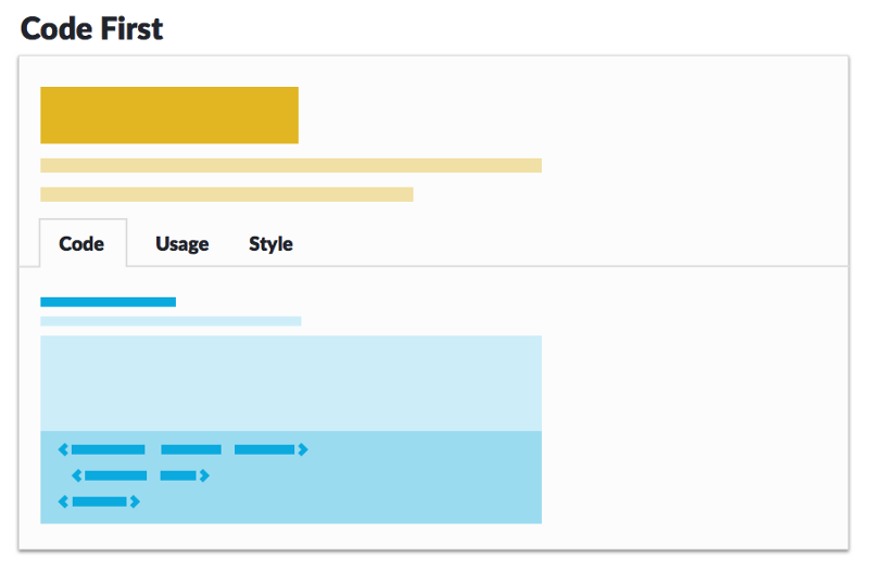
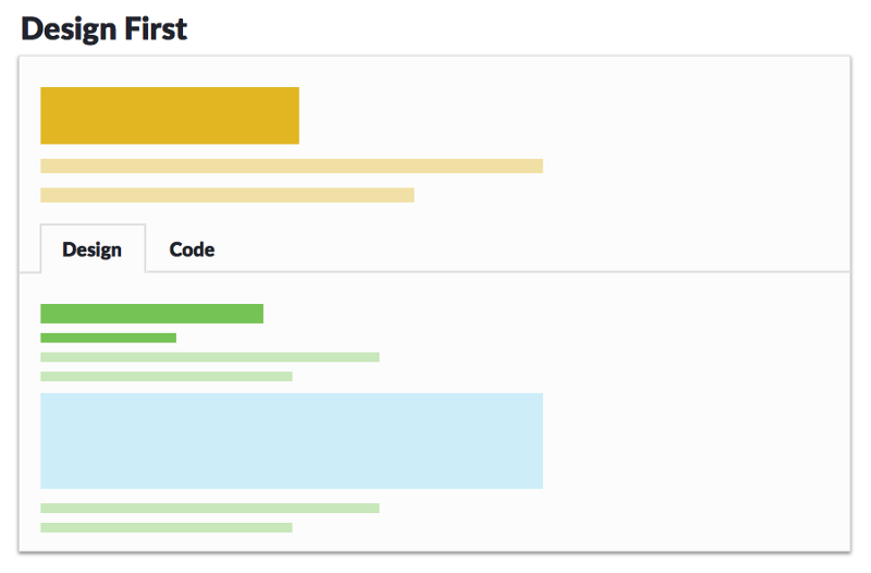
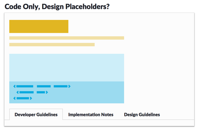
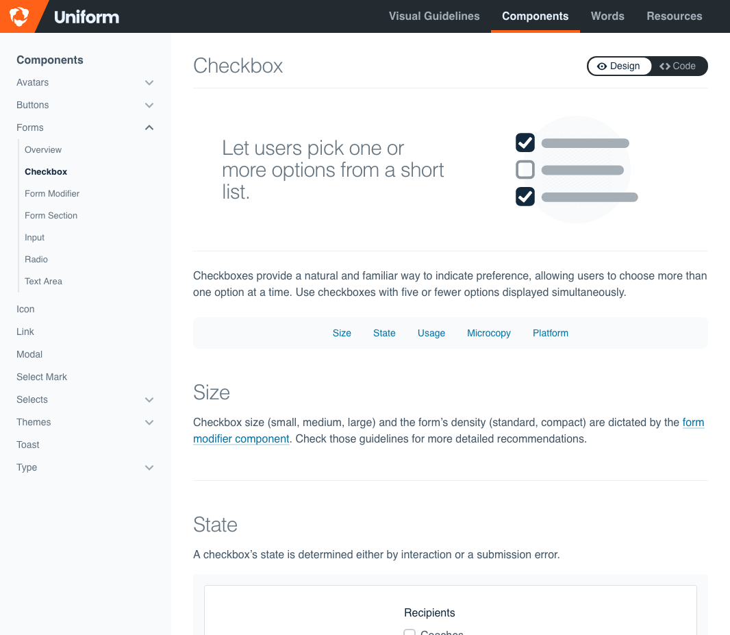
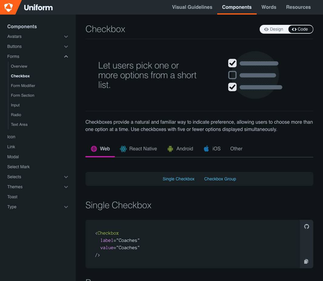
IBM Carbon values examples revealing Code first and foremost, leaving design details for Usage and Style to subsequent tabs. Hudl’s Uniform system reverses priority, telling the Design before Code, relegated to a second tab with a content taxonomy that’s similar but not exactly the same. Salesforce’s Lightning Design System presents a sensitizing example as a component explorer above a default Developer Guidelines tab, yet Implementation Notes and Design Guidelines tabs remain curiously empty.
Depending on an organization, additional sections — often, Accessibility — also emerge as a peer, perhaps before or after a Design tab.
Takeaway: Start with an Introduction and position Examples prominently. Beyond that, prioritizing Design or Code guidance varies by organization and how they value their audiences and storytelling.
The longer your page, the more important it is to signal what’s there and where you are. Vertical local navigation in a right rail works effectively: ever present, tracking page location as you scroll, and expanding to reveal sub-headers along the way.
Takeaway: The UI — across tabs or in a single scrollable view — can be a matter of taste, although many sites trend towards a vertical navigation that sticks. Ask your audience, know your content, maximize usability, and no matter what: keep section names and order consistent across the library.
The more design and code thread together, the more audiences interested predominantly in one over the other will ask to refine the page’s interface to suit what they want to see.
Consider a toggle to hide design or code concerns. This requires classifying each content type as relevant to one, the other, or both audiences, such as:
In a similar vein, Hudl’s Uniform implemented a page toggle to distinguish design and code, serving as a defacto tab to orient users one way or the other:
The implementation is smooth and yet comes with a cost: build the UI and manage content effectively. Other clients I’ve served have sought a similar breakdown, finding my heart with acknowledging the separate yet open borders between design and engineering.
Takeaway: Filtering based on content types is a content management challenge more than a technical one. The stricter your IA, the better chance you’ve got, but it depends on an effective authoring workflow and separation of concerns that may challenge the notion of content relevant for both sides.
So, you have a strong sense of your audiences, know the kinds of content to produce, and agree on a high-level page structure. It’s time to get to work.
Next → #2. Introductions
EightShapes can energize your efforts to coach, workshop, assess or partner with you to design, code, document and manage a system.