I’ve long referred to Color, Type and Icons as the “Big 3” of a system’s visual language. All UI components — from Buttons on up — are built with them. But I left something out. Space, our final frontier.
Space is everywhere. CSS uses properties like padding, margin, and absolute positioning’s left, right, top and bottom to separate objects. Across five libraries (Bootstrap, Salesforce Lightning, Foundation, a previous project, and a current project), I compared occurrence of these space properties relative to property groups of color, size, type, layout and more.
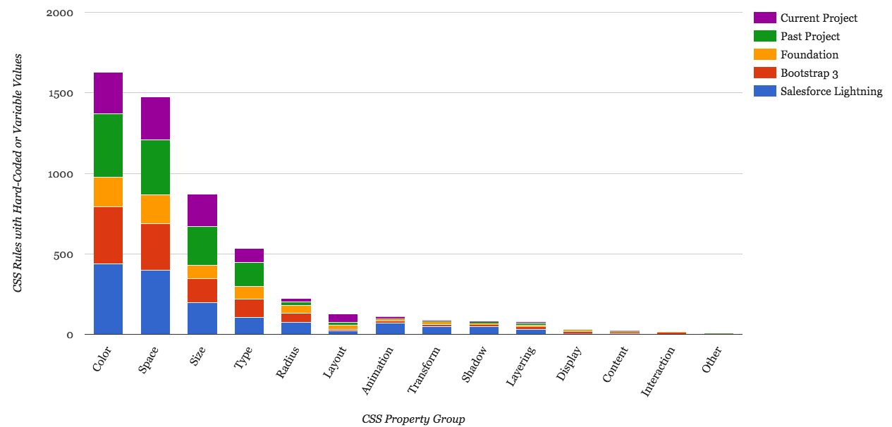
After removing effects (“zeroed” values like :0; and reserved terms like transparent or auto) where CSS already offers us a system for decisions, space rules appeared more than anything except color. Nothing else — not type, size, layout — was even close. There’s so much spatial complexity built into our libraries, let alone our products!
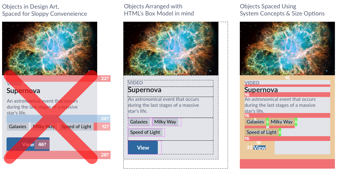
Space epitomizes the “I design this way, you build that way” gap between design and dev. We’ve long lamented the red-lined specs sprinkled over our designs. It never feels worth it. Yet they persist, uninformed by our product’s finished material: HTML’s box model.
Costs are huge: annotating, translating, discussing, visually scrubbing during QA. All that work … for something still not good enough. Thus space exacts an emotional toll, too.
We could weave more intentional spatial concepts through design, code, and conversation. But we don’t. We just use T-shirt sizes and call it a day. We can do better. We can replace red-lined, red-faced rage to inset, squish, stretch, and stack our way towards a future of spatial clarity.
With that in mind, here’s fundamentals, an expanded vocabulary, and further experiences I’ve had when applying space to systems work.
Grids are rich with spatial decisions for columns, gutters, outer margins, and responsive nuance.Teams tackle grids early so users can easily make a page. Unfortunately, that’s often when spatial conversations stop.
A grid isn’t a complete spatial system. A grid is a component that uses space, just like every other component. A grid feels different. It’s invisible, comes early, and only does space. But there’s more to space than grid.
Takeaway: Introduce spatial convention with a grid, but don’t stop there. Align a grid’s margins, gutters, and column values with deeper spatial concepts woven through an entire component library.
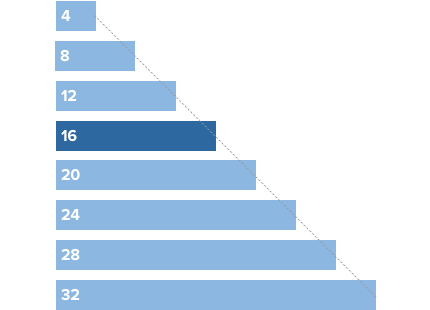
Teams setup a memorable, even magical base number to ground all other spatial values. Some teams prefer base 10, because of how we count (due to our ten fingers, by the way). I’ve even seen a team use a base 6 — with helpful factors of 2 and 3 — to make way for an uber-flexible array of 3s, 4s, 6s, 8s, 9s, 12s, 15s, 16s, 18s, 21s, 24s, 32s, and more. Stop the madness!

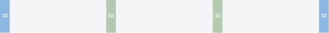
Most systems I’ve worked use 16. It’s a good default font size. It’s a factor of all screen resolutions (320, 768, 1024). And it provides memorable multiples greater (32, 64, …) and factors less (8, 4, 2) than where it starts.

Takeaway: Ground your spatial system’s range with a memorable base number, and limit expectations on how it’s used.
With an established base, teams can still slip into random steps (12, 14, 18, 22, 24, 28, 30, 32, …). To prevent that, others use a linear scale (4, 8, 12, 16, 20, 24, 28, 32, 36, 40, 44, …) where each step is a fixed increment. To me, either result is unpredictably used, offering too many choices too close together. When do I use 24 or 28? I dunno.
An alternative is non-linear. Options include the golden ratio, modular scale, or the similar geometric progression that could double each step. Starting from the base, we’ll go in both directions to stops smaller (16, 8, 4, 2) and larger (16, 32, 64, and… that’s about it) on the scale.
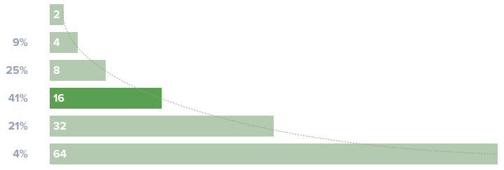
Takeaway: Consider a geometric progression or something similarly nonlinear. You might experience occasional tensions to add a 24 between 16 and 32. However, in my experience, such moments are rare and rarely justify breaking the simple system.
I love Gmail’s Compact, Cozy, Comfortable space toggle. So when we built our space system, I suggested we use those labels in our work. Immediately, a teammate challenged me: “What do we call other steps?” My spartan, teeny, and luxurious options didn’t pass muster.
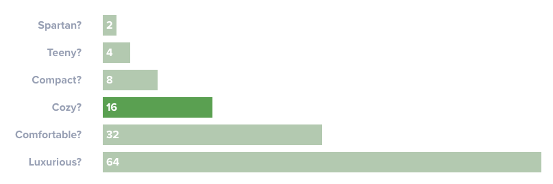
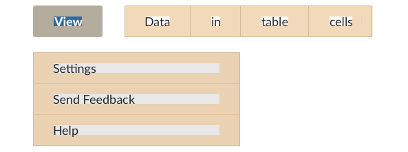
So we did what we always do: use a t-shirt size scale. Medium corresponds to default and S, XS, L, XL and — if necessary — XXS and XXL are other options. It’s what most libraries (Bootstrap, Lightning, etc) do.
Takeaway: Name space options simply, using a scale like t-shirt sizes to create a language people can remember and apply accurately. If you try more descriptive labels, be prepared for teammates to respond “Small, medium, large, please.”
I’ve reviewed many libraries and talked with many designers. Simple conventions of base numbers and a named scale are where conversations usually end. Even though these few options are simple, using space still felt so…random. I needed more.
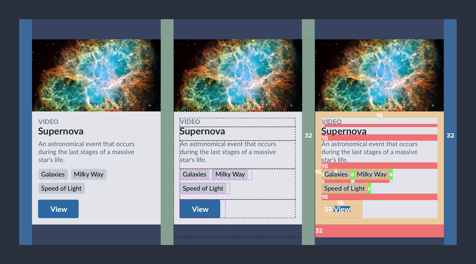
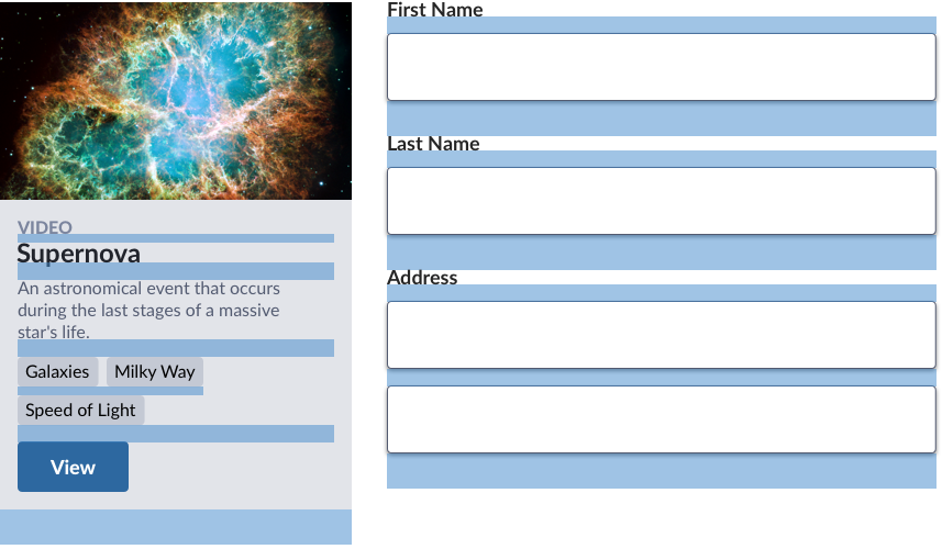
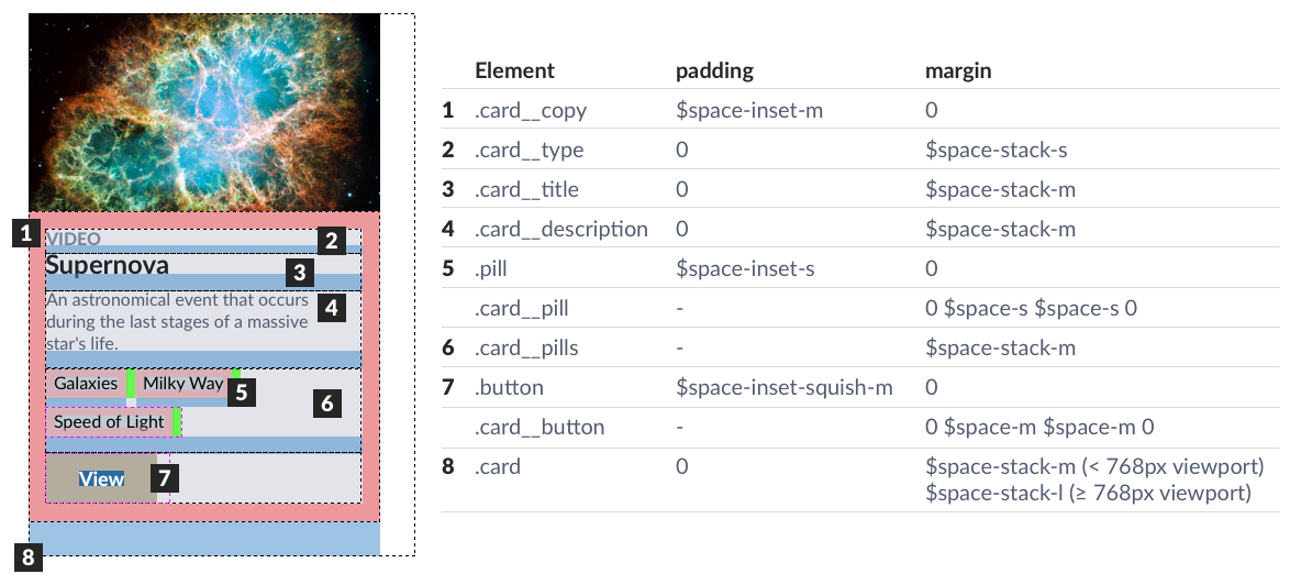
In reviewing our emerging work, there aren’t many distinct intents for applying space. For example, let’s inspect my favorite component: the card.
As a front-end developer, I envision all the boxes of elements that fit elements together.
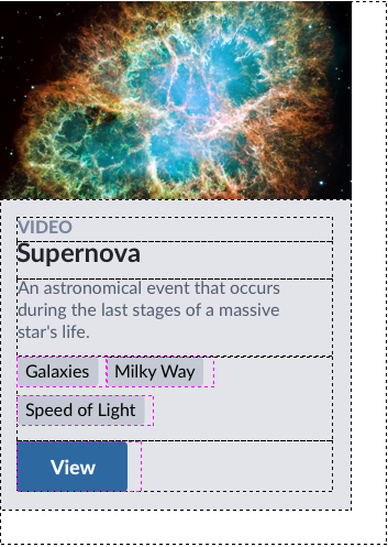
The card provides a useful illustration of many spatial concept we use: insetting content from an edge, varying an inset’s shape, spacing items inline, and stacking items within and between a component.
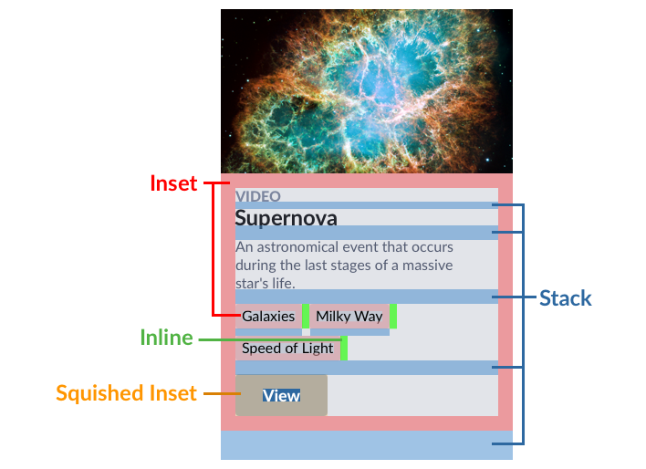
These concepts — inset, inset squish, inset stretch, stack, inline, and grid — cover the vast majority of our library’s CSS rules for space: padding, margin, left, right, top, and bottom. These concepts also enhance how each atomic is self-contained, improving composability.
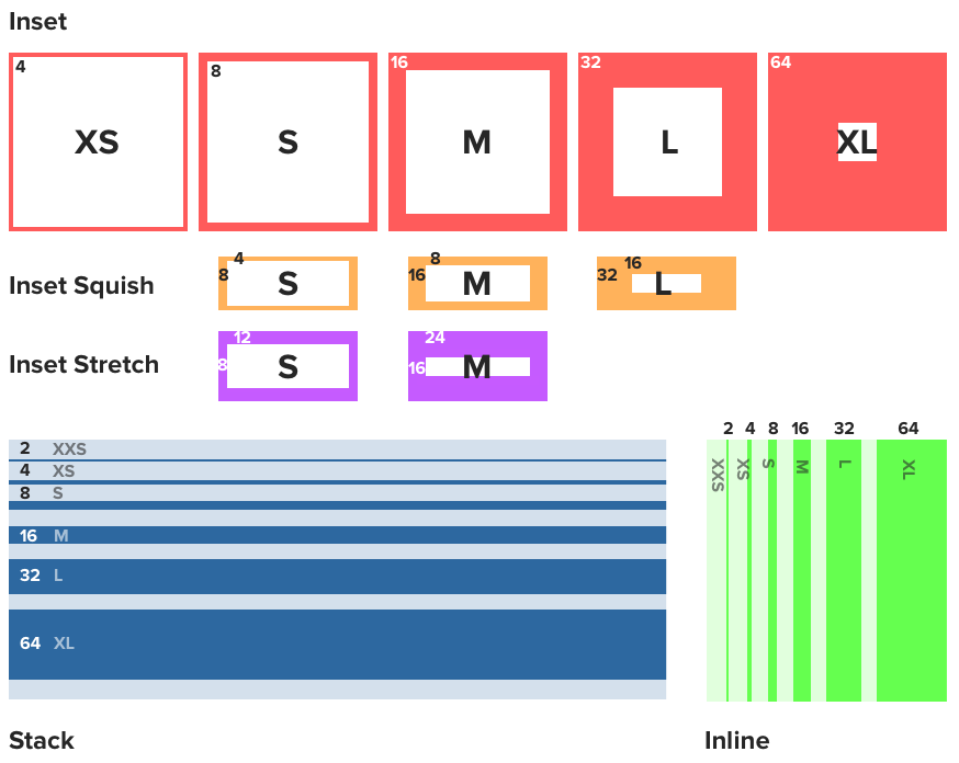
An inset offers indents content on all four sides like the matte of the framed photo on a wall. It’s use is widespread, across many components at varying sizes, whether our 3-Up module and block messages medium feel, extra compact pills, or spacious footers and mastheads.
The default is also a useful starting point for mobile first design, expanding to large at a relevant viewport width like 768px.
A squished inset reduces space top and bottom, in our case by 50%. While less common than its squared counterpart, a squish occurred frequently in elements (like a button) and cell-like containers like a data table or list item.
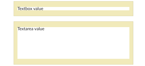
Contrasted with a button or pill’s squish, we found ourselves vertically stretching the insets of textboxes, textareas, and other form elements.
With all due respect to horizontally scrolled UI, the overwhelming majority scroll vertically. And that means one thing: we stack things. We stack message on heading on data table. We stack modules in rails. We stack copy, pills & toolbars, all in a card, each in a grid. Heck, infinite scroll means infinite stack! We stack, stack, stack.
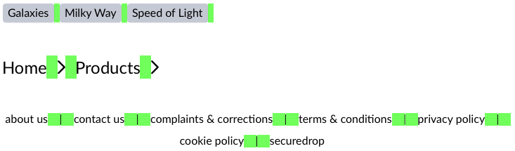
We also arrange objects inline, wrapping as they flow like text from the left or right. Such objects — pills, tags, breadcrumbs, and more — may stand alone or stack and mingle with other objects.
Ah, save the grid for last? As spacing stabilizes, we find ourselves revisiting grid margins and gutters, aligning these spaces with our magical starting point and other uses.
So, as applied to a Card component, your styled padding and margin may look something like:
Using space concepts requires us to adapt to something new. On my team, it took a day for light skepticism to give way to embracing the new model.
Most collaborators can’t see space, a primary reason it’s so arbitrarily applied. But now we’ve got a system: a limited number of concepts, each offering a limited range of options.
Takeaway: Teach your spatial concepts using a tight doc diagram or cheat sheet. Such references quicken how we grasp, apply, and sustain the concepts through design and code.
Don’t be foolish. These six models don’t solve everything. We still adjusted a margin-bottom here and left there from time to time. So, there’s justification for following more intentional space options with more generic alternatives (like $space-m).
Takeaway: Provide generic options, use them sparingly, and expect product teams to use them. When they arise in a critique or pull request, educate teammates on more specific concepts like inset or stack.
When you introduce something more complicated, others justifiably advocate for something familiar, like “Why can’t we use padding and margin in our variable names?” In this case, 2+ space concepts using padding, and those concepts can be applied via left and right properties too. margin is used to stack, grid, and space inline. Plus, how about non-web platforms that don’t use HTML?
Takeaway: Tease apart concepts from property names. They are many to one and limit reuse to a single platform.
Simple inset padding and stack margin rules collided with a long-known spatial adversary: line-height. This interaction increments space unpredictably, adding a pixel above and below our simpler inset-default of 16px.
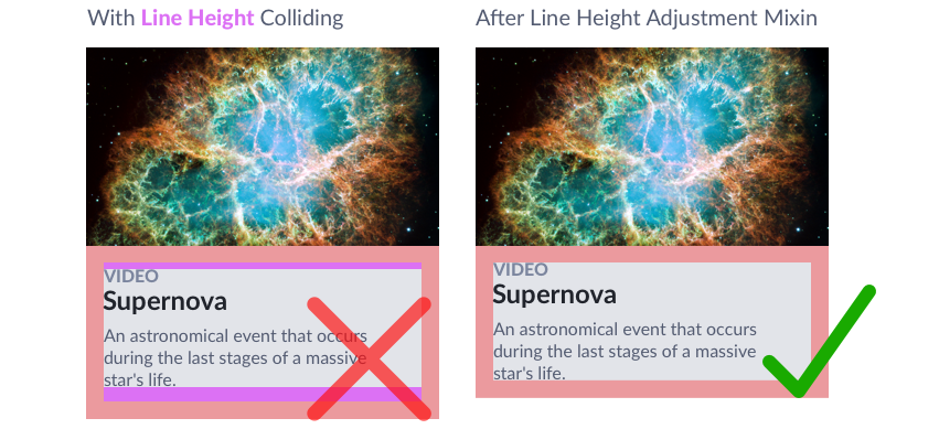
However, we followed an idea’s spark (@kevinmpowell’s “Let’s negative margin space using pseudo elements! But how much?”) with some math (I can use my college degree!). The result was a mixin formula combining type size and line-height to collapse space above and below colliding objects.
Takeaway: Don’t give up on systematic clarity because of exceptions. Try to solve them. If you can overcome such nuances, even with a bit of CSS trickery, you can persist a simpler concept everyone can stick to.
With concepts like inset, stack, and grid, you can tune the dials of density with aplomb. Search a repository, find _inset_s and _stack_s of interest, and extend or override those rules to fine tune display density.
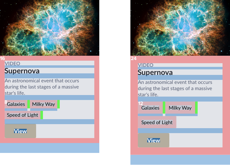
Takeaway: You can tune spatial density even with a barely-beyond primitive set of options. Without them, density control is a dream. With them, you can gradually build towards a powerful engine to find, adjust, and tune space with great intent and less risk.
EightShapes can energize your efforts to coach, workshop, assess or partner with you to design, code, document and manage a system.