#4 of 6 of the Documenting Components series: Overview | Intros | Examples | Design | Code | Authoring
I remember that morning. September 2014. McLean, Virginia. I arrive for work around 7:30am. I open Google’s Material Design guidelines for the first time. I remember exactly where I stood, for 90 minutes, soaking it all in. It was so, so good. By the end, I didn’t just know Material better. I was a better designer, and my mind was awash with how to document better.
During that immersive experience, I found guidelines pleasurable. However, component guidelines aren’t pleasure reading. They are a reference, orienting designers towards good decisions. Guidelines should afford quick learning and fast lookup, all while designers go about their business.
Thus, guidelines can’t be scribbled jottings by an uninformed soloist cranking a tedious writing task. Guidelines must be clear. Guidelines must be organized. Guidelines must articulate decisions forged by the inclusive dialogue of a participating design community. Guidelines must empower readers, not laden them with dense, shoddy prose they won’t read.
To produce quality component guidelines, you’ll need a content architecture, writing conventions, and approach to images and demos that work best for your audience. May this guide provides inspiration to get you started.
Design guidelines begin as a writing exercise, even if eventually they aren’t just words (more on that later). Well written words matter. With a predictable structure organizing advice, any reader — especially designers — can make better choices when using a component.
Some guidelines are better than none. However, a massive list of unorganized bullet points discourages readers. Consistent headings, organized by type of design concern, establishes a familiar pattern for readers and encourages authors to consider implications across concerns.
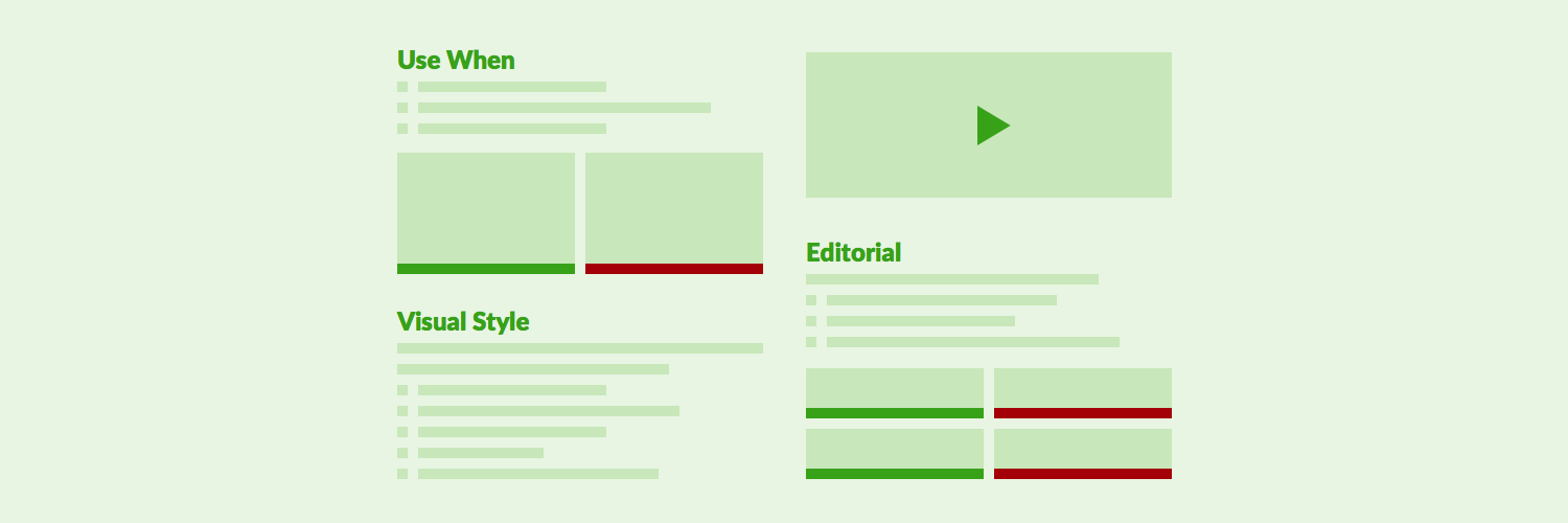
As a writing plan forms and composition begins, I recommend the following categories (in order):
Not every component offers guidelines in each category, so omit headings that lack content.
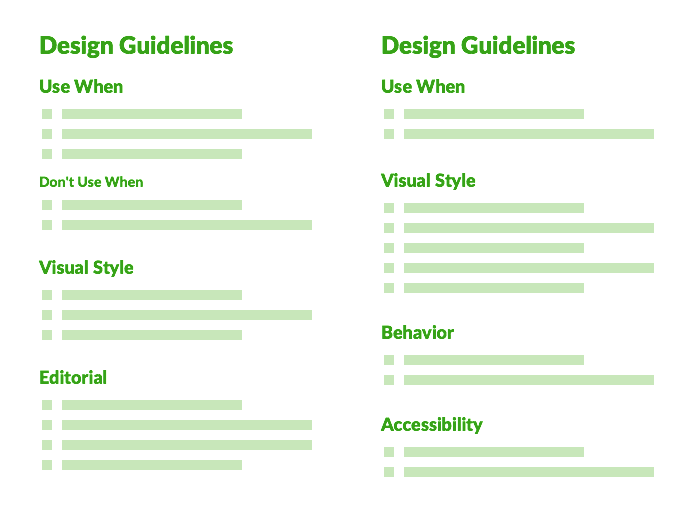
With a common structure, a component page’s local navigation (such as a sticky right link list) signals what’s there and anchors to each section.
While a component introduction may hint at relevant use, rely on a Use When section to illustrate the many cases when to use or not use a component.
While some systems opt for “When to Use” as a heading, that’s not my style. “Use When” affords a consistent and more succinct structure by beginning with a gerund (verb ending in “…ing”) like Displaying…, Requiring…, Grouping…, or Loading…. Examples include:
As contrasting examples arise, clarify what not to do. These Don’t Use When items are written in the same voice within a sibling or descendant group.
Visual style guidelines help designers tailor style given their conditions. Topics include color, typography, iconography, borders, space, size, and other visual properties. Just as common, this section elaborates on how to arrange multiple instances (example: aligning primary and multiple secondary buttons) and relate the component to adjacent elements.
Examples include:
Visual style guidelines are not specs. Avoid the temptation to make this section the final destination of excessive redlines. Specs are for important for an engineer building the component. However, by the time readers encounter this documentation, such visual details are already built into the available feature.
Whether or not your built component offers heavy logic built in, a Behavior section offers you the opportunity to elaborate on all the interactive details useful for a designer crafting an experience. Examples include:
If a library is only offering HTML & CSS without logic built-in, a Behavior section may balloon to offer guidance for designers and engineers alike. Content may take a more structured tone, such as tables offering potential events and associated outcomes.
Whether atomic (like a Button or Input) or composable (like a Card or Menu), components almost always have words or images. The Editorial section can offer advice on labels, tone, length, punctuation, and writing samples. Examples include:
Editorial guidelines in particular benefit from do and don’t samples a reader can compare and against which model their own writing.
Voice and tone guidelines vary by design system. As a team begins authoring, I’ll propose the following conventions as a starting point:
Early on, good habits elude writers. Initial editorial passes across Button, Input, and Tooltip can result in a bloody mess of Google Doc suggestions.
Stay earnest, my editing friends. Authors adjust by accepting edits, iterating, and adapting to conventions as they author the next component. These writing patterns will take hold, sometimes gradually for authors but quickly for readers.

A picture is worth 1,000 words. Or, at least it’s often over the many, many words it replaces, especially for the most important advice you impart.
As you write or edit design guidelines, your inner voice should consistently challenge each bullet point, paragraph, or heading with:
Make no mistake, pictures are more expensive to compose, adjust, and content manage than jotting down a few words. Too many images can create an overwhelming scrolled experience down a documentation page. Images get out of date too, creating maintenance headaches.
So find the right balance of words and pictures, such as 1 picture for every 5 to 10 copy-only guidelines. As you author, always be mindful of how you can enhance storytelling with captioned images, Do’s and Don’ts, and other custom options at your disposal.
As I edit, vital or wordy guideline bullets often trigger a comment of "Consider a Do/Don’t.”
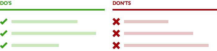
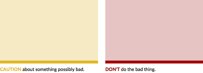
Do/Don’ts provide a welcome break from tomes of text. The blocks are definitive, concise, focused, and scannable. Each pairs an image with a succinct guideline prepended with a Do or Don’t imperative and accented green or red. Clarity isn’t difficult, and the pattern is eminently reusable in any section.
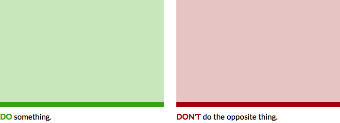
As the name implies, optimal Do/Don’ts pair one next to the other. Sure, any number of Do’s followed by any number of Don’ts can work. But enabling the reader to ping pong visually left and right reinforces a memorable teaching point. As a result, consider limiting Do/Don’ts to two per row.
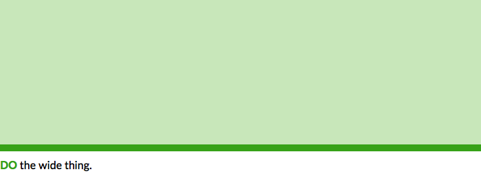
Authoring Do’s and Don’ts benefits from a standard height and width just under 50% of the content well, suggesting a design template (like a Sketch file with premade artboards) for asset creation. Sometimes that 4x3ish image ratio is an unwelcome constraint for larger or horizontally oriented images. Therefore, consider a full-width Do/Don’t variant as an alternative.
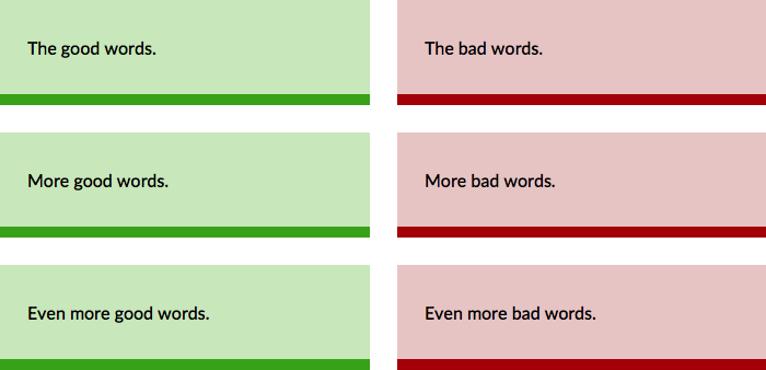
Do/Don’t work great for words and code snippets, too. The usual suspect triggering my system teams to extend the Do/Don’t display to accommodate words? Error messages, often as a stack of sensitizing examples, as seen on sites like Shopify Polaris and Morningstar.
Even Do/Don’t hedging is appearing in the form of cautionary stories accented with yellow or orange, as seen on Google Material.
As an investment in design guidelines deepens, so to does a team’s willingness to invest in more custom exhibits, including:
Admittedly, custom demos are rare across most component pages across most design systems. It’s usually more expensive, may slow down authoring, and usually requires tools and assets less familiar or available to authors. Therefore, pick your moments, but don’t hesitate when the teachable moment warrants investment.
If readers have already encountered a list of rendered examples with code equivalents (as suggested in Component Examples), strongly avoid repeating the examples in design guidelines to tell the same story. Such examples — effectively labeled and ideally coupled with succinct “Use When”-style statements — have already exhibited the range of relevant cases.
Therefore, reserve the Design Guidelines for deeper storytelling that elaborates on rather than repeats what the examples have already taught.
#3. Examples ← Previous | Next → #5. Code Guidelines
EightShapes can energize your efforts to coach, workshop, assess or partner with you to design, code, document and manage a system.