
Visual examples are the most essential element of effective component doc. How do you best render, arrange, label, and order each one to with effective content (but not embedded guidelines!) to enable quick use and experimentation? There are many questions to answer as you set about composing examples spread widely across a library. What follows are 15 tips of how to best showcase components in your system documentation.
Show don’t tell. Seeing is believing. That’s why every component (even the invisible ones, diagrammed!) should lead by example.
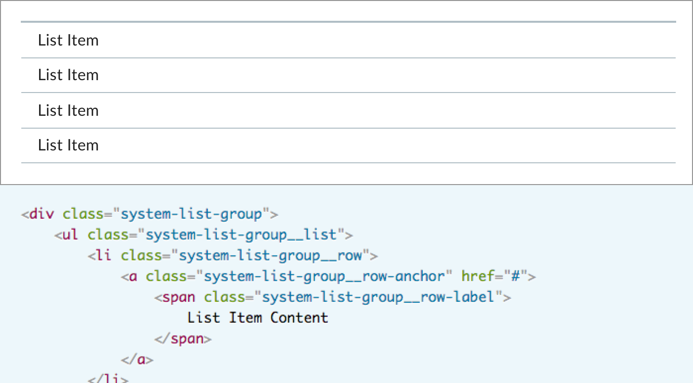
The visualized example is the most effective teaching moment on the page. Even better is the visualized example paired with code needed to render it.
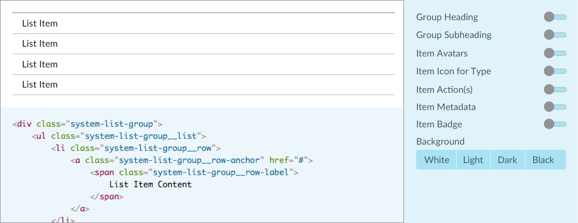
As teams tool up, it’s easy to be seduced by the alluring component explorer , adding a control panel beside the example/code pair. Revealing many (but not necessarily all) properties, component explorers invite experimentation and teach a ton in a tight space. However, that power comes at a cost: build the UI, build the logic layer, and implement per component.
For a design-only library, paired code— let alone an explorer — is impossible. Instead, an image will have to do. I’ve never heard anyone disparage Google Material’s design spec, which is full of images and inline demos.
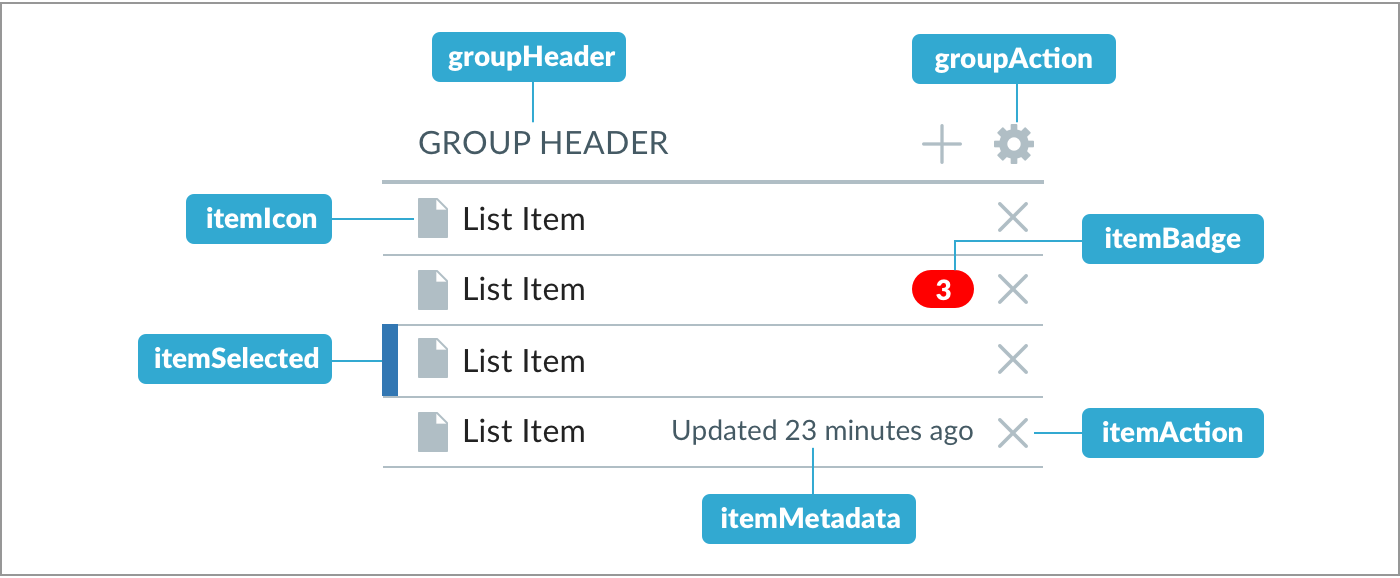
If limited to images, consider depicting the component’s elemental anatomy. Such imagery expose the need for a visual language of annotations (often, we’ll use orange) distinct from the component’s themselves, and a template for producing consistently sized and styled images en masse.
Takeaway: For libraries with code, enable live examples pairing picture and code early in your process. Component explorers are alluring, but setup can painstaking and distracting to a team early on. Consider saving explorer for a splashy followup to your 1.0.0.
If relying on images, stabilize a visual language for annotations — color, type, image size, image scale — as you document a first few components.
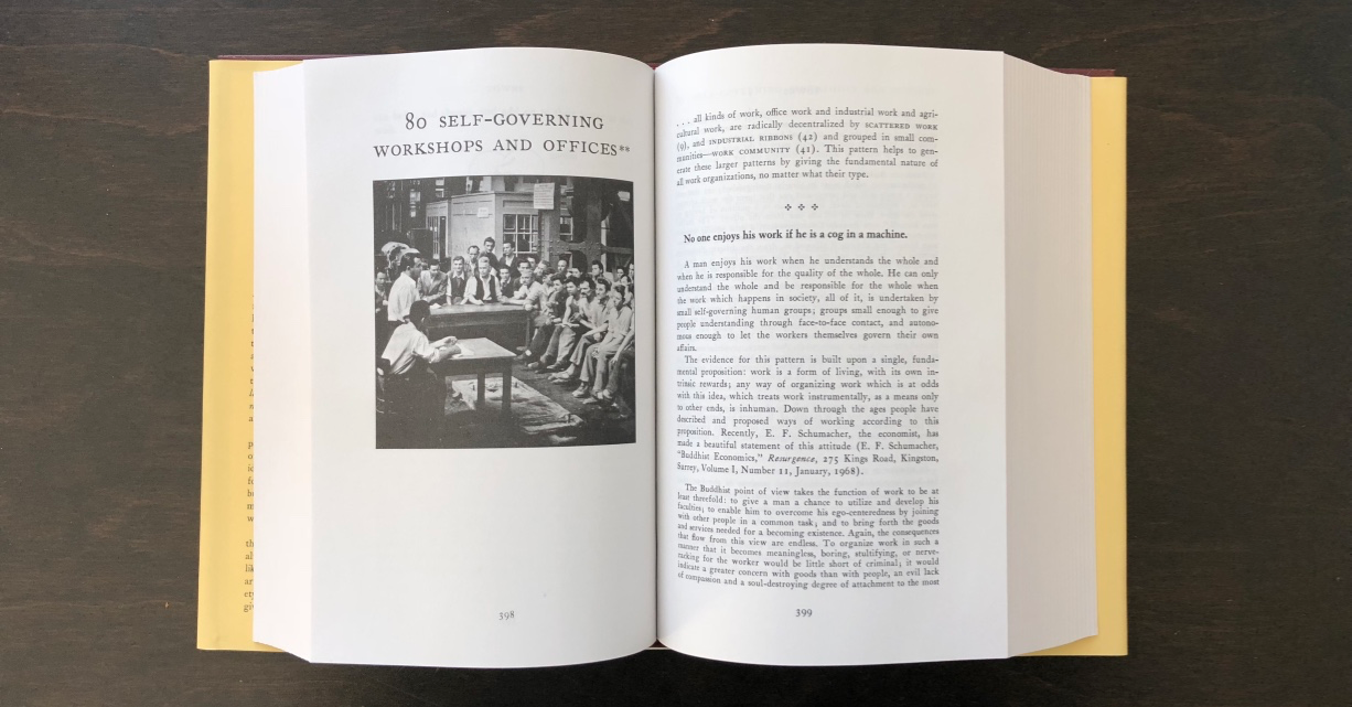
Documenting patterns has long relied upon setting context chiefly through a visual sensitizing example. Christopher Alexander’s A Pattern Language (1977) does so with each and every pattern described. The digital design community reinforced this as UX patterns arose in the mid-to-late 2000s.
For UI components, the best sensitizing example depends on component. For atomic primitives, pick the most oft-used case such as a primary button or generic input. For components composed of many elements, the choice is less clear. Do you opt for…
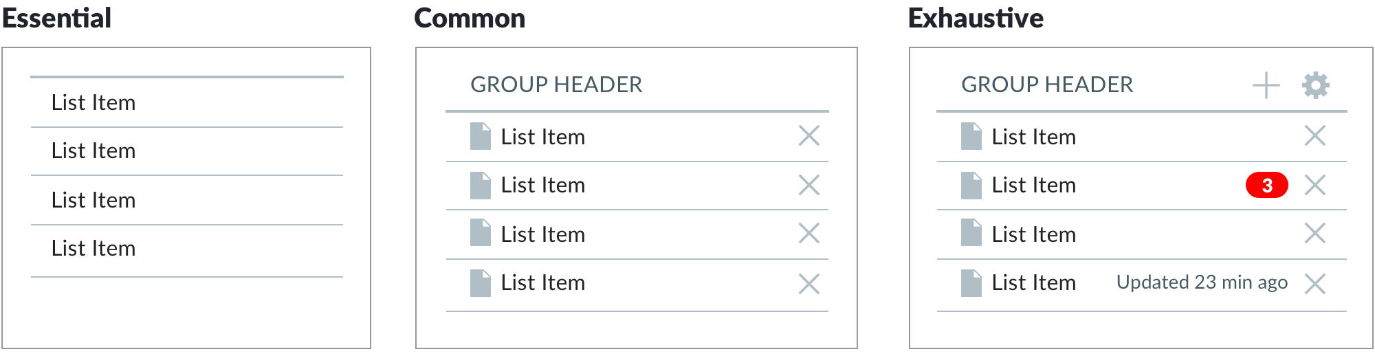
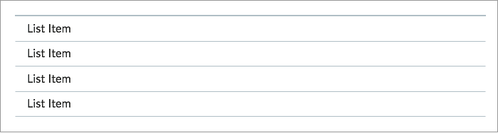
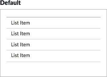
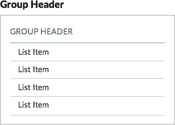
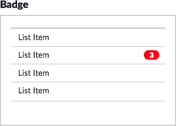
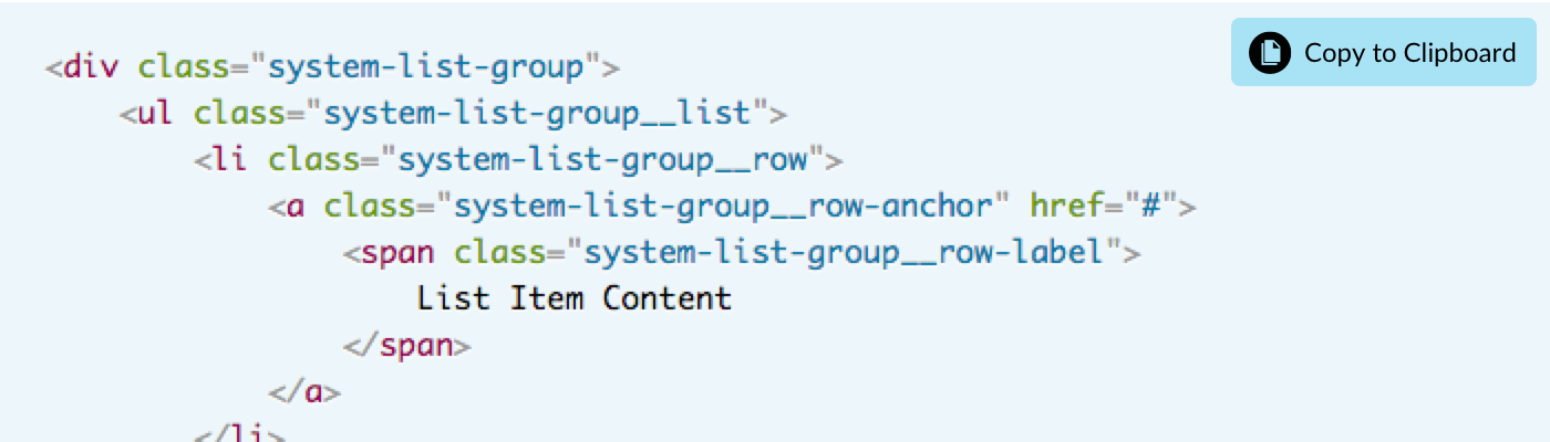
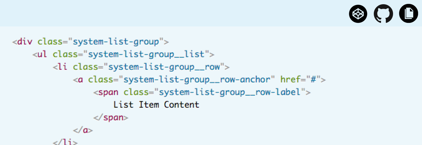
I love the highly versatile List Group component. But a glance at the essential — “Um, a stack of labels, linked?” — in unconvincing. The exhaustive case? Exhaustingly busy, unrealistic, even repellant. In this case, the best sensitizing example showcases elements like an heading, identifying icons, and maybe actions per row.
Takeaway: The best sensitizing example is obvious for primitives. Yet, for composed components, it’s a delicate balance: exhaustive examples can be too complex and not what users typically encounter. yet plain essentials may be obscure it’s power and adaptability.
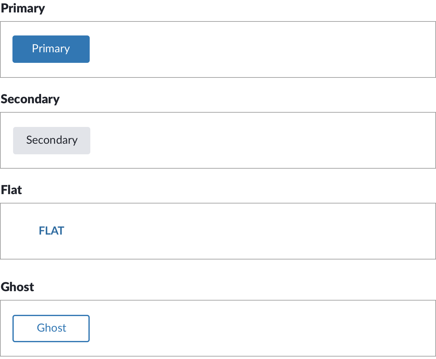
With a tone set by the sensitizing example, how do you order what’s left? This, too, depends on component type. Variants are clear among primitives like buttons: Primary, Secondary, and then Flat (and then Ghost? Are you sure?).
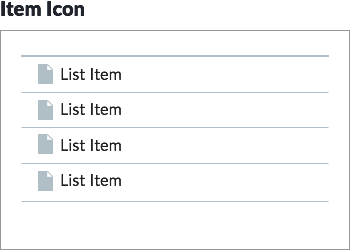
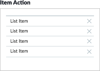
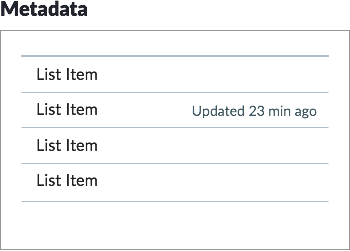
For composed components, it may progress from a default with required elements to successive examples overlaying each additional element. For example, you may express list group options with successive examples illustrating actions, headings, subheadings, metadata, badges, and avatars.
This may maps to Props or CSS modifiers, but don’t get stuck thinking this is mapping is one-to-one. I’ve seen teams seek to shoehorn the succession of examples to the list of Props. It takes a few components to acknowledge that there’s more to teach via examples than just Props by varying states, content, behaviors, and other cases.
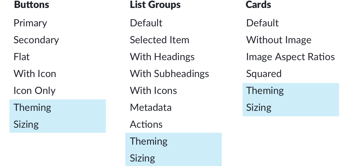
As your library grows, some properties may be repeated across many components, such as sizing (small, medium and large) or theming concerns. Consider including those examples last as a convention that recurring controls are explained after features unique to that component.
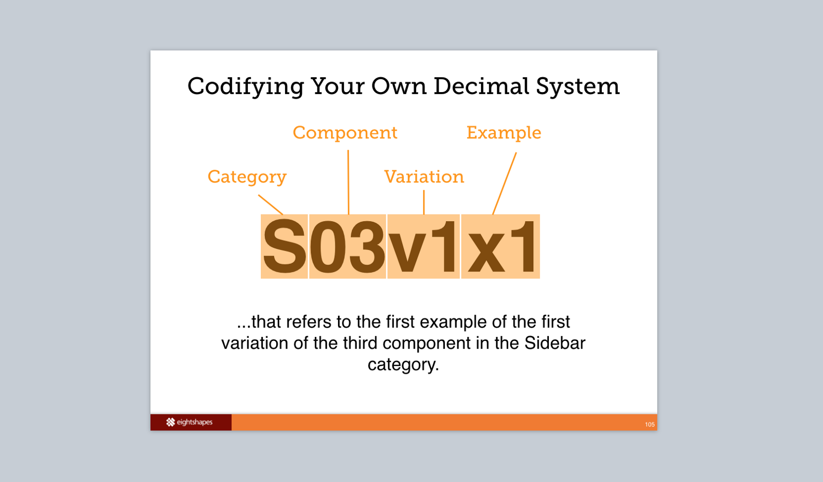
Back in the mid-2000s, I contributed to the Sun.com component library that contained 1000s of variations. The team classified components hierarchically: Category (Sidebar) > Component (03 Filter) > Variation (1 Default) > Example (1). Each item had a unique ID (such as S03v1x1), visible in doc, classnames and HTML comments still visible in inspected source of oracle.com today. (By the way, do you expect your library to last that long?)
In the early 2010s, such rigorous hierarchy gave way — usually — to a flat example list per component. For simple components with a few examples, flat is fine. Armed with a good sensitizing example, users scroll to scan and find the closest approximation of what they need.
Does this section actually need a label? Maybe a “Variations” heading in local nav, though you can omit it from page content.
Takeaway: Don’t overlay a deep hierarchy couched in vague, misinterpreted levels unless forced to. You could establish one, perhaps aligned with Sketch symbols or Props that necessitate hierarchy. But welcome hierarchy in a design tool’s UI muddle understanding a web page’s documentation. Instead, keep it flat and rely on the scrolling page to reveal variations progressively so customers can find what they need.
As component use — and testing — increases in sophistication, it’s evident that the more you can vary a component’s content and properties, the more possible displays are possible. Got five independent properties each with four possible options? Already, that’s (5•5•5•5=) 625 possible combinations, without even considering variable content!
While there are approaches to avoid needing to test every possible combination, don’t feel compelled to show every combination on the doc page. It’d overwhelm the reader and vastly reduce the relevance of each case.
Takeaway: Save combinatoric displays for testing environments. For doc, display to a progression of orderly examples to show how it works. Got a zany example? Go for it. But don’t strive to depict every possible instance.
Many components — especially atomic ones — exhibit states as a user interacts. Links, buttons, inputs, and more all exhibit varied displays on hover, active, focus, click, and disabled.
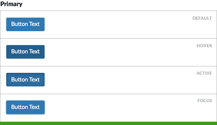
So display each state visibly, labeled and adjacent to one another, without requiring the reader to interact with the page. This usually means a little extra effort within the code, such as an extra documentation-only CSS class like .system__button--doc-hover.
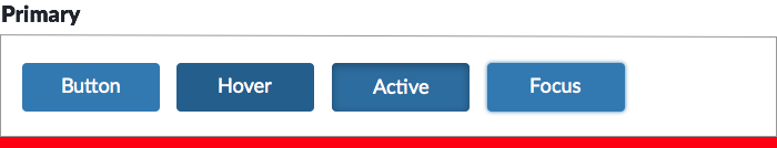
Many libraries choose to take a shortcut and display states horizontally adjacent to one another. While more compact, the practice relies on components that are narrow and have just one label, embedding the annotation (“Active”) inside the art. The practice doesn’t scale.
Takeaway: Documentation shouldn’t be a treasure hunt. Don’t make readers work hard to see what’s important. Instead, show an example’s many states by default on the page without requiring interaction.
If components can be placed on different canvases (usually, light to dark) or vary based on themes (usually, distinct brand identities), readers will want to quickly compare how the component appears in each circumstance.
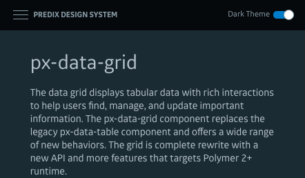
GE’s Predix documentation fully embraces the reversal of foreground / background colors, providing a toggle to the “light” and “dark” theme in the viewport’s upper corner.
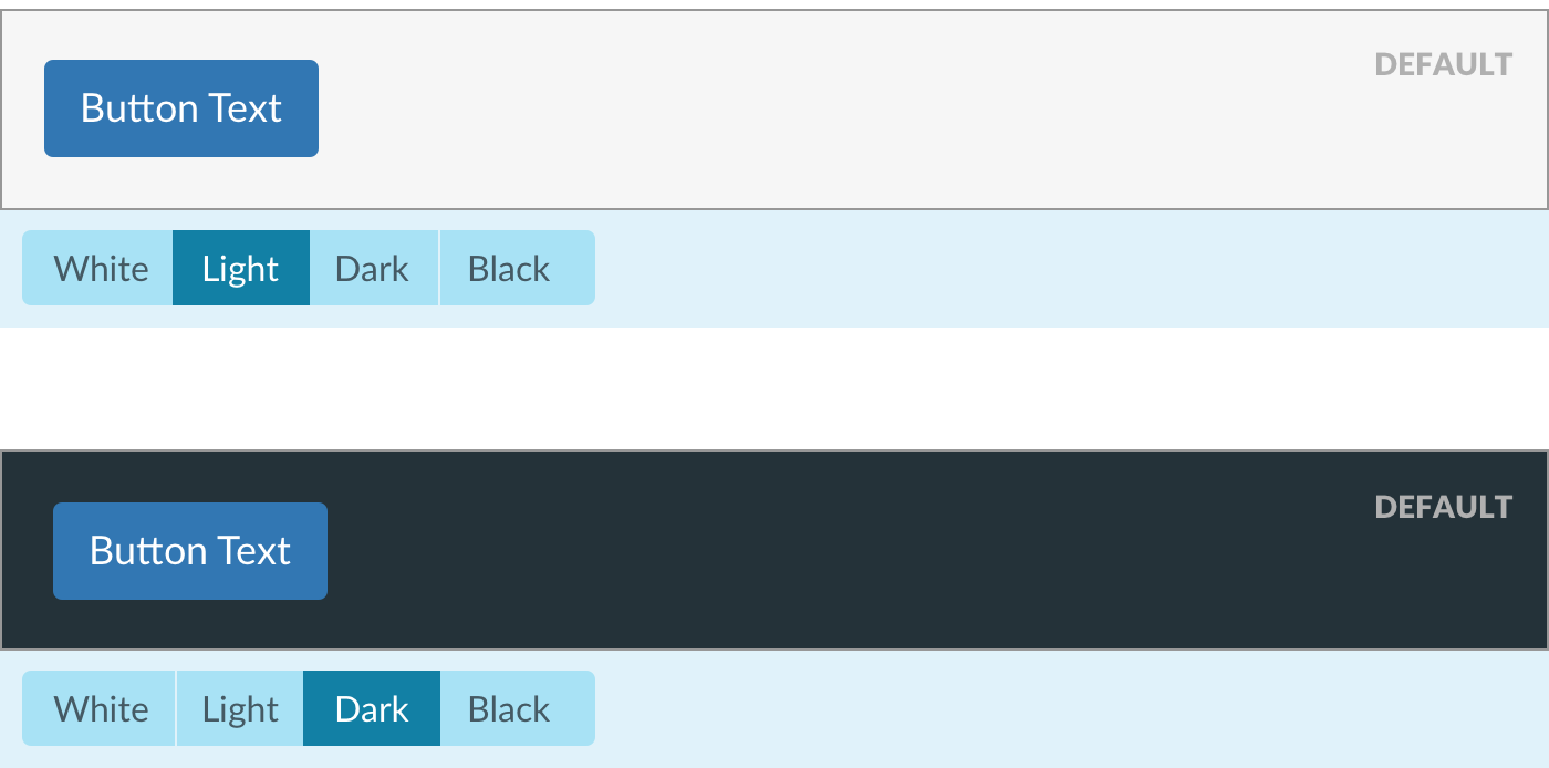
You can localizes this toggle to the component itself, insulating the display shift from the rest of the page and exposing more than a binary option.
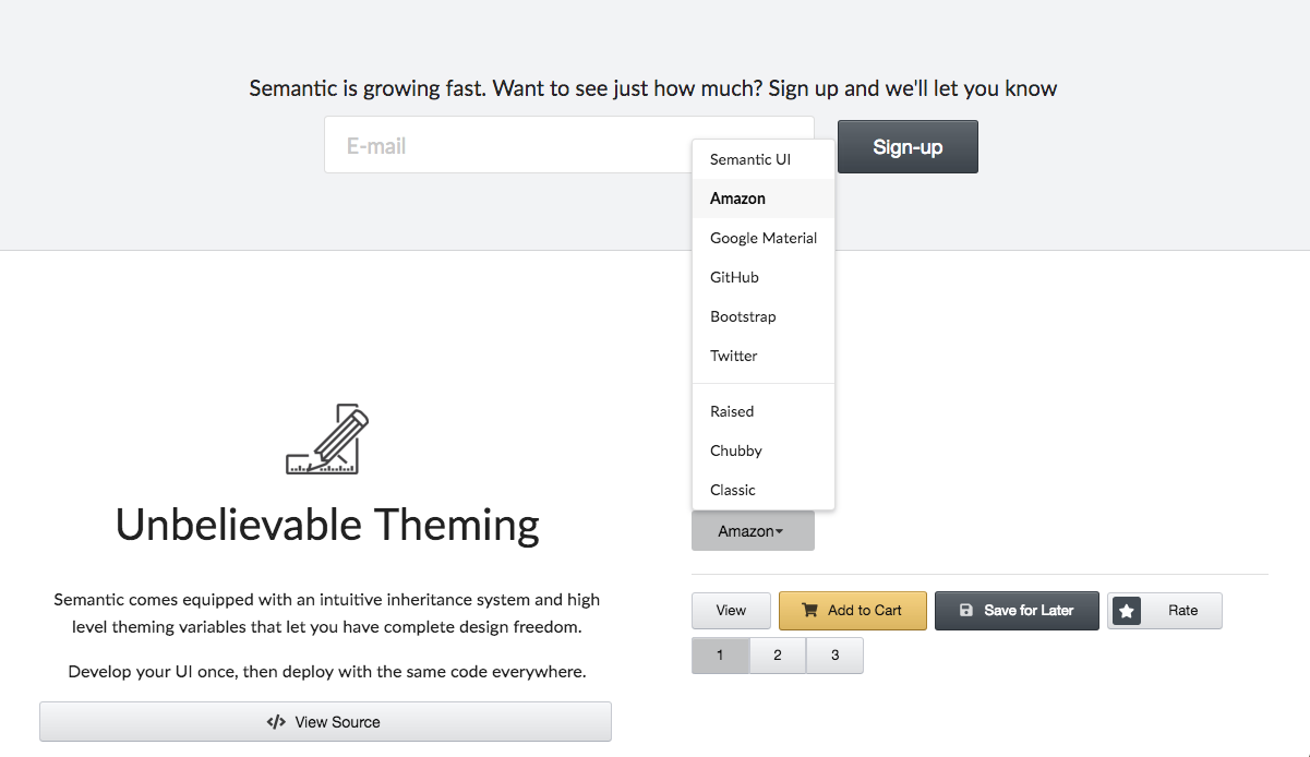
Semantic UI’s proves themability with a menu-driven demo in a row of the homepage. By shifting the style of essential components, prospective adopters are convinced quickly of the library’s potential.
Takeaway: Got themable components? Prove it by demonstrating it. Expose it via tools adjacent to it. Empower it with inspectable code that triggers it.
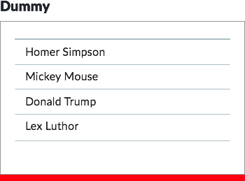
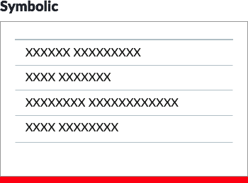
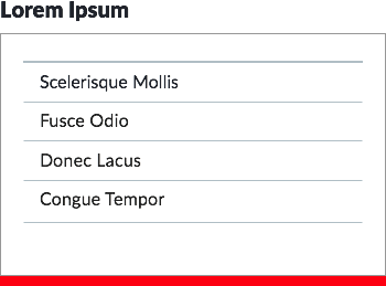
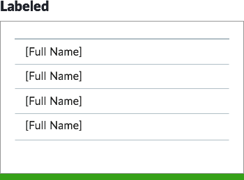
So, what content should our examples include? Dan Brown summarized techniques to represent copy in design artifacts the “Representing Data in Wireframes” poster (IA Summit,2005). Avoid dummy (“Homer Simpson”), symbolic (“XXXX XXXXXX”), or lorem ipsum for textual copy.
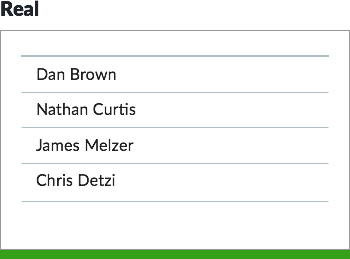
Instead, opt for real content (“Mary Smith”) or labeled data (“[Full Name]”).
While it may seem tempting to reveal editorial guidelines or data requirements inside examples, it doesn’t scale and muddles design and annotation. The biggest culprit? Buttons with labels: Default, Hover, Active, and Disabled. Better to use a real label consistently like “Save Profile” so that button state displays mirror other, more complicated components.
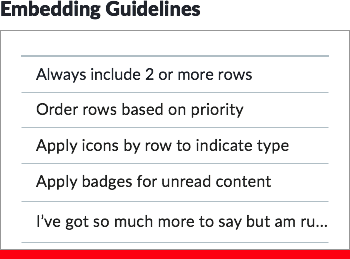
Those editorial tips for “Key Benefits” feel convenient. But what if your list can’t exceed three bullets? Can I change the title? What about link labels? Imagine: how would you document editorial tips for a button component? The approach breaks down.
Takeaway: Avoid the embedded guidance. Keep content real, and fall back to labeled data, especially for conditions where implementers focused on authoring and managing content.
While most components are visible in the display by default, others require an interaction to trigger the display of relevant content. Modals, popovers, menus, tooltips, off-canvas navigation all come into the page layered above or below or adjacent to content you could already see.
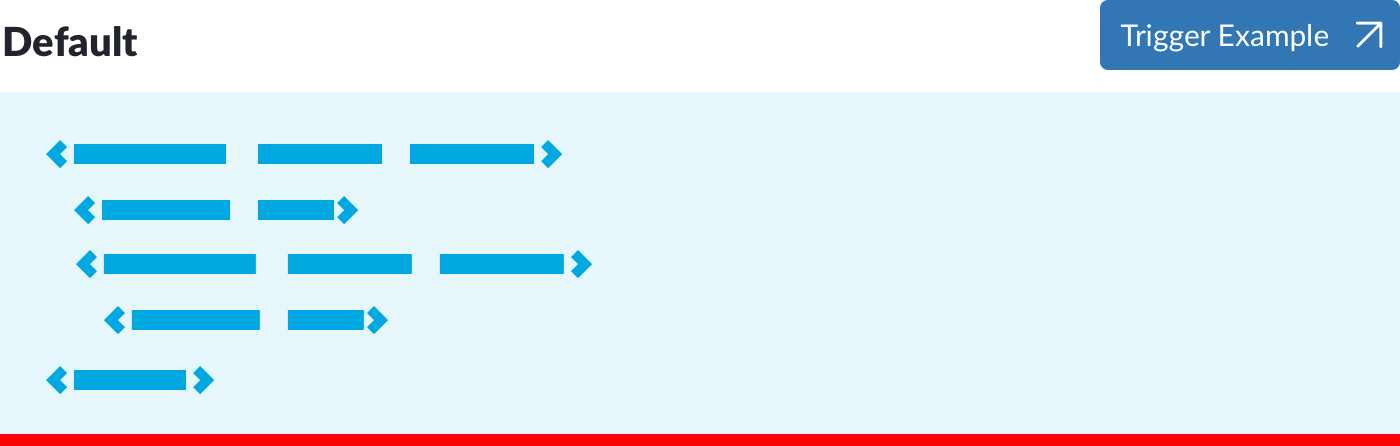
The easiest path to provide access to these components is adding a trigger in place of where the sample would go. Usually a button or link, it either invokes (akwardly?) the component in the doc page itself or navigates to a separate page’s demonstration. However, that too is a treasure hunt.
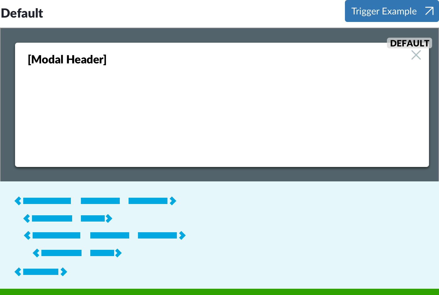
Embedding the layered display into the page’s canvas does require incremental effort. However, it’s essential to reveal the layered content – often via many examples—without pogosticking from one to another.
Takeaway: Tool up templating to show layered components in a page’s flow. Readers must easily see it, including variations of features and content, before figuring out how to configure it. Nobody I know wants to hunt and peck, and opening and closing example after example gets tiresome.
Many documentation sites display rendered examples in blocks that reach a maximum width between 700px and 1000px. Examples on other sites have no max width, expanding as the page does forever.
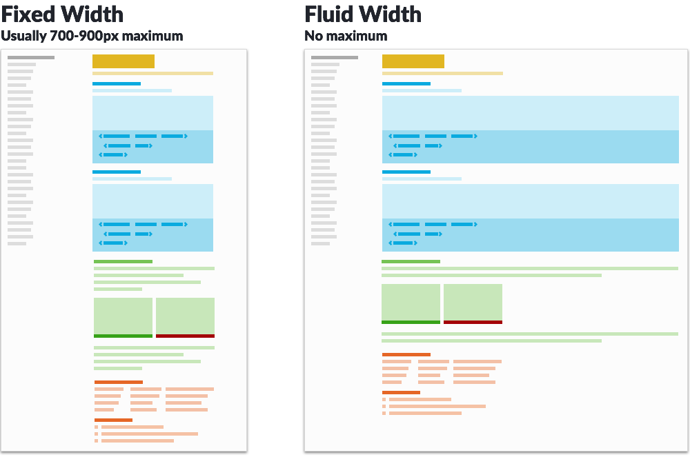
Components like horizontal navigation bars and toolbars require more width than 700px or 800px to mimic results users see. Expanding available width creates tensions with competing elements in the overall page layout (usually, navigation on the left and right) as well as excessive line measure (characters per line) of content above and below the example.
If the overall layout constrains width, you can augment rendered code examples with screenshots (Example: Morningstar) or present components embedded in an iframe to scale down a display (Example: NetApp).
Takeaway: If your library has wide components, consider alternatives so that those examples display effectively in the default presentation of the page. Widening the content’s main column — or even having example/code viewers exceed that boundary — is the first option to pursue.
Some doc sites offer inline responsive viewing by changing available width via a scrubber (Example: Shopify) or scale examples down and even variations them to tell a responsive story in space available (Example: NetApp).
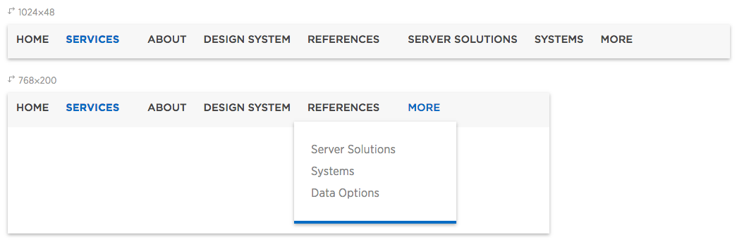
Takeaway: If you want the oohs and ahhs, this will do it. The UI design can be tricky, however, and the implementation – and managing examples shown therein – can get costly. Some teams choose to pass.
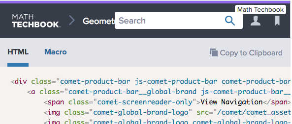
For code viewers, it’s essential that code is readably pretty, thus our consistent use of Prism. Beyond that, any self respecting code snippet usually offers a copy-to-clipboard button, ideally using the system’s own tooltip or other indicator to indicate the copy is complete.
The next most common interactions are a link to play with the component in isolation such as Codepen (Example: Material UI) as well as direct link to the component code’s source file in a code repository like Github or Bitbucket.
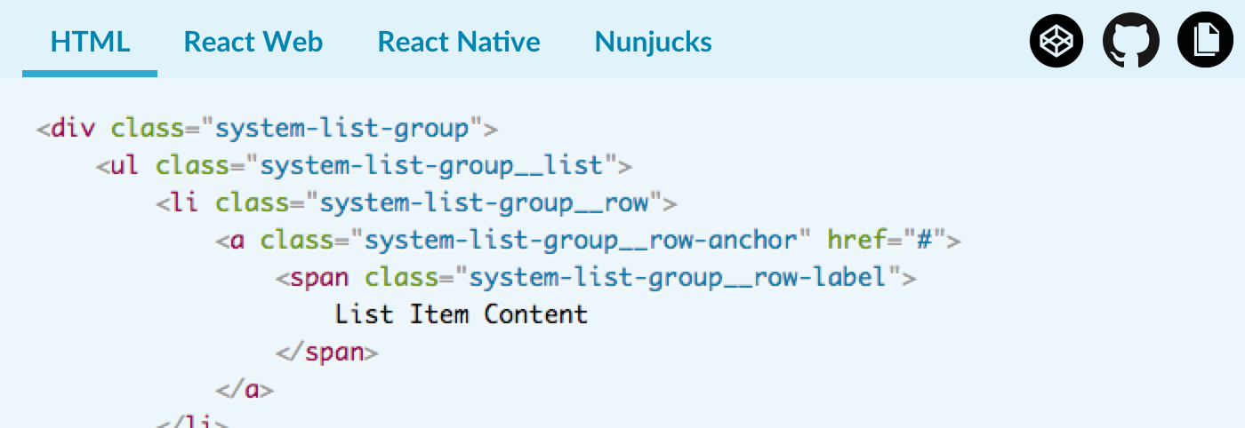
Depending on how it’s used, provide tabs for how to add a component to different settings. For example, an engineer may want vanilla HTML, a template’s macro (for Nunjucks) or JavaScript-based element (for React).
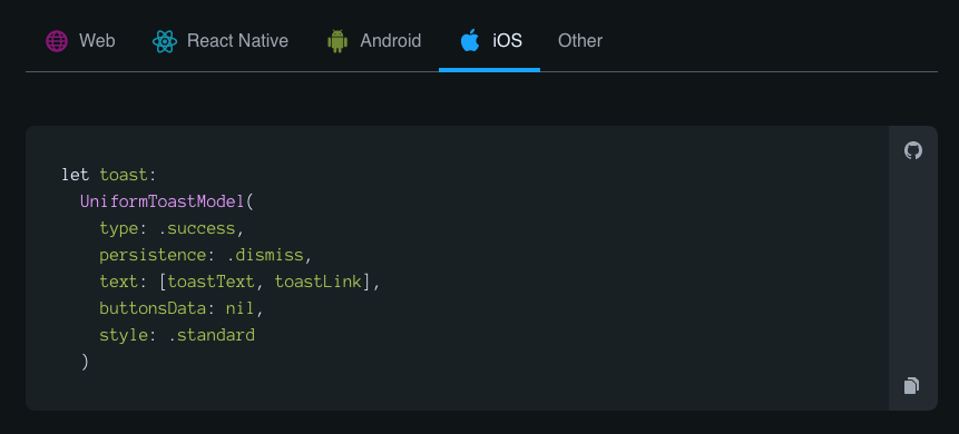
For example, Hudl’s Uniform unifies component code across web and native, clearly expressing an intent to unify the experience across all platforms.
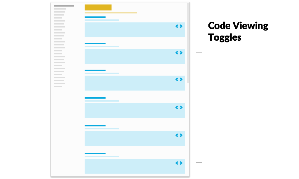
When it comes to code snippets, beware of scrolling. If code blocks are given a max height, the area within the block scrolls. Readers may find the flip flop of scrolling a page vs scrolling code block disruptive as they experience a page.
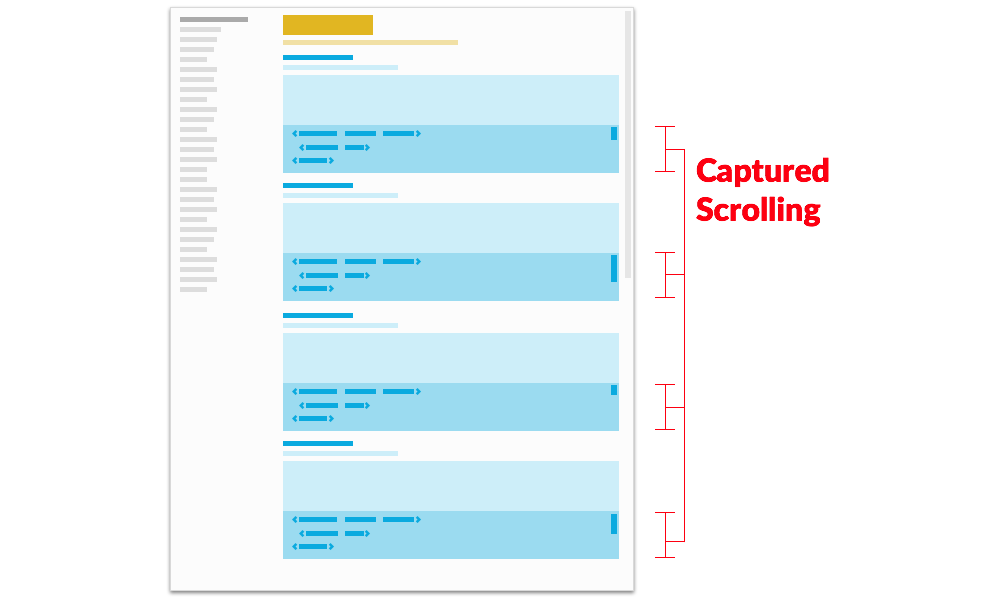
If it’s an issue, consider collapsing code by default and providing individual or page-level switches toggle to open it.
Takeaway: Tooling up a viewer requires non-trivial feature development, so balance the extra sauce — Codepens, automated direct links, rendered examples across framework types — as needs require.
#2. Introductions ← Previous | Next → #4. Design Guidelines
EightShapes can energize your efforts to coach, workshop, assess or partner with you to design, code, document and manage a system.