Every time, we use our library’s toolkit to build web-based doc of the library. A bit meta, for sure. The documentation is just another product made and maintained with the kit, only made by the team that made the kit itself.
Building an experience, even doc, sensitizes that team to what it feels like to use the kit, reinforcing the setup and build that their users have. During the process, a simple truth reveals itself, predictably:
The system never provides all the parts for you.
The library gives you Colors and Buttons. Maybe a Nav Bar. Certainly a Footer. However, a library serving online shopping doesn’t need a code viewer or color swatch. So some key components you need to document a library are in fact not in the library. So you build them, just for yourself, separate from and extending the library shared with everyone else.
What do you build? Get ready to tool up! Here’s my eight favorite documentation components, why to build each, and special ingredients you can add to make each even more useful.
Well documented libraries proliferate tabular spec tables throughout, whether a reference table of CSS modifiers, a token set, or something else. So make a component (or three) for those you repeat over and over.
Automating tabular displays helps authors use simpler syntax, promotes consistent table structure and headings, and eases maintenance for embedded data like tokens.
Special Features:
$space-s, $space-inset-s and $space-inset-squish-s.Let’s face it, you’re a product with users to reading release notes and keeping abreast of changes. While boringly administrative, release details summarize change and rout users to new additions.
So design the content well and don’t skimp on details. Ease authoring, diminish drudgery, and publish a consistent summary per release.
Special Features:
Each component page needs a local table of contents to to scan available variations, specs and guidelines, and then navigate to each quickly. Wikipedia does it. So does Salesforce. Why can’t you?
System users need to know what’s there, and some components — even simple ones like Buttons — have many variants. Local navigation improves awareness of and navigation to what’s available below the fold.
Special Features:
A tint stack vertically arranges many colors in a group, such as a single color across brightness values or a relevant subsystem of colors like Feedback’s red, yellow and green.
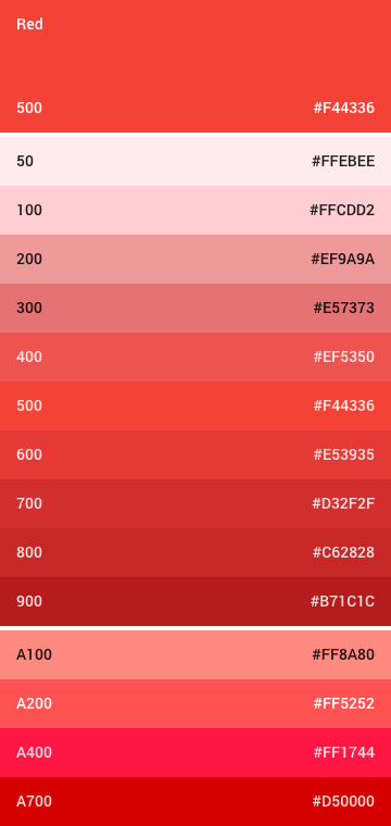
Tint stacks display many colors compactly, offering a playground to visualize additional properties of each color.
Special Features:
$color-neutral-95.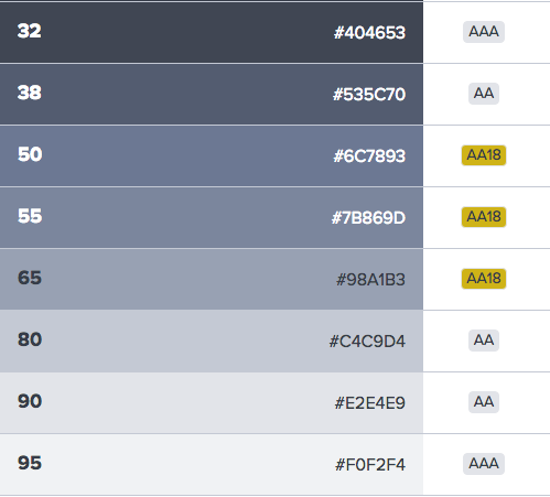
In libraries full of atomic bits, apply each in a full-page composition can take innumerable forms. So while systems must support a product’s autonomy, nothing beats sensitizing your users to intended and effective uses that comparative do’s and don’ts images.
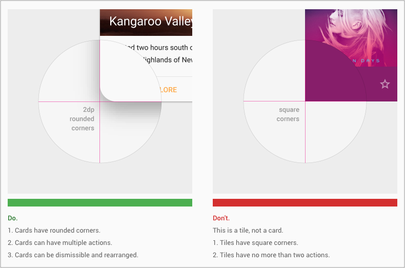
Pictures — especially comparative pictures — are far easier to scan, learn from, and recall than verbose textual guidelines. While more expensive to produce, having a do & don’t component memorably reinforces the value of this display to system authors digging in to compose doc.
Special Features:
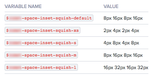
All of your system’s customers — designers, devs, product managers, execs — must believe it’s easy to build things that look great. Nothing does that quicker than showing a diverse gallery of built pages, embedded (via iframes) and scaled down to shown in a single, scrolled view. They get it: we use this stuff to build things like this.
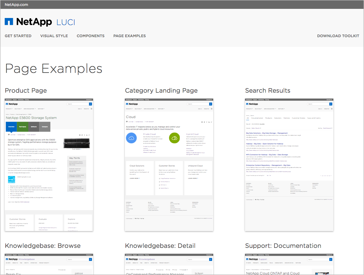
A scannable gallery of built things quickly sensitizes and builds belief in system validity. While a page rarely used, it’s powerful and easy to setup.
Special Features:
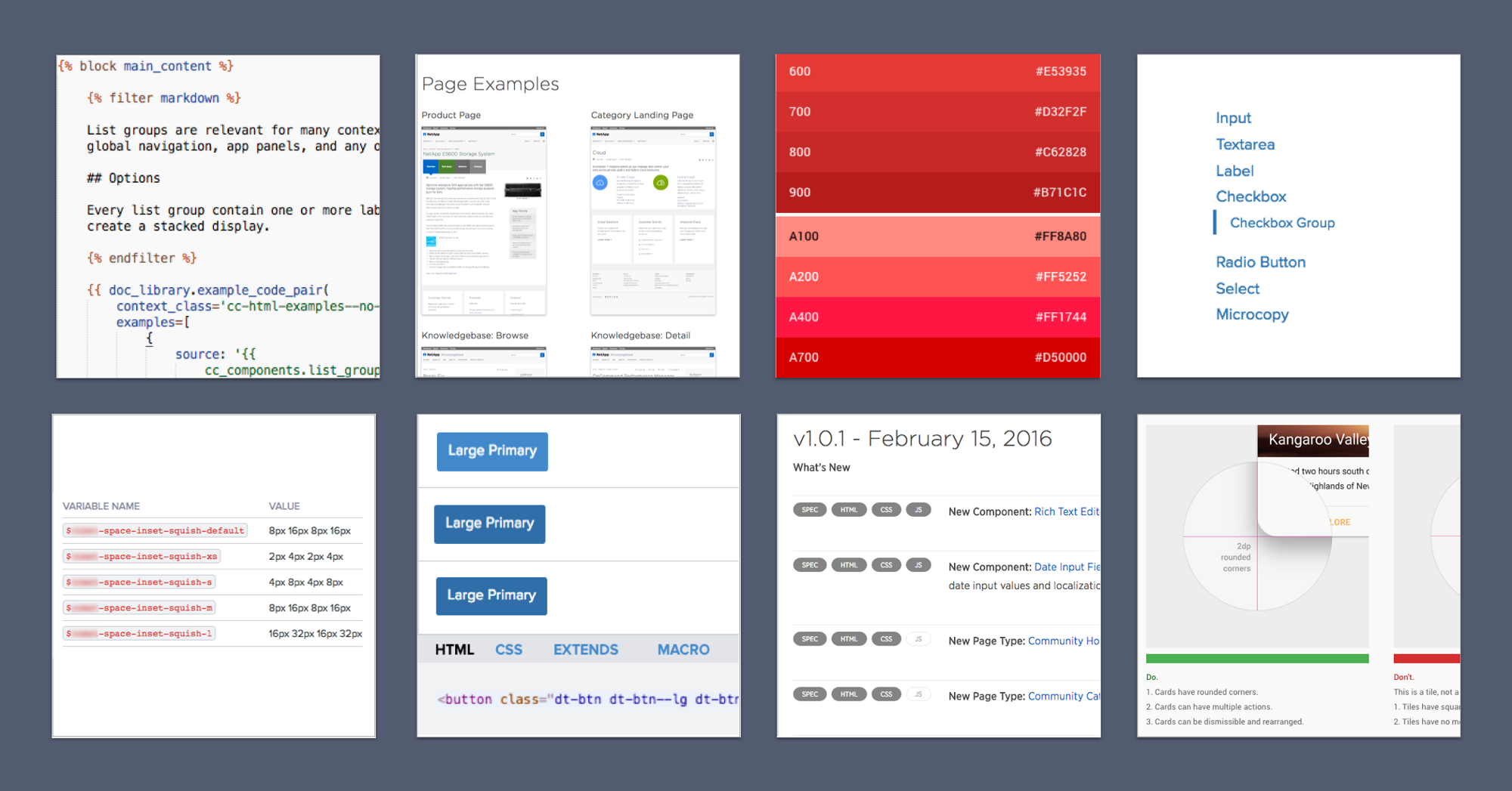
scale() property, with a default of 0.2 or 0.25) and viewport width (to quickly toggle a gallery of page types across common device profiles).It’s gotta be simple to do the basics of long form content — headings, paragraphs, lists, images, the basics. We use Markdown, cleanly integrated into Nunjucks templating mixed with calls to other components like the Do/Don’t, spec tables, and TOCs described above.
Even if you don’t use a templating system like Nunjucks, is your long form content as cleanly input and stored? A clean approach for building doc can make or break easing in contributors and migrating copy from where it’s planned, composed & edited (for my teams, Google Docs).
Special Features: Nah, who needs ‘em? At this point, keep the tool — and your content — clean!
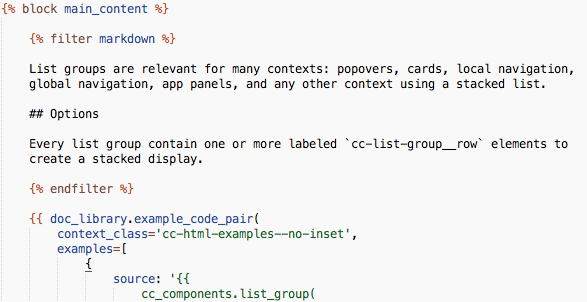
Nothing beats the utility of a visible, rendered example paired with it’s coded counterpart. While bells and whistles abound, it’s here where everyone can see it, and developers can take the thing and use it. Any self-respecting UI toolkit enables you to see the thing and use it effortlessly.
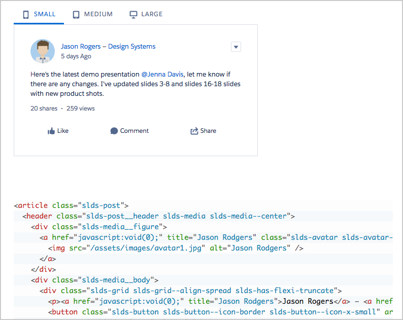
Special Features:
@extends tooling, macro usage.EightShapes can energize your efforts to coach, workshop, assess or partner with you to design, code, document and manage a system.