I’m no color expert. Far from, actually. Throughout my career, I’ve depended on visual designers better than myself to produce an engaging palette and apply it harmoniously across a UI.
Yet, as a systems designer, I’m often in the position to provoke and validate color decisions as a system takes shape. Here’s a 16 lessons I’ve learned while stabilizing a primary palette , tint and shade choices , secondary palettes , and solving for accessible contrast.
By primary, we’re talking colors used everywhere including your brand colors , neutrals , and a typically interactive digital blue.
︎Every organization has one, two, or no more than a few core brand colors. THE red. THE blue. THE orange. Settle on them. Even if reasonably set up with a color variable or two, nothing signals a design system team that can’t get their act together than constantly changing primary colors.
Takeaway: Decide your essential brand colors early, because they spread widely, quickly.

Is brand blue a bit dull? Can’t resist the urge to liven it up? Nothing poisons early collaboration more than a casual “We saturated the brand orange for web” followed by brand reacting with “You did what?” Oh the sacrilege!
Takeaway: Brand colors are the brand team’s territory. So discuss adjustments with them and defer to their judgment as needed.

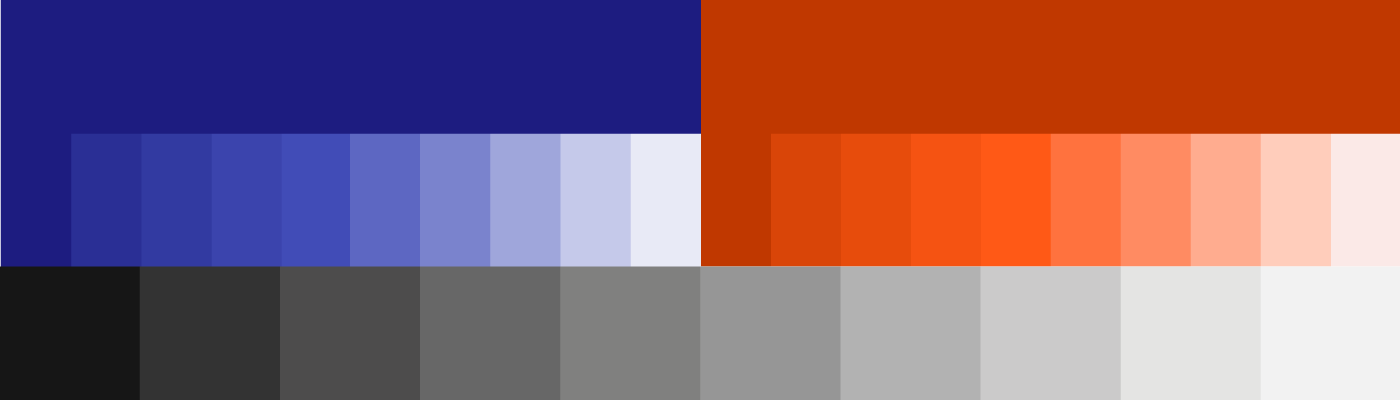
From dark-as-night charcoal to fluffy light gray, neutrals provide essential UI scaffolding. Loading a system with neutrals, even a few, risks giving teams access to muddy colors. They can also lead to “wireframey” designs. And, neither dark nor light type has sufficiently accessible contrast on a medium gray background.
Takeaway: Provide a few light grays and a few dark grays to achieve useful contrast, but don’t get wishy washy wireframey. Consider avoiding medium grays in between.
My past five design systems settled on a saturated blue as a default button and link color. Links have always been blue, perhaps since the dawn of the first browser. This “Digital” blue, a utility color for links and clickable items, is essential in any core palette.
Takeaway: When (not if ;) ) you go with your “Digital Blue,” choose an accessible one and make sure it doesn’t clash with the brand’s own blue, or red, orange, purple, or green.

You can’t have just a few colors and call it a day, right? System users often need to tune a color choice across a range, reuse with ease, and know their boundaries.
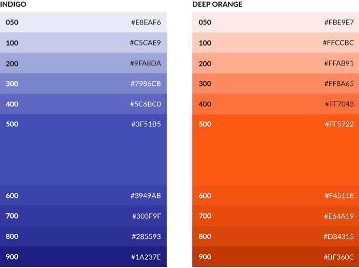
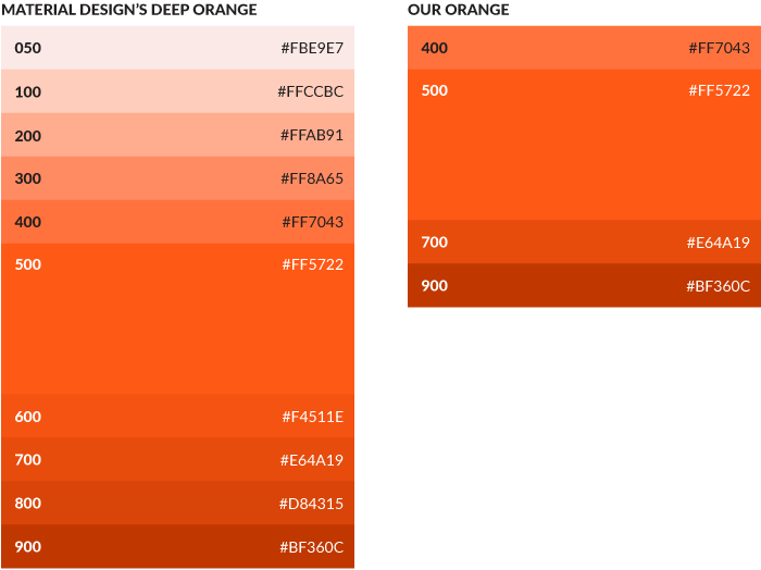
Color palette display patterns long predate the web. Yet I still love me a compactly arranged tint stack. They can be just…gorgeous. The best stacks visualize more than just a color, combining its name with HEX codes, code variables, and other indicators (such as prohibiting overlaid type). A quick scan is all you need.
Takeaway: Stack available colors in each hue, and treat the stack as a visualization to include important details compactly.
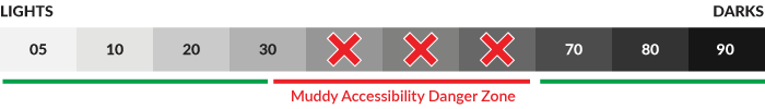
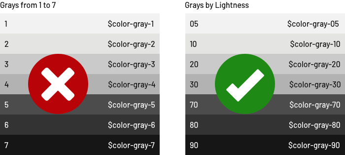
We’ve all been there. A month into the system, the neutrals $color-gray-1, $color-gray-2, ... , $color-gray-7 — are stable. And then, in a stroke, you’ve got another tint to add stuck between -1 and -2. That numbering system stinks.
Takeaway: Scale color names between 0 and 100 based on HSL’s lightness, such as $color-gray-05 and $color-gray-92. The scale reflects a familiar range from dark to light, allows for injecting new options between, and heck if I won’t remember $color-gray-93 until we retire it later.
At the core of a good system is choice without endless options, a stable aesthetic to serve as a starting point. Odds are, you aren’t Material Design, intended to serve countless products. In most cases, a design system need not offer boundless choices. The more choices you provide, the tougher it’ll be to control harmonic combinations and a consistent feel across applications.
Takeaway: Offer a handful of options and avoid tedious variety. Empower system users with just enough choice: more than a single option, but only up to a few intentional choices.
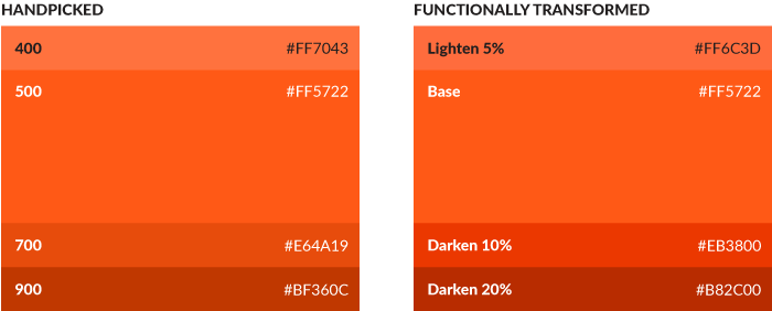
Modern tools like SASS and Stylus offer transformation functions like darken and lighten to shift a color by a brightness percentage. These handy tools enable a you to alter a color for subtle contrasts like a hovered button or tiered navigation.
But transforms can be troublesome: carefully crafted base colors can become inaccessible alternatives (see below), a page’s overall palette can muddy, or a “5% system” that works on moderately bright colors yields insufficient contrast for a very light or dark case.
Takeaway: Deliberately allow — or avoid — color transformations in your system. If you endorse the practice, then offer examples of when and how to do it effectively in your system, such as 5–10% for moderately bright cases and 10–20% in more extreme cases. If transformations should be avoided , document that succinctly.
Beyond the brand colors and their variants, well-considered color systems array the broader variety of colors reserved for varied purposes.
Most systems reserve a certain red for errors, green for success, yellow for warning, and (possibly a lighter sky) blue for informational messages. Feedback color is critical, because it’s positioned at the top of the page interacting with other key components and/or encountered as a result of an unwelcome circumstance. Without system guidance, such messages become embedded in product code, the result of product teams solving a challenge quickly and moving on.
Takeaway: Explore and define the standard feedback colors and other relevant sets to ensure that colors fit harmoniously rather wedging them in later or having teammates recall “I just grabbed it from Google.”

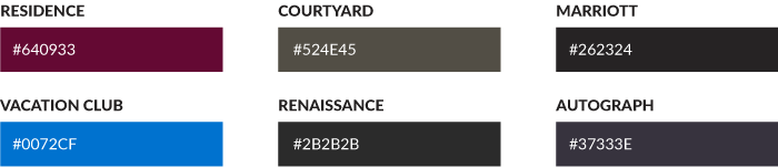
In some systems, color use is customized per product, section, or brand. Often, this may be a result of relating a master brand (think, Marriott International) to its sub-brands (think Courtyard Hotels, Ritz Carlton, and Moxy Hotels). Or it’s a prefab themes like Ambient Warmth and Frozen Blue. Maybe the user is complete control, and you need to illustrate the breadth of (all the havoc of) what they can do.
Takeaway: Reveal the range of themes available compactly, and set boundaries around allowable theme colors in certain contexts.
It’s not enough to simply say “Go ahead and theme it!” A theme color may apply to predictable accents throughout a UI such as button background-color, active tab background-color, or a primary navigation’s thick border-top. Just as important, theme colors may be forbidden from altering other bits, such as long form type or — yikes! — a link color that ends up invisible.
Takeaway: Identify how theming works, particularly via reference to specific UI element properties in play. Just as important, articulate which — if not most — elements are off limits.

One of my favorite all time design system tools is Google’s MDL Color Customizer, which enables users to combine primary and secondary UI colors effectively. It’s so easy, and the outcome so helpful. Yet, the system teams I work with either don’t want to provide this kind of flexibility or lack the time and care necessary to solve such a combinatoric challenge.
Takeaway: Avoid the rabbit hole of solving for a vast array of color combinations unless it’s a core system value. In most cases, system users will pair up their own combinations or benefit from a tool more dedicated to doing just that. Help them propagate their choice rather than solving for every combination they may consider. That experimentation is their job.
Serve users of your system by making it efficient to propagate their choice through a product, rather than making the choice for them.
Solving for accessible color contrast should a core practice of setting up any digital color system from the get go. However, design can be tumultuous place, and teams can lose sometimes. Or some members don’t know about accessibility. Or they simply don’t prioritize it.
A systems team can engrain accessible practices into a workflow to provoke and spread values in accessibility broadly across an enterprise.
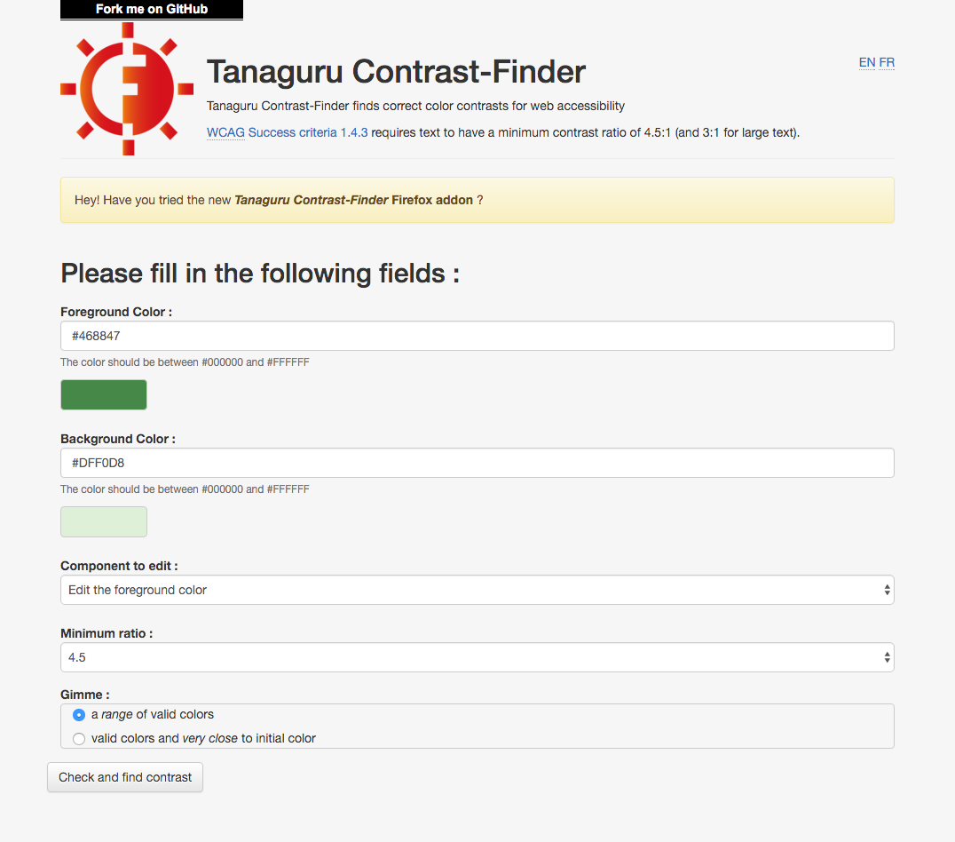
It happens often: a few weeks or days before a product — or design system — launch, finally somebody notices. The design team hasn’t taken necessary care to ensure the primary and secondary color palette is being applied in a way to meet WCAG 2.0 color contrast of 3.0 (for large, heavier type) or 4.5 (for standard type). So designers — and then, their developers — scramble to determine fixes and inject it into the code.
Takeaway: Any system designer responsible for color must be familiar with WCAG 2.0 rules, have a tool (like Tanaguru) to test color pairs, and incorporate the practice into color selection.
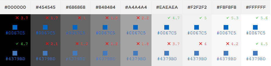
A drawback of WCAG guidelines is its stark threshold: a color pair passes or fails. This leaves designers yearning for more, but worse leaves stakeholders flummoxed at how bad the color pair fails and how much it needs to change.
Conversation quickens when we reveal a spectrum of choices. There are a bevy of tools in the design community for visualizing the contrast between foreground and background colors, including:
We even built our own tool at EightShapes called the Contrast Grid. This tool enables you to easily input a range of HEX codes, name them, and contrast every combination (even distinct colors for foreground and background).
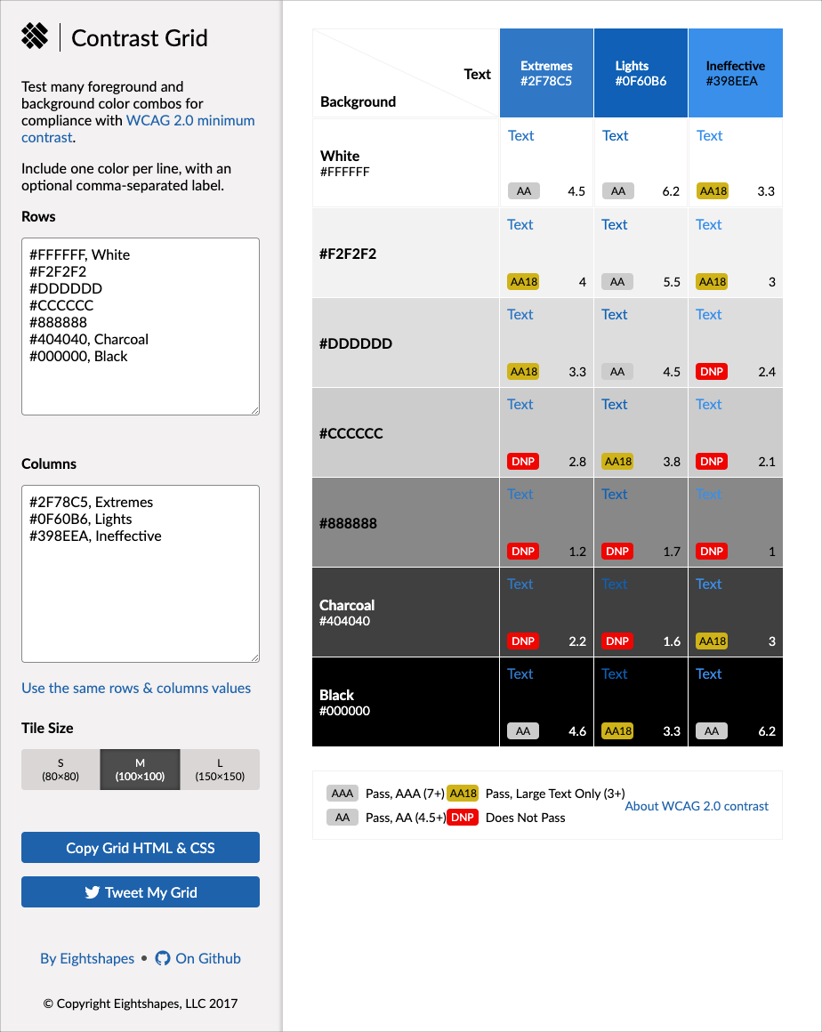
This quick visualization isn't just efficient for experimenting and choosing the right color, but also communicating contrast ranges to those less familiar with contrast subtleties. Recently, we're really encouraged about how such exploratory tools are being integrated directly into design tools, too.
Takeaway: When exploring accessible color contrast, show a range of choices to help a team select a color that passes the test.
When creating a system, it’s up to the systems designer to be mindful of and solve for the entire range of choices on offer. It’s not enough to just test for accessibility problems as they arise. Instead, a color palette should be thoroughly reviewed prior to publishing a system for reuse.
This is especially true for reverse color treatments. It’s very common for a system to default to dark text on a light background. However, most find themselves reversing color treatments, whether a black and white on light and dark neutrals or tints of another primary or secondary color.
Takeaway: Solve for and recommend reversed pairings to adopt or avoid.
Color is fundamental to a system, and accessible color contrast is fundamental to color. This injects accessibility smack dab into the middle of a system’s formation. People that matter are paying attention: brand managers, design leads, developers, and execs. What a wonderful opportunity to use color to open a door to the broader array of accessibility considerations.
Takeaway: Seize the opportunity to advocate for accessibility. Always be probing a collaborator’s knowledge of accessibility (or lack thereof) and educate and advocate all you can.
2020-01-24: Revised color contrast section to highlight EightShapes contrast grid (including image), list other relevant contrast tools.
EightShapes can energize your efforts to coach, workshop, assess or partner with you to design, code, document and manage a system.