I love buttons. I can do things with buttons. Take a next step. Make a commitment. Get things done. With buttons, interaction springs to life.
That’s why buttons are arguably a design system’s most important component. Devilishly simple, they offer a simple label in a defined region I can press. As such, buttons are where you apply a design language’s base attributes in ways that’ll ripple throughout more complex component later.
Here’s 12 lessons I’ve learned when working the primary button , secondary buttons , and a whole host of other button types in an emerging system.
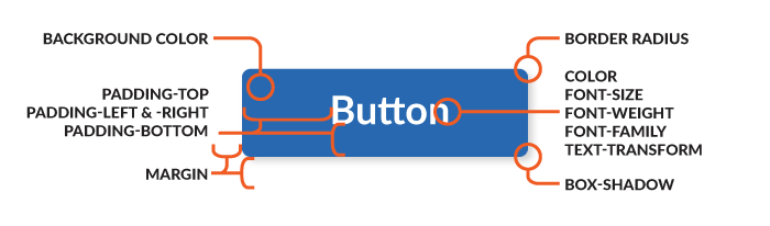
A button is the purest atomic expression of a system’s visual style. It combines the “big three” attributes— color, typography, and iconography — into a non-splittable atomic part. Buttons also provoke discussion of space: padding inside (particularly, to a label’s left and right) and margin outside (adjacent to other elements). Ultimately, button can even surface more esoteric attributes like roundedness (via border-radius) and lift (via box-shadow).
Takeaway: Embrace the button as a leading representation of a system’s style. Bonus points if you align a button’s definition with a burgeoning set of token variables for color, size, space, and other fine details.
Fortunately, “Click Here” is in our past. But we still need answers: How long can button labels be? Are labels written in the imperative (such as “Save” or “Close”)? Should I pair a verb (“Save”) with an object type (“Document”)? Are there preferred labels for common actions? Do we inject a brand voice…or not?
Takeaway: Jumpstart a consistent voice by including label guidance where I find button assets. Sure, a word lists and deep editorial standards can be found in documentation like a Voice and Tone guide. However, buttons are a great place to start bridging guidance together.

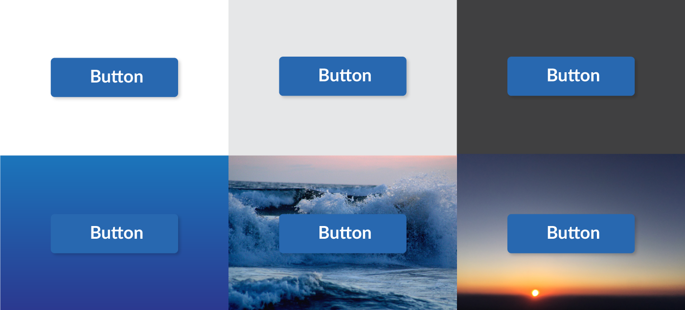
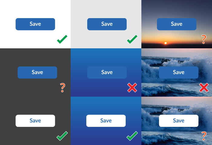
Most buttons work just fine on a white background. But what happens when you place it on a photograph? Or a different, darker background color? Heck, are you even allowed to put it on a light neutral color? Can you use a button anywhere? Can you change the color of a primary button?
Takeaway: Demonstrate viable backgrounds for your primary button, and codify an inverted alternative — white? a different color? semitransparent? — to apply when backgrounds darken. When documenting, show light and dark alternatives on a range of common backgrounds to drive the point home.
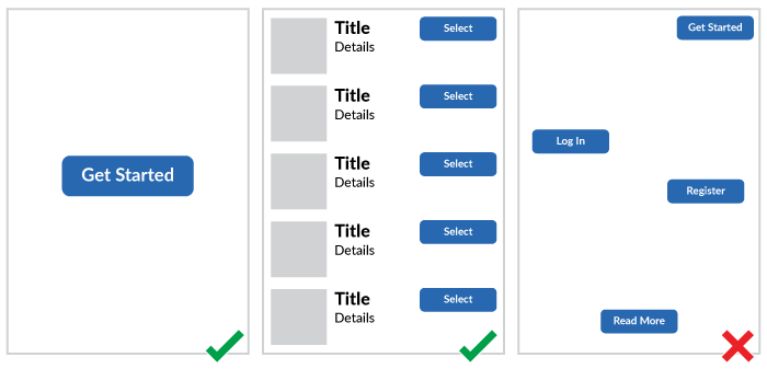
Buttons call for action. We often use a primary button to draw attention to a page’s highest priority action. Until, we can’t prioritize and there’s a bunch of primary buttons littered throughout a page (hopefully they’re consistent, right?).
In some cases, using a primary button is appropriate when you must choose from a parallel set of objects (like a stack of media objects in search results) or a settings page layout presents categories of options in equivalent modular regions.
Takeaway: Define when to use — and when to avoid — more than one primary button on a page.
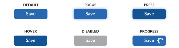
Buttons are the primitive interaction, and with interaction comes change. It’s not good enough to present a developer “Here’s the button design!” by just showing how it looks when a page loads. Instead, it’s up to the designer to show how a button appears across many states: default, hover, focused (“haloed”), pressed / active, and even a spinning waiting or animated progression.
Takeaway: Pair a live demo (just embed the button on the page!) with a gallery that shows the states without requiring readers to interact. Documentation isn’t a treasure hunt. Bonus points for including a video demo like Material Design does.
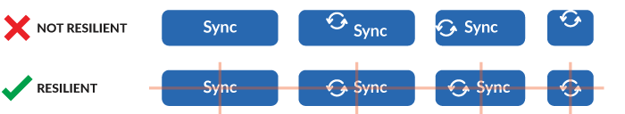
Pairing a button label with an icon reinforces meaning and quickens recognition.
Hold on! I thought buttons were a label in predictably clickable region. When you add an element, even a simple icon, a button layout shouldn’t break down. Coping with less predictable elements reveals pesky issues of spacing and alignment inside. You’ll wanna smooth these out, particularly if buttons can contain labels, icons, and other stuff.
Takeaway: Craft buttons to be resilient to including additional elements, whether in code or design tools. Users will want to add things — icons, labels, whatevers — and not worry about consequences of space and alignment. Set them up for success by doing that work for them.
No one yearns for gray buttons.
But you may find yourself needing to pair a secondary option with that inviting, saturated primary. You avoid a second saturated color, because that results in two saturated buttons next to one another, like green for Save and blue for Submit. Not even you, let alone your users, know which is more important.
So, you opt for a neutral. And the neutral is nearly or completed gray. And it looks disabled. Worse, when the primary is disabled, it’s now also gray. Next to your gray secondary. Sigh.
Takeaway: Solve for the secondary button colors and disabled states in concert. Make sure all your options work well together and none are inaccessible.

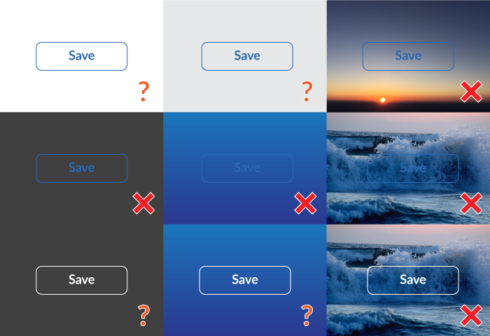
Ghost buttons rely on only a border and label of the same color while lacking a background fill. Behind that label rests an uncertain future. Sometimes the label is on white (yes, that’s easy!). However, other times a flat color or visually rich photo make the label difficult to read.
Ghosts allure designers coveting a sophistication absent from chunky, higher contrast primary button. Yet, these are called Ghosts for a reason. They disappear. I’ve observed ghost buttons donning a cloak of invisibility in usability test after usability test. Participants don’t see them or can’t read them. This weakens or destroys a button’s value in affording action we intend.
Takeaway: Inject Ghost buttons into a system at your own peril. Studies I’ve observed suggest that ghosts perform poorer than filled counterparts. Plus, you might just avoid hours spent listening to polarizing designer debates on the subject.
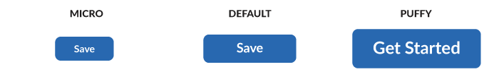
Before too long, system users will be asking you for that other button. A button big or small. A button with a menu or a toolbar of toggles aplenty. It’s up to your system to be complete-enough.
Interactions can be found in tight spots like a Card object or sidebar module. Other times, you need a massive button to sit on a full-bleed photo dominating the viewport.
Takeaway: Provide tooling to tune button size down and up as needed, as simple as another CSS class or design software style. Also, consider more memorable names — like “Puffy” or “Micro” — rather than a bland “Large” or “Small.”
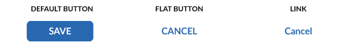
In the era of flat designs, systems like Material Design use a “Flat” button variant for use as in toolbars, dialog action groups, and inline near text. In a default state, there’s little to no visual difference from a link. However, a button’s states and behaviors bring a whole host of distinct considerations from your simple anchor tag.
Takeaway: If your system offers a flat variant, be sure it’s conventional use — in both design and code — is distinguished from links. Additionally, cover all the interactive complexity such as focus & press states, spacing, and alignment.
Richer buttons can trigger an associated menu panel with options to choose. Many systems offer multiple choices as a UI tightens up, such as menu (or dropdown) and split (or segmented) button.
A menu button either indicates a current selection (such as Arial as font family) or opens to a menu of independent options (such as Share and Print). Add a arrow icon on the right, and you’ve got an extra segmented zone to drop a menu from the right while the left label fires a separate, primary action.
Takeaway: Enrich your apps with options for button menuing, but cautiously. Such buttons and their zonal segmentation (left for dominant action, right for menuing) support many scenarios, but with a higher cost of code and guidance complexity. For simpler sites, don’t distract build priorities with these less-used alternatives.
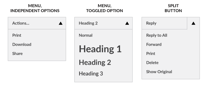
Buttons can come in groups. A button group pairs a primary with one or more secondary options. A toggle button many turn on and off (such as bold) or reveal a choice from a set of options (such as text alignment’s options for left, right, center, and justified). At it’s most expansive, a toolbar arrange many types, all together: primary, secondaries, toggles, menus, the works.
Takeaway: When expanding button variety, explore and stress-test button sets in compact spaces and with varied combinations. System designers aren’t fortune tellers, able to predict the future. But exploring a reasonably diverse scenarios can help you avoid an abomination or two down the road.
<button>There’s a treasure trove of good learning about coding buttons correctly. The CSS Tricks article When to Use the Button Element (and it’s robust and lively discussion) is a great place to start.
Takeaway: Study coding references to understand button conventions and accessibility. From articles like this, you can wind your way through excellent reads like Alex Lande’s Anchors, Buttons, and Accessibility and CSSKarma’s Meet the Polybutton, An Accessibility Polyfill.
EightShapes can energize your efforts to coach, workshop, assess or partner with you to design, code, document and manage a system.