

In a recent code review, my passions stirred as I walked through a Pill component’s style with a designer teammate. I could hardly contain my excitement:
“Look. Yes, it’s code, but look closely at those tokens. You know what this looks like? Like specs! So what? I can read this, as can you. And we can thread these everywhere: doc, designs, and convos too. Everywhere!“
My teammate’s reaction hinted curiosity, even if didn’t match my outburst’s emotional punch. He’s not a system’s geek like me. Not yet, at least. But he got what mattered: there’s a visible path for decisions we make to where they are implemented.
We’ve spent so much effort trying to get design out of our variables — those most atomic of reusable code bits — I felt instantaneously attracted to the idea of putting design back in.
Here’s how we evolved, architected, and implemented tokens throughout design, code and collaboration.
Every design system offers options. For example, colors can scale from black through neutrals to white. Each neutral — identified via a HEX code like #2B303B — can be stored and made available in a variable $color-neutral-20, for use in a preprocessor like Sass.
Variables take the mystery out of obscure values. But they don’t bridge the gap between naming and use. They answer “What options do I have?” yet leave “What choice do I make?” unclear.
Options aren’t good enough.
A system’s strength comes from knowing how to apply options (like $color-neutral-20) to contexts (like a conventional dark background color). This grounds the option as a decision.
Those are decisions I can use with confidence!
However, such decisions are usually still buried in some file in some repo used by developers working on the web-based product they own. What about designers? Other web products? Across to other platforms like iOS and Android? We’ve encoded decisions meant for everyone, but they owned in some dungeon of a repo nobody else can find.
Salesforce UX provides a glimpse. Their ideas captivate me, most of all their Living Style Guide concept that applies Design Tokens across products using their open source Theo tool.
Here, options and decisions aren’t buried in Sass files. Instead, they are centralized and propagated as tokens to any product, designer or developer adopting the system, in easy-to-use, predictable formats.
Hundreds of tokens can become readable, intentional, and traceable decisions woven into a portfolio’s or enterprise’s products.
See the decisions as a big spec sheet? I can. Designers can too. With such visibility and tooling, they recognize the impact of their decisions. Before, we decided on $color-neutral-80 for a border or background with a bit of whimsy. Now, we’re applying $border-hairline or a $background-color-light in a thoughtful, conventional manner.
Designers start to collaborate. They make decisions with more deliberation and confidence, organized their thoughts in a structure they share. Developers follow suit.
This can transform painstaking activities like redlines and pixel measuring into collaboration rich with token talk. Across our work — critiquing design concepts, writing acceptance criteria, reviewing pull requests — the architecture and implementation of tokens is ever-present.
A successful, enduring token architecture depends on straightforward grouping, ordering, classification and decision-making.
You can’t make decisions without options. Tokens are an effective instrument for illustrating the path from one to the other.
In our token files, we begin with options like available colors. After that, we apply options to contexts like text-color and background-color.
Takeaway: Organize your decisions to suggest their atomic basis: building from options to decisions and simple to complex.
I often talk of a design language’s big three: color, typography, and iconography. So it’s no surprise that our token file begins with color and type options and decisions (icons are automated elsewhere). However, visual style is composed of so much more, and so could tokens.
While we’ll start with applying color to background and text, we’ll expand to many other types of decisions, including things like:
Takeaway: Start with but don’t stall with just color & type. Expand your decisions to cover the myriad concerns of a design language.
Many tokenized concepts include scales to choose from, such as t-shirt sizing (XS, S, M, L, XL, XXL), progressions (like a geometric 2, 4, 8, 16, 32, 64), or custom terminology (like compact, cozy, and comfortable). Scales can also start with a few options (only S & M) and grow to include more as warranted.
Scales afford branching a token hierarchy to similar yet distinct variants, such as enriching space-inset (from XS to XL) to variants of space-inset-squish and space-inset-stretch (both of which also offer XS to XL).
Agreeing on a scaling model — t-shirts or progressions, you decide! — for ranges like these is a team-specific endeavor. Even tougher, you’ll need to avoid hardened scales not resilient to inserting a step in between later.
Takeaway: Adopt and tokenize scales and demonstrate how they apply across different scenarios.
When does a choice warrant becoming a token? A single use: nope, not enough. A second may lack conviction. But three? If it shows up that much, it’s usually token-worthy. Exceptions exist, but “Used 3 times?” criteria grounds discussion.
So who’s the token gatekeeper? Nobody, if we employ healthy processes for design and dev reviews. Anyone can propose tokens, surfacing candidates in a concept or pull requests. Our Slack channel has much token talk, too.
Nevertheless, I serve as a token curator, scanning work with an eye for token candidates. I may skim a request’s markup and skip the JavaScript. However, I thoroughly scan style and token files to finesse names, reclassify wayward nominees, and challenge excessive expansion. Everyone has a token voice. But not everyone cares enough or has time to keep tokens clean.
Takeaway: Make tokens a team endeavor, and (even if implicitly) designate a structured architectural mind to curate the collection.
It’s a distraction to divert brainpower to constantly think tokens, tokens, tokens. “Should this be a new token? Is that a token? I’m not using a token? Oh no!” Nobody needs this friction.
However, my teammate Kevin Powell has a healthy habit of stockpiling variables at the top of a component style file. For example, a portion of variables in use in his form component’s style identify many applications of text color to form elements like inline errors, input, labels, and placeholder text.

These component-specific variables offer a helpful inventory of candidates to graduate to the token library. Here, we can catch an opportunity to replace a less-specific disabled color of $color-neutral-90 with it’s more intentional $background-color-disabled in the form_elements.styl file. On the other hand, the component’s $border-color-input-hover is less likely for reuse beyond forms and thus a poor token candidate.
Takeaway: Encourage habits in design and development that park reusable decisions — token candidates — in a predictable place such as the top of a text file or corner of design art.
Tokens are a wonderful tool as you formulate a pristine system from scratch. But what about 18 months from now, when design decisions evolve? How does a token change cascade? What are the risks, and how do you mitigate them?
Tokens protect you from unpredictable, widespread change given their specificity and – as a result – more limited and intentional use.
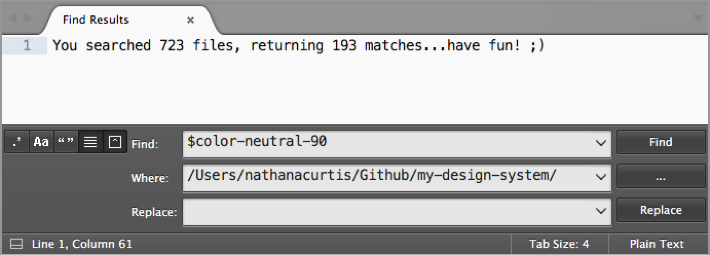
Previously, you comb and assess a repository for a #2B303B hex code or $color-neutral-20 variable applied to myriad different elements. Boo!
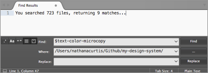
Now, you’re tracing the breadth of use of $text-color-microcopy precisely and narrowing risk. Yes!
Takeaway: Take advantage of a token’s maintenance benefits, and use that as a selling point to your adopting team.
Most teams start consolidating decisions as a huge stack of predictable, hierarchical variables names in a SASS or Stylus file. But that file buries decisions in one place, limiting use to that technology.
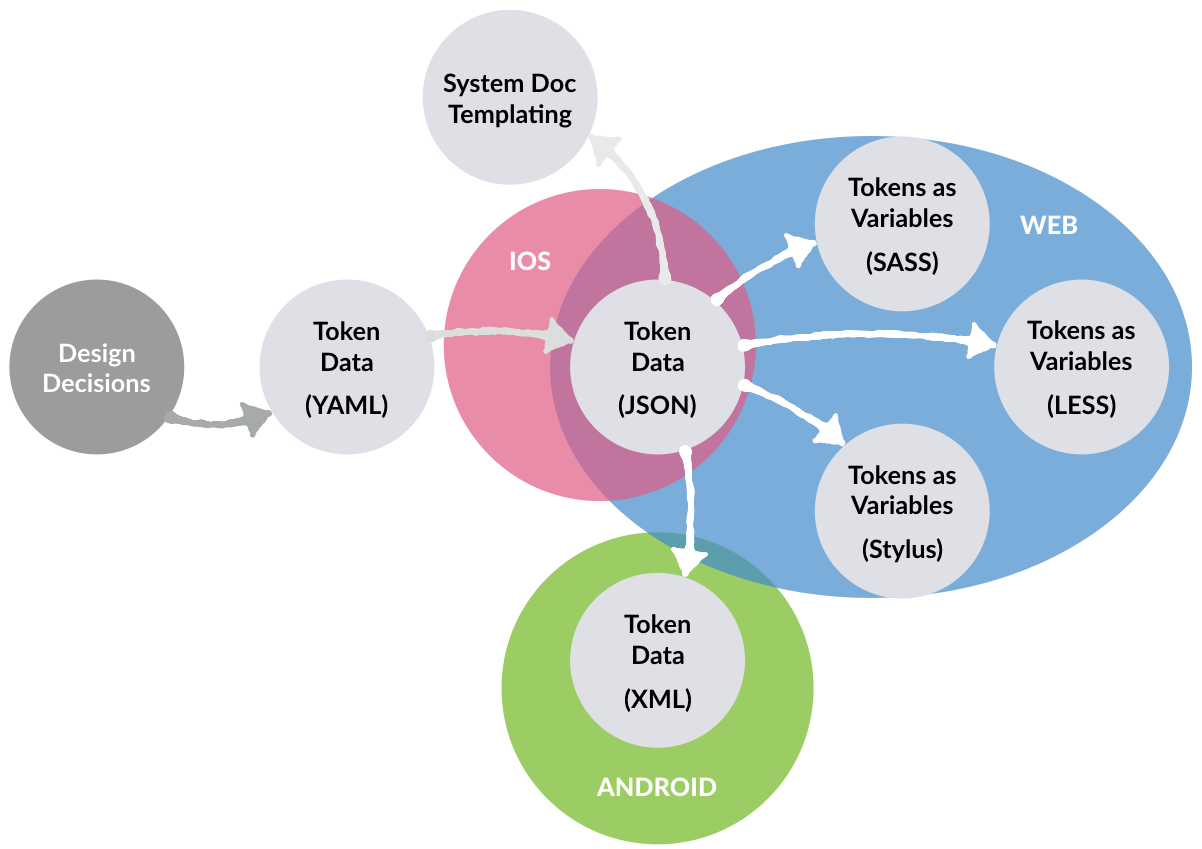
That leaves the promise of tokens unfulfilled. A first step in spreading tokens throughout a system is freeing them with an open format like JSON.
JSON is an ideal open standard for encoding hierarchical name/value pairs for reuse across tools.
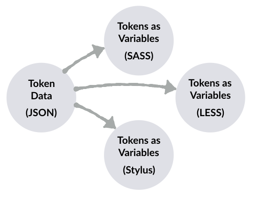
With tokens in JSON, you can transform decisions for multiple preprocessors — SASS, Stylus and LESS — as your community requires. This opens the door to products constrained to a preprocessor they can’t or won’t leave behind, even if it’s not the system’s “recommended” one.
Similarly, JSON creates a bridge to other platforms, whether directly consumed in iOS work or transformed into XML for Android teams.
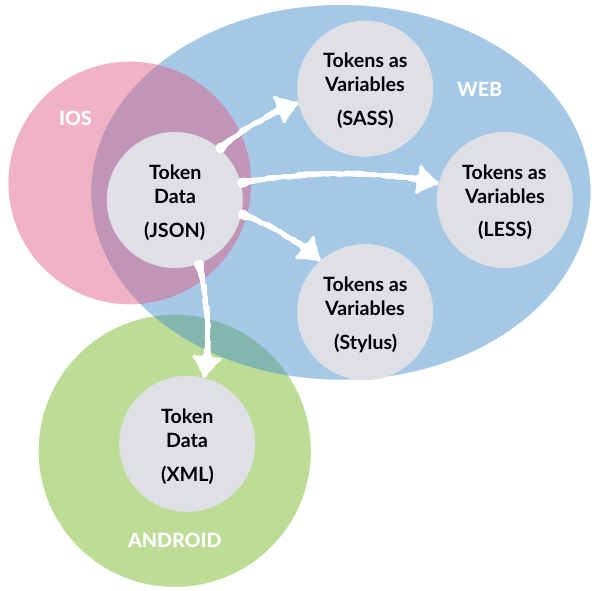
Takeaway: Encode tokens in a format reusable across platforms, exposing them in a form everyone can use.
JSON is powerful, hierarchical, and flexible. However, it’s imperfect as a place to manage data. Syntax is verbose, prone to error when manually curated, lacks comment support, and lacks variables.
Enter YAML, a more human-readable language for recording hierarchical property/value pairs. YAML adds variables and comments to JSON’s hierarchical capability in a more readable format. YAML helps quickly show tokens readably to any audience and its simplicity opens a border for designers to suggest new values and even submit pull request themselves.
Our team uses yamljs to transform the YAML data we manage as a single-source-of-truth into a JavaScript object as a step of our build process.
Takeaway: Consider YAML to empower designers to engage with and work in code, drawing them closer to code and those that use code.
Embedding design decisions in code isn’t valuable if designers and developers don’t know what the decisions are and how to access them. That’s why we use tokens as content as much as we do code.
In our systems, we thread tokens as a data structure (think: JSON) into templates to show decisions in a tokens reference and other topics like space and themed buttons.
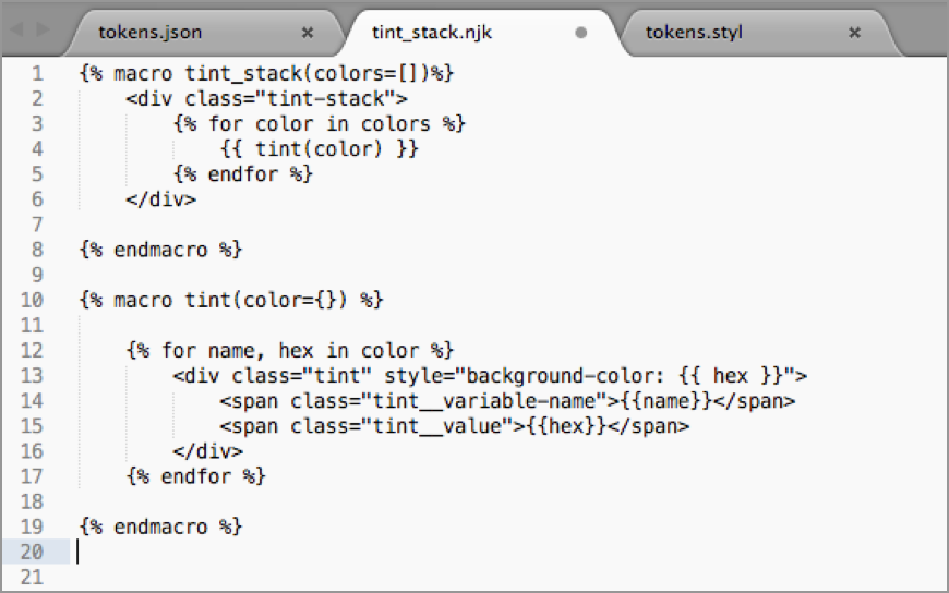
Other documentation is more customized, such as a color tint stack that includes names, accessibility scores, and more. While not a simple loop through token hierarchy, the documentation can still use tokens directly.
Takeaway: Use tokens to enrich how living your living guide can be.
Token data can inspire ideas for tools for not just developers, but designers too. We talk about building custom tools for our portfolio’s designer community in tools like Sketch , Photoshop , or (back in the day) InDesign.
Such software offers varyingly robust hooks to use JSON data to your advantage. For example, InVision’s Craft relies upon JSON objects stored as text in subfolders, suggesting a possible integration with outputs of our system’s build process. Such connections were effortful and siloed enough in the past that they’d be ignored. Today, they feel more realistic as a system matures.
Takeaway: Identify opportunities to extend the system into designer tools, especially design software. Consider costs — both setup and maintenance — relative to the benefits to your system user’s experience.
The more my teams use tokens, the more at home I feel discussing design. Threading smart decisions encoded with meaningful names helps me trust the output of my team is arcing towards the aspiration of a more cohesive, maintainable system.
EightShapes can energize your efforts to coach, workshop, assess or partner with you to design, code, document and manage a system.