
As a system changes, adopters will want to take advantage of what’s new.
Trouble arises when change is poorly communicated or its impacts ill-defined. Developers compare a proposed design to system code, identify what needs swapped or added, and carefully install or upgrade what’s needed. They are also usually mindful of breaking change in dependencies.
Are designers as sensitive to changes when working in a tool like Sketch? Not as much. They replace this with that. A new Button goes here, unaware that older buttons are used elsewhere in that or other pages. Designers flow updates swiftly, indicating neither the component’s version nor annotating an upgrade compared to what’s coded today. Friction ensues:
    <div class="escom-pull-quote escom-pull-quote--light">
        <div class="escom-pull-quote__the-quote">
            I add a new system feature to my design. Yet the developer says we can’t use it.
        </div>


        <div class="escom-pull-quote__attribution">
            Designer on a proudct team
        </div>

    </div>


    <div class="escom-pull-quote escom-pull-quote--light">
        <div class="escom-pull-quote__the-quote">
            The designer sprays style and component upgrades across a new feature, completely unaware of the upgrade costs it triggers across our whole app.
        </div>


        <div class="escom-pull-quote__attribution">
            Developer on the same product team
        </div>

    </div>
Designers want the latest. Developers balance tradeoffs of new quality with scale and maintenance. Systems should clean up that conversation.
Identifying how to version is simple (use SemVer!). However, identifying what’s versioned — by library or by component —is more challenging. Versioning communicates how things change from launch through deprecation and end-of-life. This article takes us through that cycle of change across system outputs: code, tokens, design assets, and doc.
Every discussion about versioning design system outputs begins and ends with the industry standard Semantic Versioning (SemVer).

SemVer versions in a MAJOR.MINOR.PATCH format, incrementing each as a:
MAJOR version for incompatible API changes (that is, something "breaks"),MINOR version for adding features that are backwards-compatible, andPATCH version for backwards-compatible bug fixes.Daniel O’Connor, Atlassian’s AtlasKit, and Morningstar’s Design System offer helpful deeper examples describing SemVer’s application to system features.
Long an industry standard in versioning code, versioning is increasingly relevant in design tools too. Many system teams apply SemVer to Sketch symbol libraries in software tools like Abstract and Invision DSM. You can learn the methodology at http://www.semver.org.
Takeaway: Strongly encourage designers to learn SemVer. Not only will it help them communicate with engineers more effectively, but it is increasingly meaningful in designer-to-designer collaboration too. It changes lives!
A design system team versions its library as a single, monolithic package or separately per feature, such as component by component.
A design system versioning by library applies the same version number to all system assets simultaneously, such as 1.4.0 applies across all components.
If any component adds a backwards-compatible feature, then the entire library increments a minor version from 1.4.0 to 1.5.0. Similarly, if any component has a breaking change, the entire library increments the major number from 1.4.0 to 2.0.0.
Versioning “by library” is the comment choice for teams delivering vanilla HTML & CSS. Adopters typically integrate markup and style into their app and refer to a library’s collectively compiled CSS, such as core.css.
You can’t include a core.css from 2 or more versions without CSS conflicts. The only way to do so is if the system supports namespacing CSS files and classes across versions. I’ve not seen a system do that. Instead, they all operate like this: Want button from library version 1.4.0? Then every component on that page must use library version1.4.0. Otherwise, things may break.
Versioning “by component” enables adopting teams to mix and match button version 5.3.1 with form checkbox 3.1.0 and radio 1.1.0 in the same page.
Adopters need not worry about when each was released, since HTML markup, style and script is encapsulated and won’t conflict with other components types included in the the same page. This may or may not mean you can uses multiple versions of one component simultaneously. “Can I include button’s 1.7.0 in one part of the page along with button 1.2.0 and 2.5.0 elsewhere on the same page?" Depends on how the library works.
Versioning by component is consistent for teams using a continuous release model and using a JavaScript framework (React, Vue, etc) or delivering web components. They’ll make much smaller changes more modularly more often.
SemVer enables adopters to recognize key moments in a system’s life cycle.

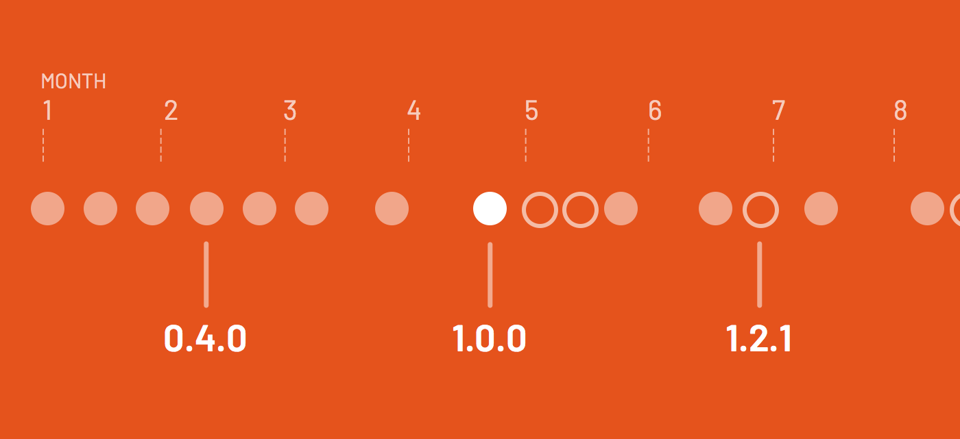
0.1.0, 0.2.0, 0.3.0, …) reveal an unstable system architecture and feature set. Over the past few years, this period lasts three to six months before a first major release for most teams.1.0.0 is hailed stable and dependable. It’s delivered with fanfare, signaling readiness for mass adoption. The 1.x.x period that follows can last a year or more for systems versioned as libraries, and is shorter when versioning by individual components.2.0.0, 3.0.0, …. This signals the system's interface broke. Attention and adjustment is needed as a team upgrades.Takeaway: When planning a system, set expectations what version numbers mean. 1.0.0 should be a clear commitment to stable and predictable change.
A 1.0.0 designation comes with commitment. Freewheeling days of unstable early foundations are behind you.
Unfortunately, those unfamiliar with SemVer misinterpret what it means to go from 1.13.0 to 2.0.0. There’s a breaking change, but not necessarily new features and/or a costly upgrade afoot. It’s definitely not a marketing ploy to gain attention. But that’s how many perceive it.
A breaking change triggering 2.0.0 could be as simple as changing the system-btn--primary class to system-button--primary. Or retiring how Modals open using toggleModal in favor of openModal and closeModal instead. Small API changes, spread piecemeal through an adopter's code, could be straightforward to audit and cheap to correct.
Eric Elliott describes a more precise approach to describe changes using SemVer with breaking.feature.fix labels. I agree, those labels clarify level of change. Neverthless, I’ll stick with a system that works well despite suboptimal labels.
Takeaway: A major version is neither a marketing ploy nor a guarantee that major effort awaits. Instead, it’s a signal that a stable architecture has shifted in ways large or small, and adopters should pay attention as they upgrade.
Once a major version like 2.0.0 is released, we'll classify new feature ideas and customer requests as 3.0.0 or Breaking Change using JIRA’s Version attribute. As we commit and plan for a 3.0.0 release, we’ll then deprioritize changes that didn’t make the cut to a new4.0.0 JIRA version.
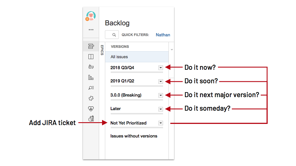
Takeaway: Establish a routine for recording and funneling breaking changes trigger a major version. Isolating these items removes distraction from current work and provides a collection to review as you plan for what’s next.
Deprecation warns that feature use should be discontinued and support will be removed in the future. The system may offer a preferred alternative, or the feature is no longer necessary or in demand.
When deprecating a feature, consider current use:
    <div class="escom-pull-quote escom-pull-quote--light">
        <div class="escom-pull-quote__the-quote">
            We’ll audit product code to find instances where it’s used. If used broadly, then we’ll communicate with those teams prior to making a decision to deprecate.
        </div>


        <div class="escom-pull-quote__attribution">
            <a href="https://twitter.com/rowanmanning" rel="nofollow noopener" target="_blank">Rowan Manning</a>, <a href="https://origami.ft.com/" rel="nofollow noopener" target="_blank">Financial Times</a>
        </div>

    </div>
Once a feature is ready for deprecation, follow a well-defined process. Atlaskit’s versioning doc outlines a simple process:
In deprecating, timing removal is critical. You can’t yank it without warning.
    <div class="escom-pull-quote escom-pull-quote--light">
        <div class="escom-pull-quote__the-quote">
            On our platform, teams builds huge solutions costing millions of dollars and walk away. If we change and they don’t know, then they get really upset. Our message? We’ll give you 18 months to react.
        </div>


        <div class="escom-pull-quote__attribution">
            <a href="https://github.com/brandonferrua" rel="nofollow noopener" target="_blank">Brandon Ferrua</a>, <a href="https://www.lightningdesignsystem.com/" rel="nofollow noopener" target="_blank">Salesforce Lightning</a>
        </div>

    </div>
How long is long enough? Salesforce supports a wide base of disconnected teams, so timing is clear and long: 18 months. Origami by Financial Times operates with a tighter developer community, allowing for a compressed period of 3 to 6 months.
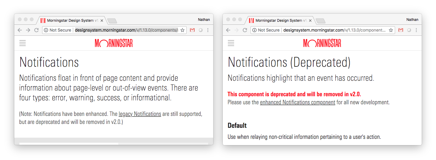
A new feature can exist alongside old. Morningstar expanded the Notification component in 1.9.0 with new features, breaking the API in the process. For six months until 2.0.0, the system offered both a new "enhanced" notification (the default doc page) and a deprecated notification (on a separate page), linking both via an introductory message.
Salesforce Lightning sustained two versions of a Path component.
    <div class="escom-pull-quote escom-pull-quote--light">
        <div class="escom-pull-quote__the-quote">
            We built v1 Path, then…the whole design changed. Unsurprisingly, the existing API didn’t work with the new bells and whistles. So, we decided to deprecate and remove the old version eventually. No one will use it. They can’t find it, the code’s wrapped in a deprecate mixin, and retired selectors are described in metadata.
        </div>


        <div class="escom-pull-quote__attribution">
            Brandon Ferrua, Salesforce Lightning
        </div>

    </div>
Code practices can also provide notice. The browser console and terminal can issue deprecation warnings, such as Salesforce UX’s Sass Deprecate feature.
As a deprecation period concludes, a system can either remove it or leave it in unsupported. “At no point does the deprecated feature become unavailable. Instead, our commitment to maintain it stops,” Origami’s Rowan explained.
Takeaway: Once you leap past 1.0.0, establish a predicable time period for deprecating features. Communicate upcoming deprecation across channels (code, doc, design assets, announcements) to your community.
A system’s code is it’s truth. A code’s versions takes their rightful role as the hub against which all other outputs—doc, design, tokens—align.
Many systems weave code and (code-only) doc into the same files, producing navigable documentation from library’s core style and components. This coupling offers clear efficiencies yet triggers challenges like:
Should doc update every time the code releases? Absolutely. It must always reflect up-to-date examples and reference tables.
Should the library release for every little doc change? No. A UX pattern or workflow description may be pages-long, yet have no code. Why block publishing until the next code drop and/or increment a library’s version to make a content change?
Systems teams I lead take the mindset that the “doc site” (and its content) is a product consuming the system library. We separate the two codebases.
I’m also unwilling to cede another tradeoff: diminished non-developer participation and content serving wider audiences. The more doc is woven into complex code, the less flexible your content model and the less capable your other authors—designers, content strategists, accessibility specialists—are in editing or expanding it. A tight coupling of code and doc could also slow down how you publish a guideline in response to a community resolving a standard in critique.
Takeaway: Consider decoupling documentation versions from library code. This separation can trigger useful yet indistinct workflows for each.
Most teams adopting a systems don’t upgrade with every system release. Some may upgrade no more often than every six months or a year alongside so much other “value generating” work.
Most system site document just “the latest.” But for a system describing button v5.2.1, how does a a team maintain their use of v2.11.0?
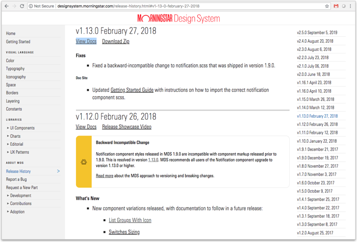
The Morningstar Design System publishes “the latest” at .com/ root and also offers access to every past doc site version at predictable subfolders such as .com/v1.13.0/. Each version is accessed via a “View Docs” link per entry in the Release History. Just as important: doc links are relative, so that once in docs for v1.13.0, you stay within docs for v1.13.0.
Takeaway: When your system serves a wide audience upgrading irregularly, ensure they have doc of what they use for as long as they see fit.
Sketch libraries and other design resources are designer territory. “How should we version these?” a system designer asks. “We’ll put the latest in the Google Drive folder location that everyone else refers to.” they often answer. Not bad, but not enough.
Using a linked library, designers can be completely unaware how assets changed since they’ve used it a day, week or month ago. They dynamically integrate “the latest” symbols en masse into art. Away they go! It’s magical! Until it’s not magical, at all, for engineers building.
What version(s) of what component(s) are these? Technically, it may be that everything on the page must be from the same system version. Designers mixing and matching versions drive developers bonkers. It’s not just inconsistent but technically expensive or impossible.
A design system could do better to:
That means not indicating a version (“Use this latest!”) or using last updated date (like System_Sketch_2016_10_31.sketch) should be behind us. In design assets, you can communicate version number in…

…symbol library name (or last updated if versioning by feature)…

…symbol name, particular if within a folder-based hierarchy…

…or an annotation layer, particularly if toggled on/off in artwork.
Even for “design-only” libraries lacking code, communicating design and doc changed to teams making features themselves has significant value.
Takeaway: “Use the latest” isn’t good enough, so establish a versioning scheme for design assets. The scheme should maximize how design assets relate to system code and enable designers and developers to communicate and consider version impacts as they make their product.
Design tokens codify style. At their core, they’re a component dependency. Many teams embed tokens in the versioned library of web-based components. Yet, tokens could serve other teams, whether more web products making their own components or teams building for iOS & Android.
A new tokens version could include new colors (such as a data visualization palette) or fine tune an interactive blue to improve accessibility. When embedded in a web-based component library, such changes could block release since you’d have to update all components too.
It doesn’t have to be this way. If you separate tokens as a packaged dependency of UI component library, then:
Takeaway: Separating tokens from UI components could improve tool flexibility and signal improved support for more and more adopters.
EightShapes can energize your efforts to coach, workshop, assess or partner with you to design, code, document and manage a system.