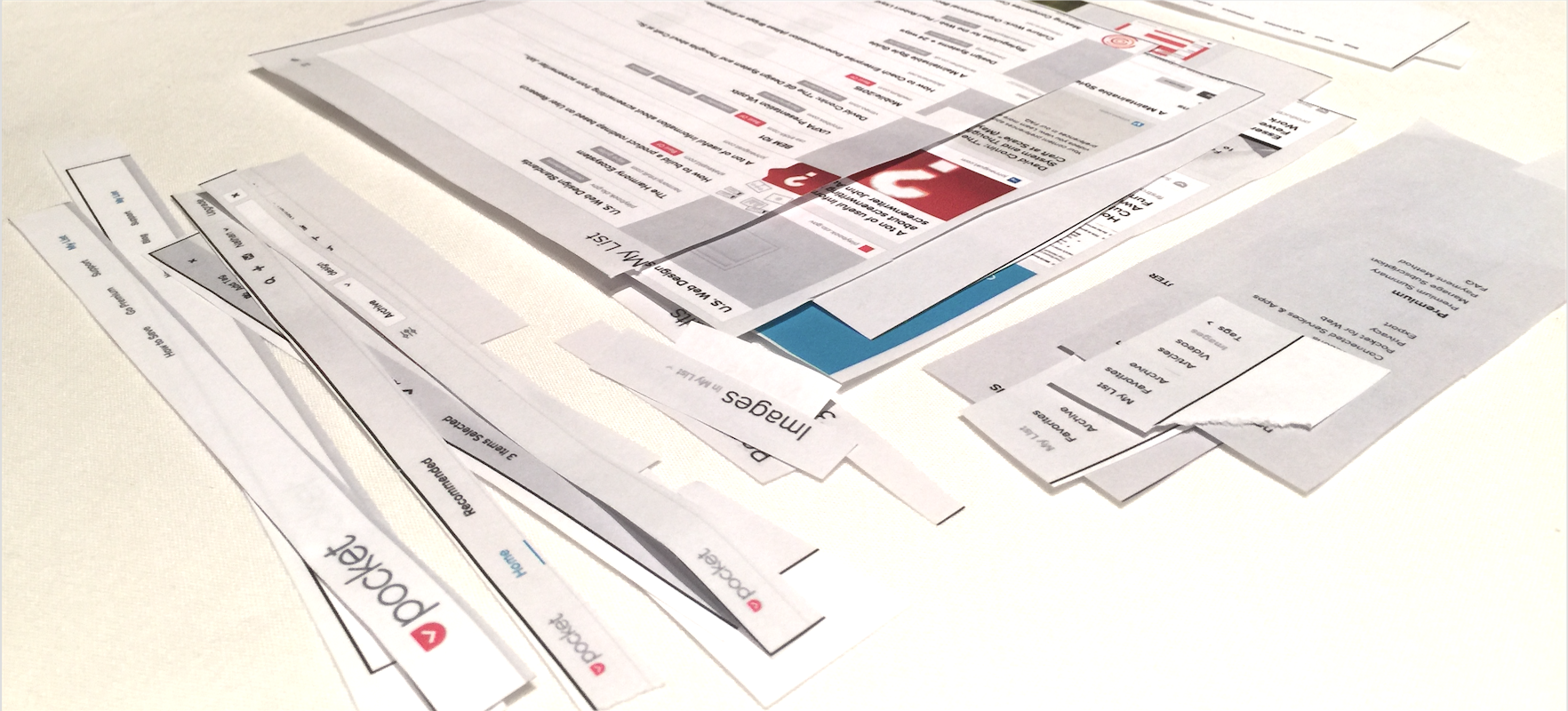

During early system activities like our Component Cut Up workshop, participants can get stuck on the “correct” way to chop up page into components. Staring at pages on offer, each person has their moment—scissors in hand—wondering:
Card) the component?Button or Tag) the component?Card Grid with Toolbar) the component?After years working on libraries, my response is a straightforward: Yes.
When users start working with a library, instinct suggests that a page is just 10 to 20 reusable chunks: a top Header here, a multi-level Tab navigation below it, three Sidebar Modules over there. Recent practices build understanding up from an atomic base: a Button here, a Menu there, perhaps a limited variety of Card. Forever, all these parts have been assembled into Layout.
Experience seasons the judgment and instincts of where the a component’s boundaries lie. Yet, over time, we begin to transcend the notion that there’s only one layer of lines to cut that arrange component simply as siblings on a page.
Instead, modular component libraries embrace the reality of the material in which they are built: a rich hierarchical tapestry of interrelated things, small and large, ultimately assembled into a full page composition.
Beginners see pages as a two-dimensional construct displayed on screen. That’s why the activities like the Component Cut-Up are so effective. Soon, designers (using a light source) and developers (via z-index) develop a more nuanced appreciation for depth, unflattening elements into a third dimension.
But make no mistake, web pages are built hierarchically. The impact on how we manage and relate modular components hierarchically is profound. I find myself injecting subtle reminders that every component in a library need not be a sibling, components can contain other components, and smaller doesn’t always mean more valuable or broadly relevant.
Considering the impact of hierarchy frees the minds of library makers and influencers to have more nuanced discussions around what matters, how parts relate to one another, and how we’ll build for reuse.
A library must have a sufficient quantity of bite-sized components — Button, Textbox, Tag, Checkbox, Breadcrumb, Modal, even Cards — to be minimally useful and adoptable. Let’s say you need ~10 to 20, including at least Button (with lots of variations), Forms, and a few others depending on the system’s context.
But it’s not long before a system team starts addressing more sophisticated arrangements, such as a Card Grid that contains Cards that contains Primary Button and Icon Button and Tag.
Modern front-end tooling—like CSS preprocessor mixins and template partials and macros—help us encapsulate the definition of and interface to small components.
Library users don’t care about how things are encapsulated. To them, it’s just compiled CSS classes applied to markup so that a button looks right, behaves right, and fits right when used in something bigger. They are shielded from and comfortably depend on component relationships being resolved.
But encapsulation is a challenge for library makers. Where do properties go? Will CSS classes of smaller components be integrated into or encapsulated within the classes of larger ones containing them? How can ensure larger components are resilient to changes in their reusable smaller parts? My emotions are mixed: Encapsulation is required to scale a library, but increases complexity, lengthens conversations, and requires thoughtful planning. Practicing effective encapsulation is far from free.
The more atomic a part, the more likely it’ll be broadly reused, correctly, at a small cost to the system. However, this doesn’t mean system can’t also offer big components like a “Hero Carousel” banner, a Toolbar with varied menus, icons, and buttons, or—if you’re serious about bringing products together—a Header system (possibly including panels like Megamenus that may span products).
Big components — Heroes, Toolbar, and especially HeaderBar — are essential for making a broad experience cohesive. Yet these components are complex beasts, particularly responsively, as measured by overflowing lines of markup and style.
Is “Give ’em some atomic elements and hope for the best!” across 5+ products the right approach? For both cost and consistency, that’s bollocks. If a system is a centralized force to eliminate wasteful redundancy and deliver consistency, then build and propagate big ones that matter.
A library lacking big components risks looking like a muddled mess when things are put together. Larger components provide inspectable examples of both visually and in code. You can see how small things fit in big things, learning how to apply spacing, color, variable names and themes along the way.
Likewise, larger pieces are material to QA the library as tokenized decisions—a border-radius here, a bottom-margin there—are adjusted centrally yet impact broadly.
The parts on a page are all composed in a the hierarchical journey, from the most atomic element all the way up to the body tag.
The invisible scaffolding that holds a page together is often erroneously thought of as “The Grid.” Without it, some feel unable to build anything visually coherent: Get me the Grid! I need the Grid! I can’t build anything without the Grid!
Most libraries offer a Grid defined as (more often now) rows containing columns down a scrollable page. The Grid has many hallmarks of a component, in that a grid is:
A Grid is a component.
That said, a Grid never the top-most component that contains everything else. It’s an intermediate component sandwiched between the smaller parts and often one of a few likely Layouts.
A Layout provides empty page regions into which you can place components, such as a website’s header, footer, and sidebar that envelop the main content well or a web app’s header, toolbar(s), and panels evoked from viewport edges and corners.
When library users approach a library, they can be overwhelmed by the vast ocean of atomic choices. A library’s breadth of parts is correlated with its perceived worth. However, another key question is: Can I compose my layout, arranging an array of prebuilt parts how I want to, bound within a shell of “global” components that I may configure but need not rebuild?
That’s not “the grid” and it’s more complex than just a layout of empty regions. We’ll often offer a page Shell as a prearranged layout that already contains a Header, GlobalNavigation, and possibly Footer and other _Panel_ing*.*
Shells ease the assembly process and revealing how things are organized. They help adopters not just see regions visually (in a browser) and in code (in their editor) into which they add, but get users a few steps ahead with the parts they should be skipping past anyway.
While our libraries begin as bottom-up collections of atomic elements, library users often begin composition top-down. Like the code we share and designs we converge, the conversation always meets and heats up in the middle.
EightShapes can energize your efforts to coach, workshop, assess or partner with you to design, code, document and manage a system.