
A smooth onboarding is an essential moment in a product experience. That’s why an Getting Started as an Engineer is arguably the most important documentation your system publishes.
Engineers want to traverse simple, dependable steps that are quick, effortless, and painless. Getting stuck can be catastrophic. They should plow through, even in minutes. By the end, they yearn to feel empowered and successful, ready to weave the system throughout their codebase. This first impression is critical to make or break their belief, leaving them confident (yes!) or confounded (oh no!).
Getting Started for Engineers is not just positioned prominently on system’s homepage and in navigation. It should also be composed early as you iterate towards launch. The authoring process leads a team to affirm system architecture, test onboarding with key partners during a beta period, and polish it up by the time adoption is widespread.
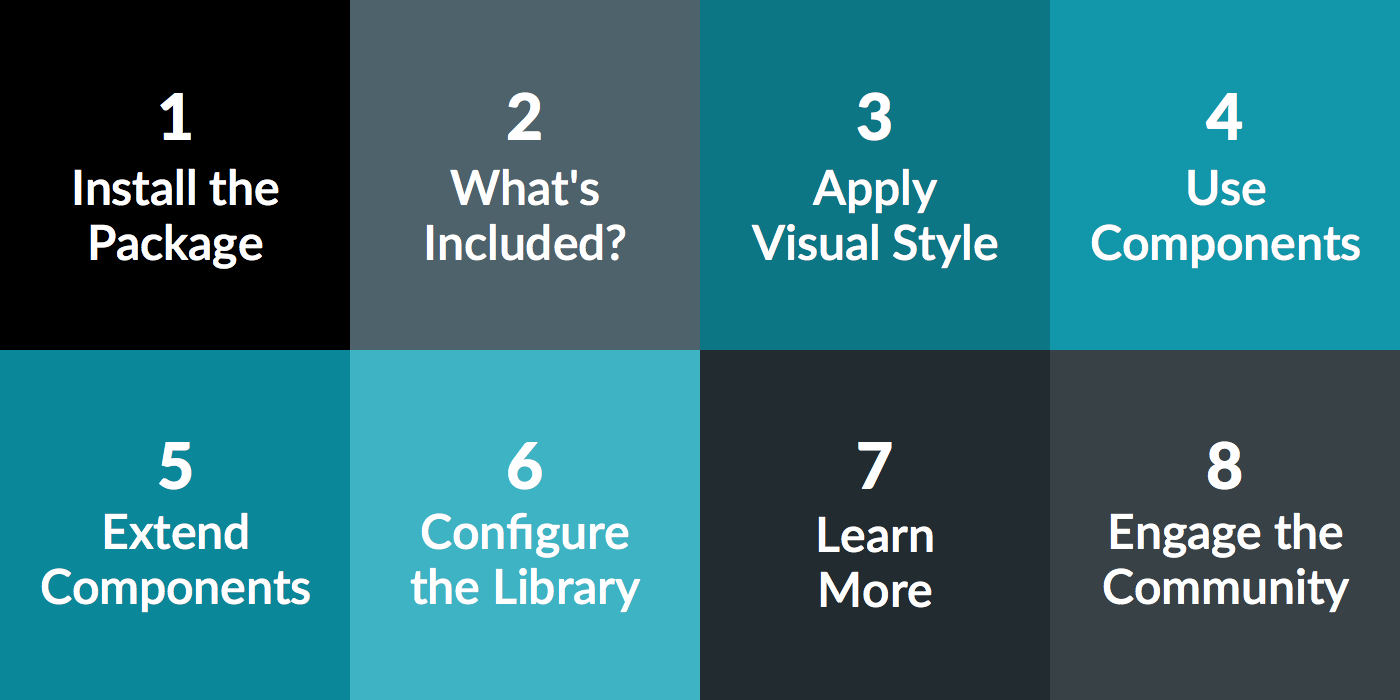
While each system is unique — how it’s built, features it provides, flexibility it enables, integration it requires — most Getting Started pages flow through how to install, use, extend/override, configure, learn more, and connect with the system team.
All is lost if they can’t integrate a system into their codebase. It may be tempting to scribble off a simple yarn install or npm start and move on. However, insufficient doc can leave aspiring adopters helpless by a blocked environment. Engineers need details on how to:
hosted, downloaded (as pre-built or built by the adopter), or integrated via tools such as yarn, bower, npm, and/or gulp. (example: Material Design Lite).web versus React Native, Android, or Apple (example: Hudl Uniform).React or Vue or vanilla HTML & CSS , if both are available. (example: Shopify Polaris)Takeaway: Don’t skimp on installation. If poorly described, you risk alienating adopters before they get through the front door and/or relying upon costly and disruptive calls for assistance.
Once installed, give the engineer a lay of the land. Components are here, fonts and icons there. Markup is invoked from these files, scripts are references in those folders. This can be as simple as a diagram of folder hierarchy (example: IBM Carbon) or two-column table related assets to folder locations.
Takeaway: Help an engineer see and find what they want while sensitizing them to what’s to come. This familiarity improves confidence and momentum towards the tasks that remain.
Usually, setting visual style up for success precedes the widespread application of components. From colors to space and size, from icon files to web fonts, there’s a core set of fairly predictable assets and variables upon which components are built. Engineers need to know how to:
<link> in the view (example: Morningstar Design System), if relevant.Takeaway: Don’t skip visual style as you barrel towards components. Empower engineers to ground and extend their implementation using the system with style tools and assets that are well-organized and dependable.
To engineers, design systems are fundamentally a catalog of components to reuse as building blocks to compose an interface. So this section better bring the goods. Engineers need to know how to:
import statement & folder paths.This is almost always done by a single, sensitizing example akin to the “Hello World” of a component in an implementation.
Takeaway: Here more than anywhere, the focus should be on instructions and outcomes. Code examples are essential, but improving the instructions with rendered outputs can reinforce the “what you get” and provide opportunities to elaborate on the most important suggestions to optimize their adoption.
At times, your DatePicker, Masthead, or – heck, even – Button may not offer all the features and variety an adopter craves. To solve their problem, they may need to build upon or override what's on offer to be successful.
Engineers need to know how to:
Icon and Button—to build a custom displays like a Card action bar.Takeaway: As much as you may want to believe otherwise, a system doesn’t solve every problem for every adopter. Therefore, tune onboarding to the reality that a system serves as baseline tools that equip adopters to compose components themselves, too.
A system should afford how consumers flexibility adapt what’s on offer to serve their own needs. Engineers may need to know how to:
<link>ed CSS) and other downloads (like an icon SVG).For more powerful configurations, these topics may warrant their own pages to describe more in-depth step-by-step processes. When this occurs, expose the scenarios here to familiarize first timers and link elsewhere to the details.
Takeaway: Since adaption can take many forms, limit onboarding materials to the most common case(s) for which your system invests in tuning its tooling.
While allusions to methodology can pepper an entire onboarding process, most Getting Started samples in our industry leave such overviews to the end. These sections can include:
Hopefully, by the end of a getting started, they’ve started. They are now building using the system! But systems nothing without a community of support and collaboration. Therefore, leave your adopters with an inclusive sense of how to:
Takeaway: Conclude an onboarding process with calls-to-action that leave the a new adopter not stranded on an island but connected to a community. Encourage them to engage!
EightShapes can energize your efforts to coach, workshop, assess or partner with you to design, code, document and manage a system.