Within a component library, what component has the most dependents (other components in the library that include it)?
“Button!” is a knee-jerk response. Good guess! Buttons are reused heavily by many other components. "How about paragraph?" someone suggests. Not exactly. Paragraph is usually reused as a style, not a component. I pause, then reveal "Would you believe... icon?" Ahhh, of course, icon.
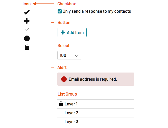
Many, many components depend on icon: checkbox, button, select, alert, list group, and so many others. Even a simple, atomic button can include two icons, one to the left and one to the right! Hopefully icon stabilizes early, and doesn’t change often. But when it does? All those dependent components must change too.
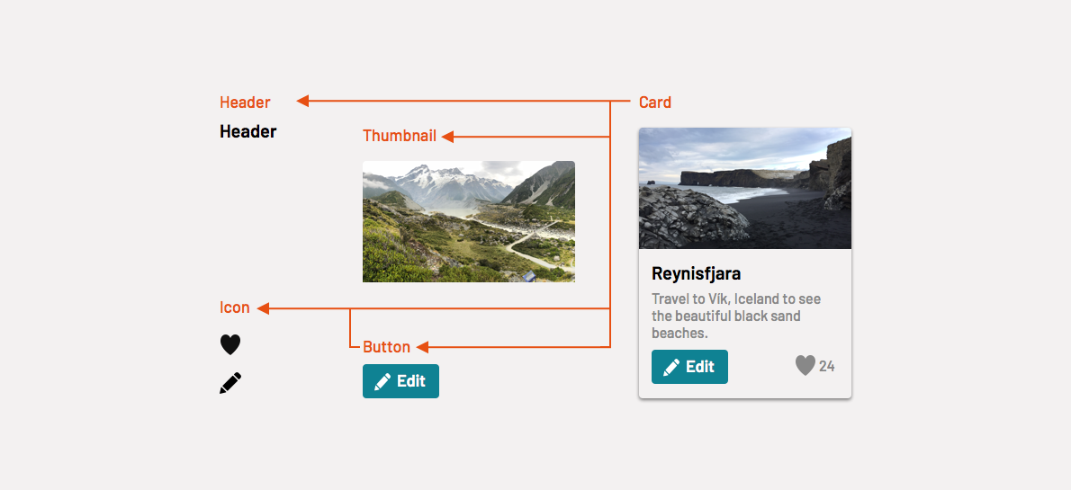
Compositional depth isn’t limited to two levels, and components don’t exist only on one prescribed level, anyway. A card can depend on a button, and both of them can depend on icon. Effective system teams understand this and cope with change across this hierarchical chain of dependencies.
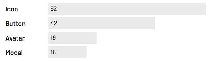
Atlassian’s AtlasKit exposes dependent relationships visibly in NPM. Their published components reveal icon's dominance of 62 dependents that exceeds button's 42, avatar's 19, and modal's 15.
Composability made concrete exposes the dependency chain that a team must maintain as a library changes over time. As systems mature, teams build, trace, and update components as change ripple up through the hierarchy to keep their library outputs in sync as much as possible.
So many of our components are built using other, more primitive components in the library. Take, for example, a menu.
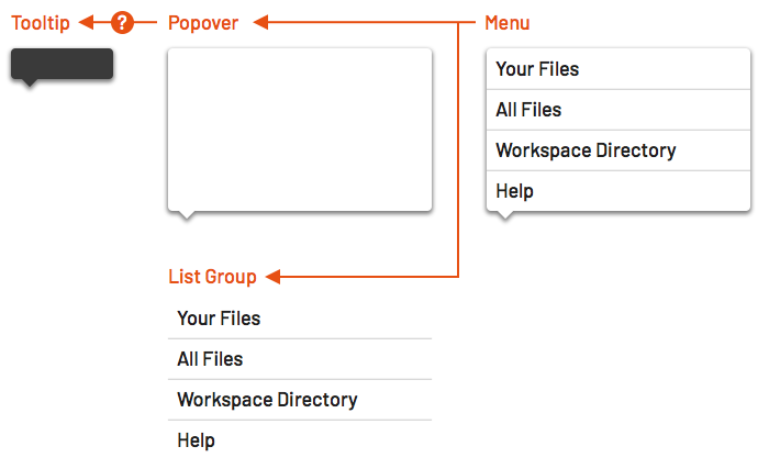
Compositionally, a menu is a popover with a list group inside. The popover is tooltip with a flexible content area, reusing tooltip's collision detection, directional notch, and layered appearance. Depending on how you architect your system, menu could depend on both list-group and popover, which might be a sibling of or dependent on tooltip.
Takeaway: Designers and developers level up system acumen by recognizing, unwinding, and delivering features with such compositional dependencies. Lessons learned decomposing this chain cost us sweat, tears, and scars, but are what earn our badges as “system thinkers.”
Component-by-component dependencies should be visible and easy to trace. I see an icon in the button. Other dependencies are implicit, especially styles and sometimes behaviors.
For example, a tooltip exhibits many behaviors relevant to other layered components like popover, menu, modal, and dialog. These include states (opening and closing), animation (how it opens and closes), and collision detection (how it adjusts location based on proximity to a viewport's edge).
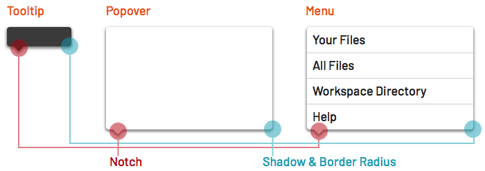
Similarly, a tooltip usually imbues a shadow (separating it from content below), notch (connecting it with a trigger), elevation (within a page's z-index stack) and usually rounded shaped (produced by a border-radius). Such styles can be shared using design tokens, mixins, and other style tooling. It's guaranteed that other layered components also depend upon these styles.
Takeaway: Style and behavior, not just component objects, can propagate throughout a library. Therefore, establish predictable locations for both that can ease tracing from a decision’s root through the dependency chain.
If so commonly included, we should make icon first. For similarly reasons, buttons is among the first few components we will make. For the next layer of components, that order isn’t so clear. As we consider each, we decompose it into parts and gauge if some parts need to be delivered primitively first.
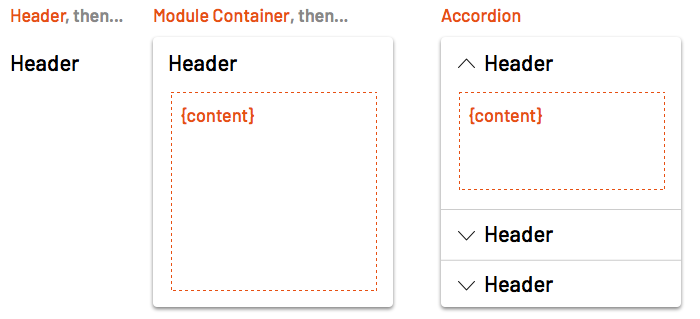
At Morningstar, the team delivers dependent components in sequence. For example, the team first delivered Header across many sized levels. Next, the team released a Module Container for layouts with many content types. Finally, the team extended those features with an Accordion.
As Accordion took shape, the team had to reconsider how Header and Module Container were built. While they avoided breaking changes, deploying Accordion required deprecating the original Module Container in favor of an adjusted version.
Takeaway: Order what you build from small (like tooltip) to large (like menu). As you do so, create opportunities to compose examples of small things in larger things to stress-test how the chain works.
You release icon first, and then other components that depend on it later. Then, icon adds minor features or suffers a breaking change. If you update icon, you can’t stop there. You must ripple that change through all of icon’s dependent in the library too.
    <div class="escom-pull-quote escom-pull-quote--light">
        <div class="escom-pull-quote__the-quote">
            If we upgrade and break a component, we have to go through and fix all the dependent components.
        </div>


        <div class="escom-pull-quote__attribution">
            Jony Cheung, Software Engineering Manager, Atlassian’s Atlaskit
        </div>

    </div>
Developers and designers share this challenge. For code, some may start with a search through the src directory for instances. More sophisticated tooling enables teams to traces the repository in intelligent ways.
    <div class="escom-pull-quote escom-pull-quote--light">
        <div class="escom-pull-quote__the-quote">
            We run a script to highlight where dependencies exist. That said, our team has been around long enough to be so familiar with the library to not need to use it.
        </div>


        <div class="escom-pull-quote__attribution">
            Rowan Manning, Developer of FT’s Origami
        </div>

    </div>
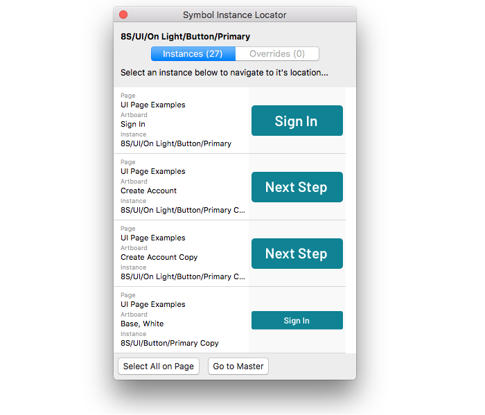
For designers, tracing through a Sketch file of library assets can be a chore. Imagine changing button spacing, or revising your interactive blue token. So many painstaking adjustments! Fortunately, Sketch plug-ins like Symbol Instance Locator and Find-all-instances-of-symbol enable you to find symbols and instances across artboards and jump to their location.
As package management capabilities improve, teams improve how they cope and document a chain of impacted features. Atlassian’s AtlasKit release tool displays impacted dependencies and prompts authors to designate version increment level (breaking, minor, fix) for each one.
    <div class="escom-pull-quote escom-pull-quote--light">
        <div class="escom-pull-quote__the-quote">
            Our release wizard provides a prompt identifying dependent components, indicating that they too will increment a version.
        </div>


        <div class="escom-pull-quote__attribution">
            Jony Cheung, Software Engineering Manager, Atlassian’s Atlaskit
        </div>

    </div>
A team must decide version type for each impacted feature in the chain. Breaking icon means a major version increment. However, that doesn’t imply that button, list group, and alert also all incur a major increment. To some, it may simply be a patch increment to consume the new icon version.
Teams must also weed out inconsistent version dependencies within a catalog. Financial Time’s Origami errors when conflict occurs, like a compilation resulting in multiple versions of the same module being included.
Cannot complete build: conflicting dependencies exist.o-colors:- Required at version 1.7 by o-nav- Required at version 1.9 by o-cookiewarn
Wouldn’t it be nice if tools like Sketch could automate detection of old and new text and layer styles across a catalog? Yes, yes it would.
Takeaway: Establish moments in a release process to check and require authors to confirm and communicate change chained across the library.
Most of our time as a system team is spent discussing the composible intricacies of the components we build. However, dependencies also span across the high-level outputs we deliver, from demo page types to the documentation and tokens too.
Many teams offer sample page types composed with many components composed together.
For example, Discovery Education’s Comet design system provides a link on the Product Bar component page to demo the component composed along with a nav on the left, a footer at the bottom, and content like cards in rows.
When releasing a new version of the library, system teams themselves must cope with the cascading changes beyond just the component library. The examples aren’t dependencies of other teams. But they are essential demos, starting points, and even fertile ground for testing whether a component works as expected. For testing, Morningstar’s form compositions reveals impacts in composed dependencies by signaling failures in automated visual regression testing.
Takeaway: Arranging components into compositions is a great way to stress test the library, yet it comes with a production and maintenance cost. Justify that cost by fortifying system quality through manual or automated tests that trace the impacts of dependencies.
Opinions are as varied as there are system teams, but some choose to separate high-level system concerns. For example, at EightShapes we’ll often separate UI component code for the library from design tokens, documentation content and templating, documentation components, and even build tools across separate chained repositories (refer to ESDS Build).
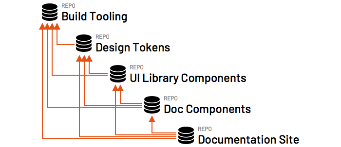
This suggests releases must be coordinated across and published sequentially through that dependency chain. First, build tooling, then tokens, library, doc components, and ultimately the documentation site itself. Other teams like Shopify sequence releases similarly:
    <div class="escom-pull-quote escom-pull-quote--light">
        <div class="escom-pull-quote__the-quote">
            Tokens, then React, UI Kit, then Doc Site for changed links to those + release docs
        </div>


        <div class="escom-pull-quote__attribution">
            Kaelig Deloumeau-Prigent, Developer, Shopify’s Polaris
        </div>

    </div>
A separated token dependency affords the flexibility to more quickly publish changes to a visual foundation prior to releasing component library outputs. However, that separation is more useful for token adopters avoiding your component library code and potentially just taking advantage of design tokens, sketch assets, doc or all three together.
Takeaway: Do your best to synchronize system assets. While some assets (like documentation components) may rarely change, others — particularly design tokens, UI component code, Sketch assets, and a documentation site—can often change simultaneously from release to release.
This post focused on dependencies within a system team’s features. However, it’s worth recognizing two external dependencies that have impacted my system teams more than most: frameworks and third-party scripts.
Frameworks impact both engineers and designers. When coding components compliant to a JavaScript framework like Vue, Angular, or React, it can be an extraordinary cost to upgrade a library from one version to another. One team starting a library in early 2018 was extra flummoxed: build for React v15, v16, or… both? Picking the correct option is essential.
The same goes for designers with fast changing products like Sketch. Count me among the elated to hear about Sketch 52’s Text and Layer Style overrides. Count me also among the freaked out, since a month prior I’d built a library using cruder styling methods that were “state of the art” before. There’s now a huge cloud hanging over my increasing design debt strewn across system assets as I continue making edits in the old way.
System teams have control over how often they upgrade their dependency. But they don’t control how often the dependency gets upgraded. More than one system team I’ve found depends heavily on Select2 for quickly implementing combo boxes, yet laments it’s slow growth and incomplete accessibility configurations. Every six month planning session diverts into the “Should we just build this ourselves? When will it change? Should we ditch it?” 10 minute conversation before a facilitator urges the team to move on.
Takeaway: Integrate third-party and framework dependencies that you are comfortable with depending on at least the current version offered. Avoid avoidable dependencies if you can, yet be cautious of building things yourself that the world struggles to do as community.
#4. Visual Breaking Change ← Previous | Next → #6. Step-by-Step
EightShapes can energize your efforts to coach, workshop, assess or partner with you to design, code, document and manage a system.