Whether standing up a system from scratch or engaging in incremental planning, teams wonder: what’s a mature component catalog look like? Conversations quickly hone in on quantity: 30 components? 50? 70?
    <div class="escom-pull-quote escom-pull-quote--light">
        <div class="escom-pull-quote__the-quote">
            How many components does our catalog need?
        </div>


    </div>
Making components—a repetitive and reliable process yielding measurable outputs—can become a team’s comfort zone. Yet, on average, each additional is more complicated, has more dependencies, and costs more to make and maintain. These same components also tend to be less relevant to fewer customers. There’s a point when the next component, centrally made and maintained, isn’t worth it. There must be a quantity ceiling. This ceiling has teams thinking.
In later 2018, multiple teams gauged the stakeholder sentiment of: “If you had to choose only one, should the system…
The question’s premise shook respondents:
    <div class="escom-pull-quote escom-pull-quote--light">
        <div class="escom-pull-quote__the-quote">
            Hold on. Our components aren’t already top quality?
        </div>


    </div>
An insatiable instinct for more components was halted by challenging their assumption of perfect quality. No system I’ve worked on has perfect components. Shouldn’t teams assessing system maturity based on quality as much as quantity?
Quality stems from and is proven by an implemented testing plan by which components are inspected prior to release. This article describes criteria and tools for testing components and how to order making them at a high level to help teams plan.
Any time is the right time to assess a testing plan, whether starting from scratch, coming out of a hectic delivery a first generation, or assessing the health of a mature system. The list of potential capabilities is intimidating in it’s length and cost. Yet, a team can add such capabilities incrementally, intensely at first but even more gradually over time.
During the planning of a system program’s increment (usually, three or six months), I’ll weave testing into the our discussion of what components are in and out of scope. Invariably, that component list reveals itself as a list in a spreadsheet or on a whiteboard.
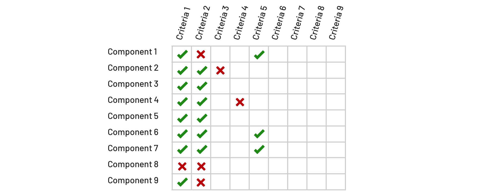
I’ve gotten into the habit of listing prospective capabilities as columns above and to the right of that list, creating a tabular structure. This helps teams to:
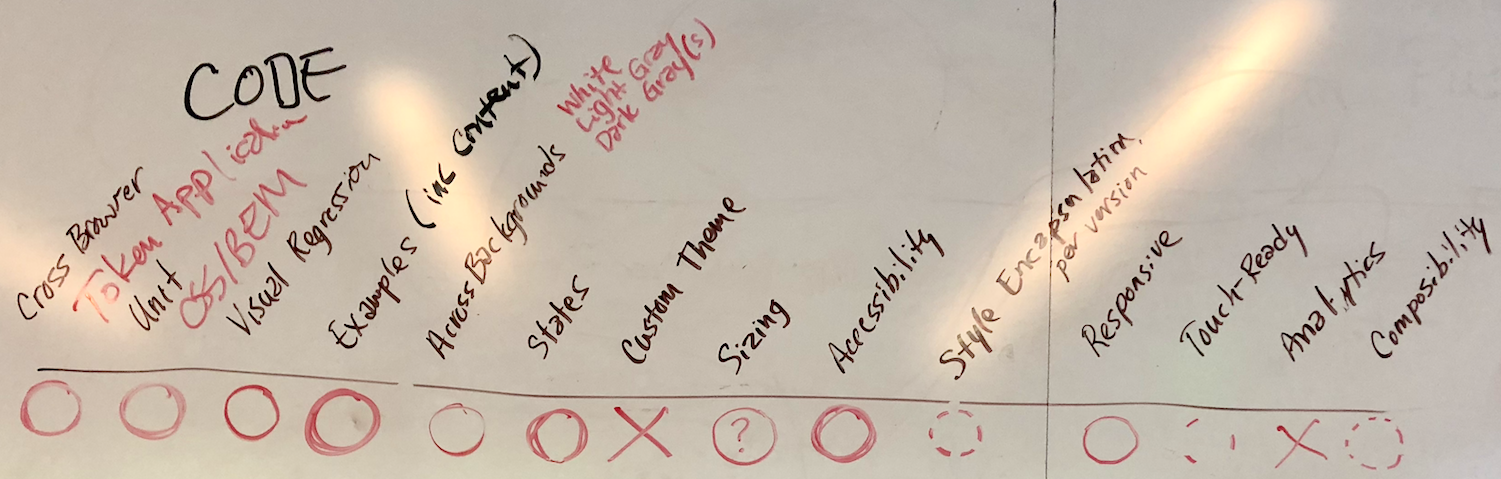
Testing plan criteria listed on a whiteboard and subsequently prioritized as critical, yes, maybe, or not pursued
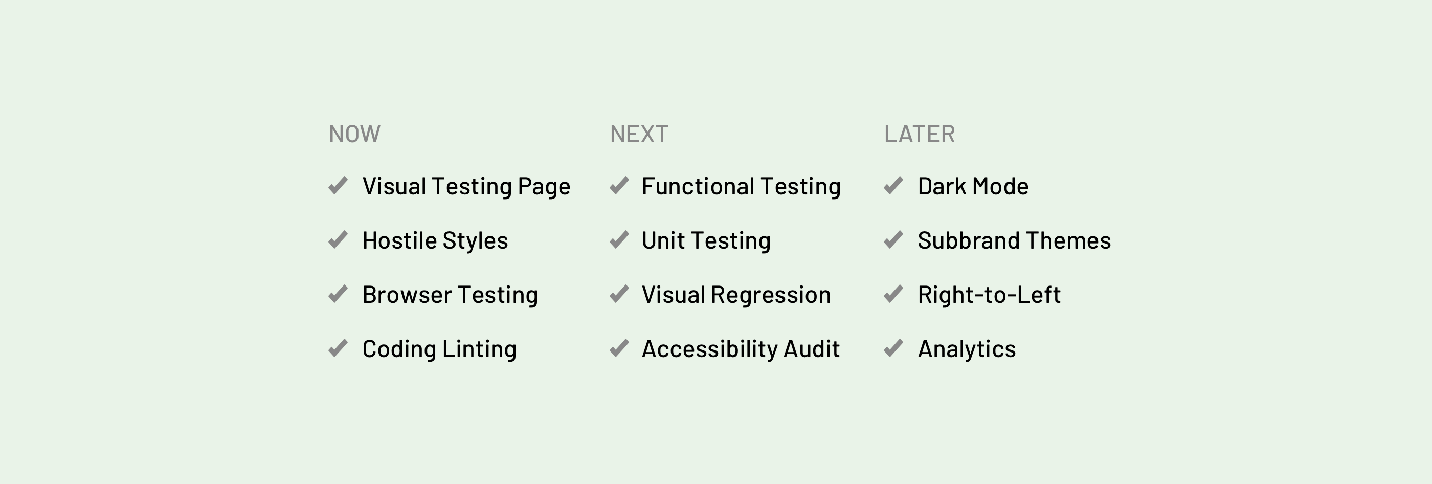
As development begins, tooling must enable both developers and designers to inspect visual test cases and code practices. Avoid blocking early work by the misguided notion of starting with a perfect, comprehensive test suite. Instead, focus on testing fundamentals as you iterate early work. As a team establishes environments, I suggest that they set up:
A testing page visualizes and enables inspection of component variations, states, behaviors, content examples. Visible to all, it evokes every possibility including background settings, sizes, and responsive qualities.
Every component catalog I’ve worked on must work on a white background. Therefore, components are built at least to display properly in that setting.
Components must not be impacted by styling applied elsewhere in the page. Introduce hostile styles on generic, page-level selectors to pollute the cascade, triggering visual errors in a component that’s insufficiently styled.
Components must be infused with design tokens codifying visual style, which requires a token dependency setup from the beginning. Both developers and designers are expected to review how tokens are applied via code reviews.
Components must work across supported browsers, each tested manually as every feature, defect, or optimization is added. Obtaining access to browsers can be painstaking (particularly, IE11 and Edge for those working on Macs).
Linting tools analyze source code for easy-to-detect programming errors, bugs, suspicious constructs, and of adherence to team conventions. It’s easy to setup, confirm via pull requests, and require corrections prior to approval.
As development accelerates, adopters begin using alpha and beta releases. Expectations rise. At this point, testing rigor must expand based on what the team values most. Equally important is establishing who reviews each, whether the assigned developer, one or more reviewers, or a team’s outsider.
At their core, a component must work. A team must establish conventions of how they’ll test functionality, such as a modal’s open/close toggle, a tooltip’s sensitivity to a viewport’s edge, and more.
AVR establishes a baseline result of all visual test cases (variations, states, content examples, etc) and then automates comparison of the baseline with the result of each successive change. Our tool of choice: BackstopJS.
✔ Unit Testing (of JS-based components)
Unit tests are short code fragments written to test the success of small units of source code. One reference: Morningstar Design System’s documented test driven development (TDD) approach for making web components.
System designers and developers deliver with accessibility in mind. However, they may lack in-depth expertise of an accessibility specialist. Audits canvas an entire library or changes since a previous audit. Some specialists drop in to assess each component as it’s completed, whereas others engage at regular intervals (quarterly? semi-annually? annually?).
I’d expect a team to norm on how to version components, deal with dependencies, and assess breaking changes as they get started. Nevertheless, they’ll acclimate to making—and documenting—those decisions as they iterate through early cycles. Proof will be in how successful features are packaged and changes logged.
Depending on the features of your system, there may be additional criteria relevant to most components in a catalog. These can include validation of:
Also known as “Light and Dark Mode,” a component can be placed on both light and dark background settings. Many start with white and “black” (which actually may be a darkest gray like #222). More sophisticated systems may offer four (white, black, light gray and dark gray) or even eight settings.
Some systems support backgrounds for one brand color (“Brand Blue”), many brand colors (blue and teal and green and …), or even multiple tints of each brand color (light, medium and dark teal, …). If components promise to work everywhere, testing must address variations and states in each setting.
Some systems can revel in the simplicity of a single theme. Others must test for a closed set (such as a company’s 37 subbrands) or an open field (think: Bootstrap or Material supporting any theme). Such an API into component styles warrants markedly incremental testing procedures.
Systems like Morningstar Design System apply consistent schemes to size components for varied settings. They’ll position small, medium, and large size variants for List Group, Button, and most of the remaining catalog. Testing would address both component-specific sizing across contained elements as well as the composability across components of the same size.
How well are interactions tuned to the conventions of varying platforms in which a component is displayed?
Validating the display for a range of languages isn’t as easy as inserting a long German label in a title field (although that’s a good place to start). Know your languages, and then ensure you can promise each component addresses those needs. Easier is a price displayed in Japanese Yen, far wider than USD. More challenging: a “global” header bar supporting German, Chinese, Arabic and Cyrillic. Many more visual test cases are required, indeed.
Recently, I was elated to learn that a team I coach announced they’d be adding a team member dedicated to QA. Such is a luxury at this stage when establishing a core team in our burgeoning field, with nearly every other team falling back on designers and developers filling that void.
Teams alleviate considerable manual rigor by automating the testing of visual test cases across browsers. Tools like Selenium also multiply the range of browsers and devices teams can and are willing to test against. Nevertheless, such automation seems beyond the grasp of most system teams.
As individual components become more complicated, their responsive capabilities may become quite varied and sophisticated. Testing environments must be easy to setup and ideally automated to validate displays across a range of widths, contexts, and triggers.
I’m very impressed by (and jealous of) Atlassian’s Component Analytics Framework. The framework enables teams to track how customers use an app (via public events) and component authors to monitor how teams use their components (via private events). Once established, a team must validate the setup and performance of such tooling across each component.
EightShapes can energize your efforts to coach, workshop, assess or partner with you to design, code, document and manage a system.