
Months after our first release, productivity was strong. We’d reached 20 components. Buttons and forms were behind us. We cranked through cards, tables, and nav bars. As another component went to review, comments unexpectedly overwhelmed the pull request:
As discussion quickened, everyone swarmed to ask more questions. Really good questions. The contributing developer was overwhelmed: a finish line thought close extended again into the distance.
Ugh. We had documented neither what we check for nor how we QA. At all. We just built things, “checked ‘em”, and moved on. System teams must hold themselves to a higher standard than that.
In adopting a system, a product team must trust that the system saves time and reduces risk. The system’s quality must be no worse — heck, let’s be honest, better — than what the product team would have done on their own. Therefore, incorporate quality into your messaging, but be ready to deliver the goods.
System advocates highlight quality when marketing their library. For example, Material Design Lite says that they…
This isn’t whimsical aspiration. It’s a promise, promoting that library parts ascribe to attributes of quality. In fact, one of my favorite system principles is Salesforce Lightning’s Beauty, with a keyword I really appreciate:
In fact, I’ve observed the tone of a system pitch completely shift based on just one word that affords quality, like:
Stakeholders–your director or VP–listen for those trigger words. To them, it signifies a library (at least partially) can unburden teams struggling with or ignoring things a leader cares about.
Therefore, you better be ready for the next questions: “What do you mean by quality?” and “How do you assure that quality?” Your answer must be better than “We check stuff after we build it.”
Here’s a quality checklist my most recent team established:
Does the component apply visual style — color, typography, icons, space, borders, and more — using appropriate variable tokens?
Does it cover all the necessary variations (primary, secondary, flat, menu button) and states (default, hover, active, disabled), given intended scope?

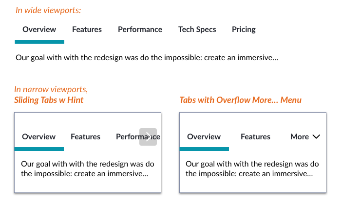
Does it incorporate responsive display patterns and behaviors as needed?
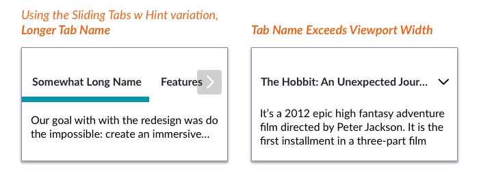
Is each dynamic word or image element resilient to too much, too little, and no content at all, respectively? For tabs, how long can labels be, and what happens when you run out of space?
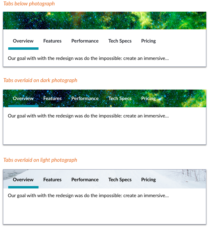
Does it fit well when placed next to or layered with other components to form a larger composition? For tabs, how can they be applied stacked with or on top of other components?
Do all behaviors – typically, JavaScript-driven – function as expected? For responsive tabs, are gestures (for sliding left and right) and menus (for overflow tabs) behaving correctly in varied device settings?
Has the design and implementation accounted for accessible:
svg and img attributesThe list goes on, and could be augmented by testing with a screen reader like ChromeVox.
Has the component visual quality and accuracy been assessed across Safari, Chrome, Firefox, IE and other browsers across relevant devices?
Has the component design been assessed via usability testing with our customers, whether conducted for a product team or by our system team?
We don’t gate releases of an component — particularly the smallest ones — by usability testing. But we do seek out opportunities to assess component efficacy in related product tests as well as commission our own studies of relevant concepts too.
It might feel like a pain. Too much rigor. A threat to team momentum. That was my gut reaction to the realities of a QA-then-refactor step. Do this to the whole library, now that we’re behind? This could limit production for sprints! It didn’t, actually.
I credit my team with convincing us that the library is nothing if the quality is poor or below a stated standard. Sure, we’d done light damage. Components in the wild now needed light refactoring. And this did trigger a distracting major semver release with a bevy of small, breaking changes. But the library’s demonstrable quality — and team’s confidence — shot way up when we got our act together.
Takeaway: Devise your QA checklist and process as you build your first components. You’ll justify the promise you make to your customers, and improve confidence and reputation as a result.
It may be tempting to think you can test your variations using that doc page you’ve also started to build. Bad idea.
Documentation page structure tightly constrains component displays to fit in the article’s width and example box, limiting display options. Plus, the page loads all the CSS of everything it displays, conflating your no-longer-encapsulated component styles with everything else.
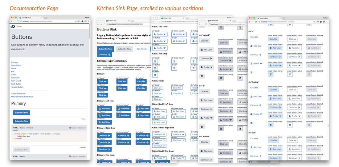
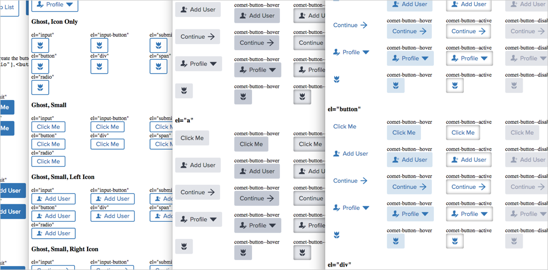
As an alternative, our team creates a “kitchen sink.” The page bursts with examples: states (default, active, disabled, etc), content (too long, too short, just right, none), colors and themes, all across the many variations (text only, with icon, icon only, etc). We limit loaded CSS to only that component and base styles, improving encapsulation.
We publish sink pages named buttons-sink.html in the same folder as thebuttons.html documentation page. There it rests, a useful if orphaned resource for design reviews, quick reference and automated visual differencing.
Takeaway: Separate documentation from testing artifacts.
QA begins when a developer signals they’re ready for a final review of their work in the build step, distinct from the documentation that may run in parallel but usually concludes after build.

Takeaway: Incorporate QA as a clear step or sub-step that’ll prevent an item’s release if tests aren’t passed.
A dedicated QA resource is a luxury item for a systems team. Instead, systems teams I’ve been on blend designers and developers that wear other hats as needed, including QA. We hold a contributing developer accountable to submit components that they’ve already run through the checklist. Our process then also requires a distinct person — a different developer, the component’s designer, or both — to run through the checklist too.
Takeaway: Identify a predictable role expected to review each contribution.
EightShapes can energize your efforts to coach, workshop, assess or partner with you to design, code, document and manage a system.