When it comes to selling a design system, you’ve gotta have a pitch. And by pitch, I mean a compelling, infomercial-like comparison of
Early on, nothing — not a library, not a sticker sheet, nothing! — demonstrates a beautiful future more than reference designs.
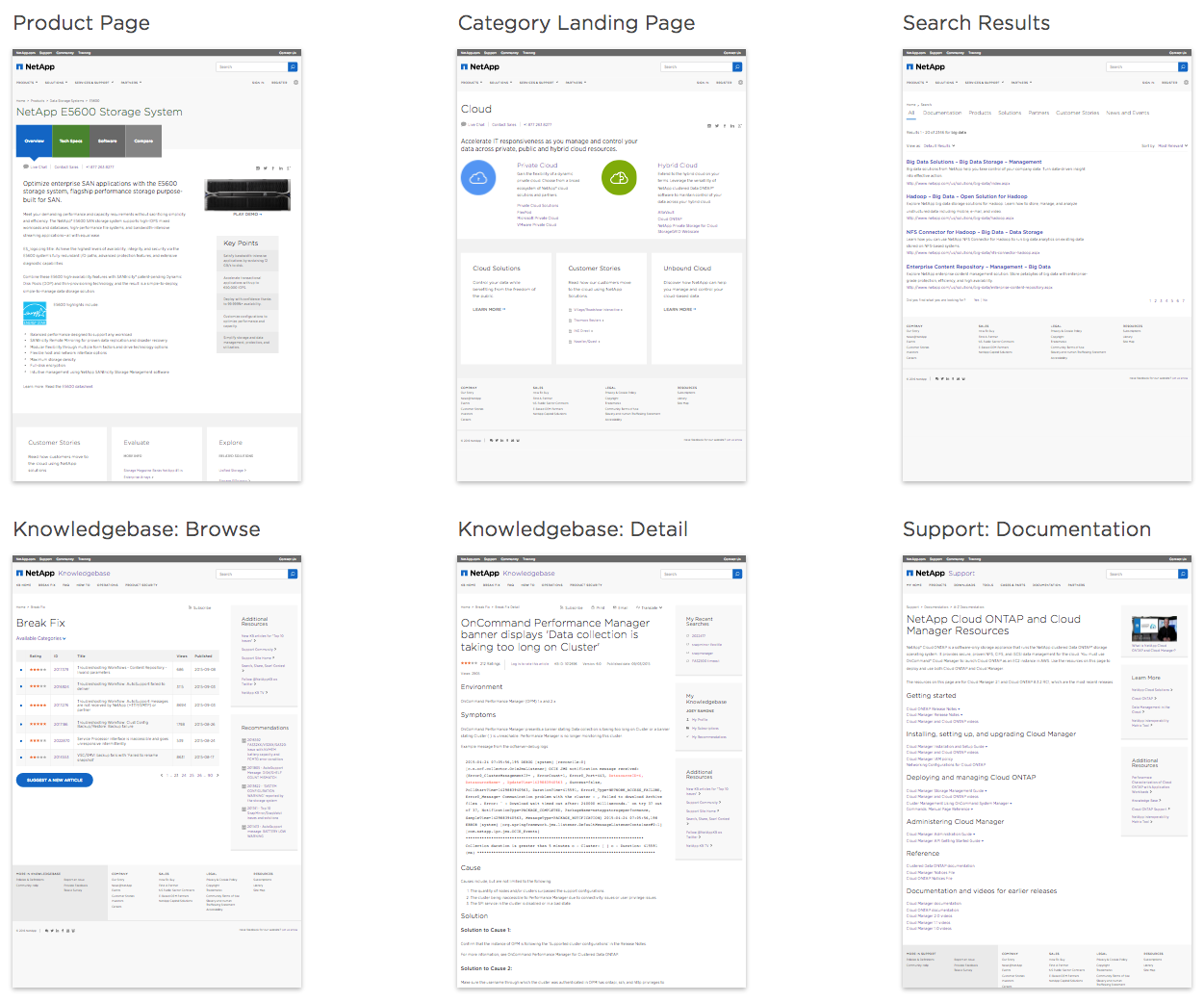
Reference designs are a collection high-fidelity page concepts (static or threaded as a prototype) spanning a holistic customer experience, shining with a new system. While disposable and imperfect, they still depict an aspirational future that every stakeholder can understand. They invite reactions from the enterprise and begin to stress decisions made in narrower exercises like style tiles and element collages.
Don’t skimp and stay too atomic. Use reference designs to build belief in a system’s promise and convince everyone you are headed in a direction worthy of everyone’s invested time and attention.
Reference designs are more than just concept explorations. The output is familiar: a collection of high-fidelity page mocks and/or prototypes. However, you’ll approach the activity — how and who does the work, pages you design, and more — differently with system-focused mindset.
When creating reference page concepts, thoughtfully select pages representative of a the broad experience, not just one or two flagship products. You should:
Takeaway: Don’t just launch into designing some cool pages. Thoughtfully consider such criteria to confidently select pages that demo well and inform the system.
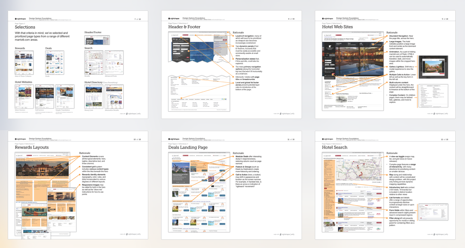
Rendering two or three layouts representing a couple flagship products doesn’t convince anyone of a design that scales. That’s too limited a product reach and insufficiently diverse. So reach for more. While some teams succeed with 5 to 10 for more limited portfolio, an enterprise-wide set often warrants 10 to 20.
A burst of reference designs usually takes place in sprint 2 or 3 of a system’s formative period, after planning and strategy solidify. With sufficient focus, a reference designer (or up to three or four) can crank through a first pass within a week, and iterate for one to three weeks depending the depth and range of feedback required.
It’s hard to divert leading product designers from their product teams for a sprint’s worth of collaboration in a war room. That doesn’t mean you shouldn’t try. If you can’t assemble your all-star team, at least assertively seek feedback from designers on those flagship and secondary products.
Takeaway: Minimize black-boxedness of conceptual exercises. This will bode well for future adoption and start down a path of collective ownership.
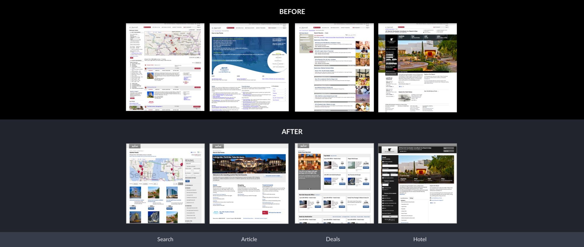
When presenting reference designs, start with the old, reveal the new, and follow with key points of visual style (like color, typography, and space) and components (like buttons and global navigation). Once complete, rest your presenter’s display on a side-by-side view of old vs new to open discussion.
This lets the audience compare on their own. I may have a boundless passion for button varieties. But my audience usually isn’t like me. They are usually convinced by a bigger picture evoking today’s pain next to tomorrow’s promise.
Takeaway: Sell your audience on the before and after, side-by-side. Revel in it. Let the comparison persuade them.
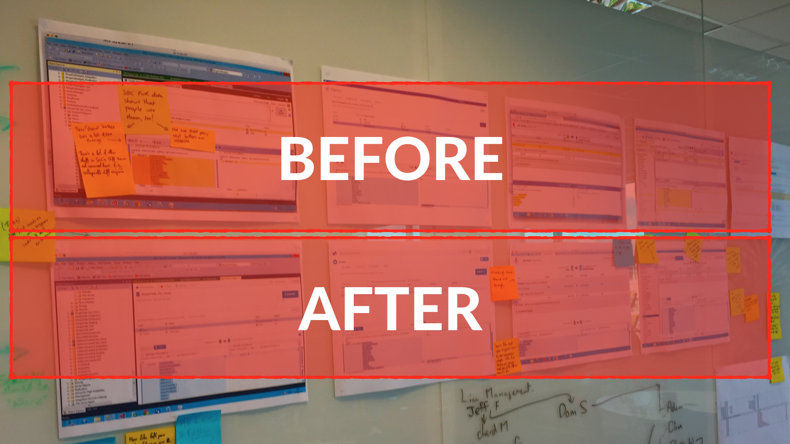
Some teams post reference designs on walls of a conference room or hallway. This exposes the target state in a space where others can stop by and thoughtfully consider the designs themselves.
The hudl.com system team led by Kyle Murphy and John Henry Müller used an effective Post-It notes and dots technique to invite structured feedback for their pre-system product design audit. While the audit preceded this activity, the structure would work really well for reference designs too to solicit:
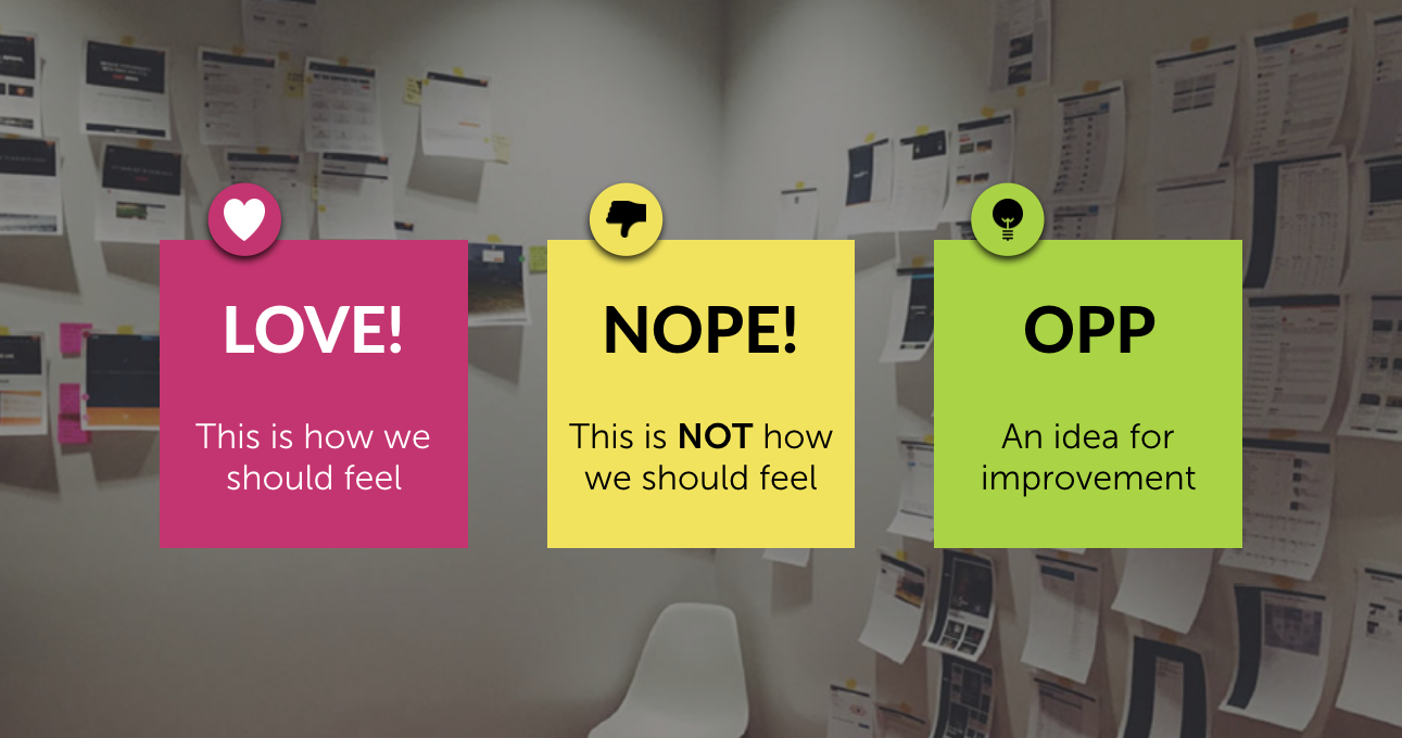
Their wall of designs transformed into visualization. The systems team catalogued responses to inform early priorities and subsequent work on color, buttons, forms, and other components.
Takeaway: Don’t bury reference designs in some InVision prototype or Keynote deck for only attendees of an invite-only presentation. Put ’em where they can see ’em, invite feedback, and be transparent.
As early reference concepts give way to painstaking design and build of each part, I’ll revisit reference designs for:
In my experience, I pull out reference designs as I build individual components to look for inspiration: additional states I haven’t considered, alternative layouts I’d not expected, and variations that help us build more flexible pieces.
As a system’s library matures towards a first release, building full pages based on components you’ve built is essential. These pages showcase examples of what’s possible and stress test your build by fitting all the pieces together. More often than not, we’ll build our initial reference design concepts using the parts we’ve subsequently built.
EightShapes can energize your efforts to coach, workshop, assess or partner with you to design, code, document and manage a system.