
#2 of 6 of the series Documenting Components: Overview | Intros | Examples | Design | Code | Authoring
Naming a thing well is essential, and sometimes hard.
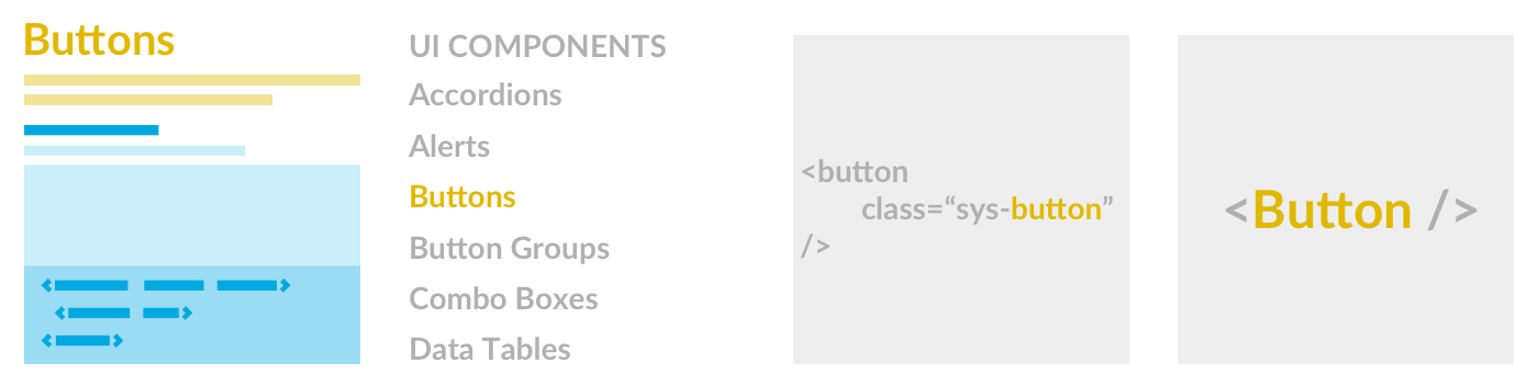
A component’s name (Buttons) appears as the page’s title, a label in site’s navigation (Buttons), and a code identifier of a CSS class (-button) or HTML element name (<Button>). Button is easy. It’s a name we refer to easily and consistently, together, everywhere in our work.
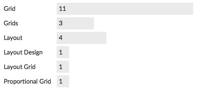
Drawer or Accordion or Collapsible is hard. Even harder? Grid or Layout or Layout Grid or Rows & Columns or Box or Proportional Grid or whatever you call invisible scaffolding visually ordering a page. Even Card isn’t universally defined: is it a generic container or the defined composite of all it contains? Making a library forces the choice.
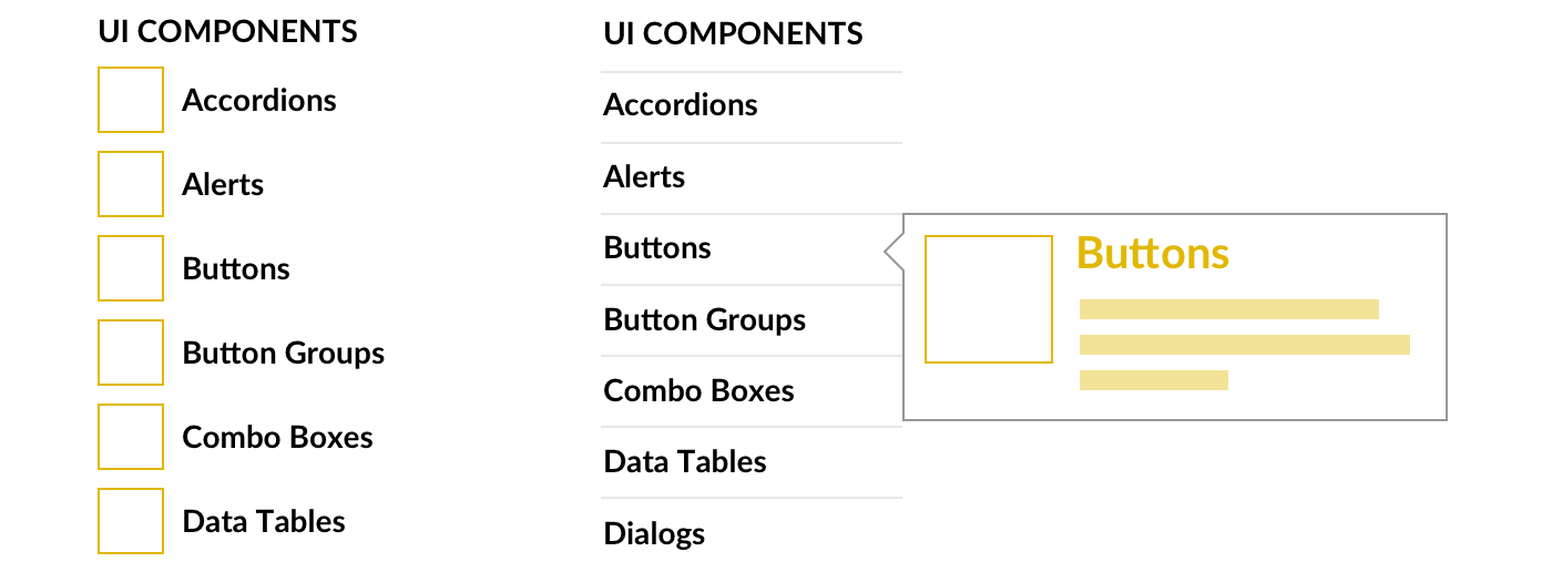
For most doc sites, navigation relies on label alone. With a little effort, nav could be enhanced with a thumbnail, maybe only via a tooltip on hover. That same snapshot—or fully rendered components—could also be arranged in a gallery introducing the Components section. We can do more.
If demystifying synonyms is your game, sprinkle in a little “also known as” subtlety to sensitize rather than confuse.

Takeaway: A optimally clear title can be a challenge, so sweat the decision only just enough. Always pair it with a sensitizing example, and sprinkle hints elsewhere in the UI.
Names in code uniformly refer to a singular instance (-button, -input, -card). For components used many times on a page, whether primitive (Buttons, Inputs) or composed (Cards), an industry sample suggests most libraries prefer the plural form for page titles and site navigation labels.
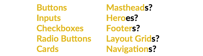
However, the singular form is common for components used once on a page. Global Navigation, Footer, and Grid are thought to frame the page (although Grids do repeat within a page). Similarly, a Masthead, Hero, or Billboard can set the page’s tone, but aren’t repeated further down. When we verbalize these, the singular form sounds more natural.
Now, navigation is tricky. As a component label, it’s the most vague, so consider avoiding it altogether. Yet for the remaining examples, plural variants — Footers, Grids, and Mastheads — work just fine.
Takeaway: Most teams favor plurals, and it’s up to your team to form a convention. Perfect consistency may not be worth the stirring the passions, but if you mix both, have a rationale.
Names offer an imperfect, incomplete component explanation. Therefore, many libraries elaborate with a description to capture a component’s essence.
The description can be short:
Each elaborates with details that sensitize: a Button’s action and hierarchy, a Grid’s rows, columns, and purpose to create page layout.
As a typographic tradition, the description—known as a Deck—should be paired visually with the component’s title and separate from remaining content. The deck’s font size should notably larger than paragraphs that follow. Tantalize the reader onward.
How long’s too long? I encourage teammates to embrace “Tweet length” (and by tweet, I mean original the length of 144 characters). Is two sentences OK? Perhaps, although my peer reviewing history is littered with suggestions trimming from two sentences to one.
When writing an introduction, capture the essence, not the whole story. That means clarifying component structure and purpose instead of implementation details. For a Grid, “rows and columns” for “responsive layout” are favored over “12 columns” or “breakpoints at 768 and 1024.” For Buttons, keep it very short. Like 10 words or less short! Everyone knows what a button is.
Takeaway: Set essential context and tone, avoid packing in every feature, and above all else: keep it short.
For Buttons :
For Cards :
For (Layout) Grids:
Sometimes components require introductions that elaborate on concepts, complexity, or library-specific points of view that aren’t self evident.
This is very evident in Layout Grid documentation. Rows, columns, breakpoints, alignment, shifting, stacking, offsetting. Oh my, there’s so much to understand. I’m exhausted just thinking about it.
So the instinct is to introduce in detail. An introductory paragraph becomes a section. Code examples to explain each concept only crop up later, mirror the introduction’s subheads. The repetition is unnecessary, bogging a reader down in details before they even get started.
Component recognition relies as much or more on what a reader sees (the picture) rather than read (the name), even if recall and conversation depend on the name. Therefore, position the name as the page’s title close to the item’s picture. Usability testing of component doc affirms:
In a introduction, avoid deep context setting and lengthy overviews. Save the feature details and expansive design and code guidelines for the examples.
Takeaway: Spare the gory details; instead, get to examples adopters can immediately apply! If you have long story to tell, save it for later.
Component introductions must be powerful yet short. The objective is to tantalize enough to ensure the reader is in the right place. As a result, minimize the distance from component title to a first glimpse of the “goods” that follow. Get to the examples you can to use.
#1. Overview ← Previous | Next → #3. Examples
EightShapes can energize your efforts to coach, workshop, assess or partner with you to design, code, document and manage a system.