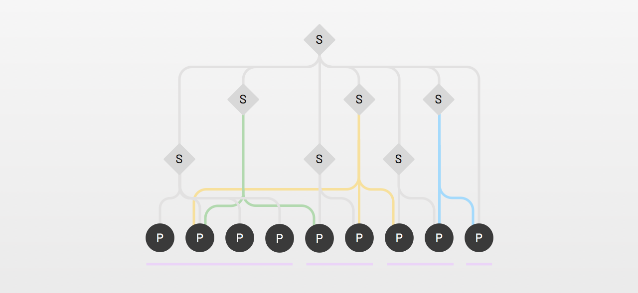

Our design system, the one-source-of-truth. Singular, central, perfect. The one place you find all the answers. Are systems destined to have one set of only the best things? I’m not convinced.
Why limit design systems to only things of the highest quality, relevant to everyone? Is there space between a design system’s core and adopters for less-perfect features to live? A place to share working ideas, run experiments, and stabilize quality over time?
I propose that design systems offer an opportunity for a taxonomy of flexible tiers below a highest-quality core. Using tiers, systems can incrementally improve capabilities and quality of meaningful feature sets and promote ideas from a team or group upward through an architecture everyone shares.
Ideas bubble up. They may start with an idea in a single person’s mind. That idea is useful to a collaborator nearby. Others realize gradually that they share the need. Eventually, an idea may — or may not—be relevant to everyone. We can architect design systems to reflect such levels.
Architectures start—but need not stop—with two tiers of a System and it’s adopting Products. A two level hierarchy is simple and easy to understand.

Yet, not all components and other features are equally valuable, hardened to the same level of quality, or relevant to as many people. The higher the tier, the more broadly something is shared.
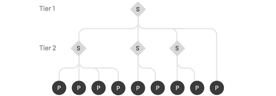
Takeaway: Anticipate that as a system grows, it may benefit from additional tiers to make and share design assets, code, and documentation. Lower tiers can be spaces for features that need not belong to a system’s core visible to all.
Once a system exposes features of varying quality and relevance, a core will need to be separated as the highest quality and most relevant to everyone.
At this point, a design system’s core is predictable: a visual style’s color, typography, iconography and space applied to components like headings, button, icon, checkbox, input, and others everyone obviously needs. Until you get the core right, you can't craft the sophisticated stuff with confidence.

The core is managed and documented centrally by a core group or designated design system team(s). Communities of design and engineering have a heavy influence, but they also need a team to point towards that is responsible and accountable for a core’s sustained success.
Takeaway: Once additional system tiers begin to emerge, designate a “core” tier useful to all adopters and maintained by an identifiable core group. Call it what you will—core, base, foundation, whatever — to clearly denote these most essential features at the top.
Feature sets form naturally within organizational boundaries, such as groups A, B, C, and D depicted below.
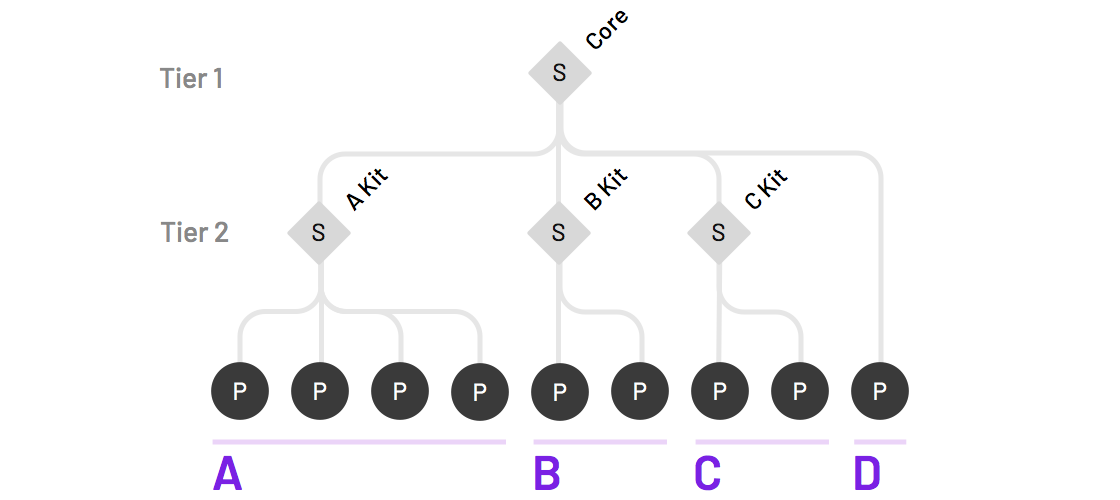
My observations across design systems suggest this occurs already, but in an ad-hoc manner ungoverned by a system team. One system team offered Core kit of Sketch assets and component code. In the wild, platform designers in groups A & B made distinct sketch kit extensions, and an engineer had made a “C Kit” of component code for their group. In such cases, a system program could model and provide tools for such extensions of design and code.
A system need not limit a feature sets to organizational boundaries. Tiers can enable a community to share across boundaries, too. I’ll remind system teams that their visibility across products not just a strength, but a responsibility. Spotting opportunities and triggering connections is part of the job, even if beyond what’s in their system core.
Consider an ecosystem’s multiple touchpoints integrating a rich-text editor. It’s not just an editor window with paragraphs, headings, lists, and other content. There's toolbars for formatting. Dialogs for uploading. Full screen toggles to compose immersively. Editors aren’t cheap. As a team in Group A takes it on, group B hears about it, and a shared investment takes shape.
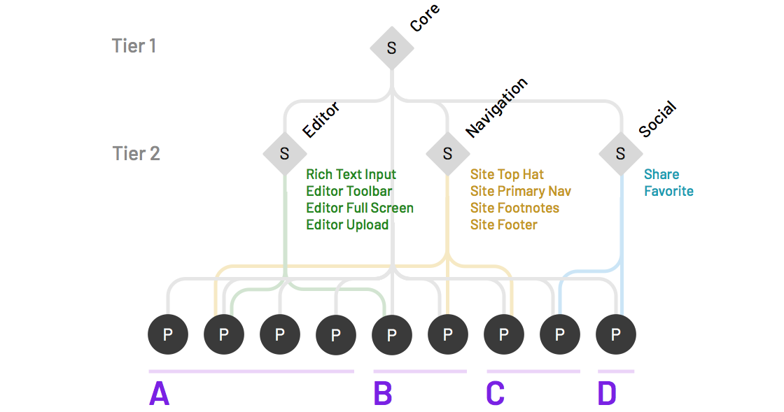
In the same ecosystem, other shared investments may arise, such as experiments with components for navigation, social, and other features below the core.
Takeaway: Be a matchmaker that connects efforts across teams. Offer tools — repo and component scaffolding, Sketch templates, doc fill-in-the-blanks—to start conversations so that their first date grows into a fruitful relationship.
So, how would you roll tiers within an organization? One approach would be to pilot a first phase for a few sets across teams—editor, navigation, social. This would give you the opportunity to trial the access permissions, onboarding, workflow, and even potential promotion. As those pilots succeed, you deepen the tooling in a second phase to support more autonomous and extensive use at a third tier within teams.
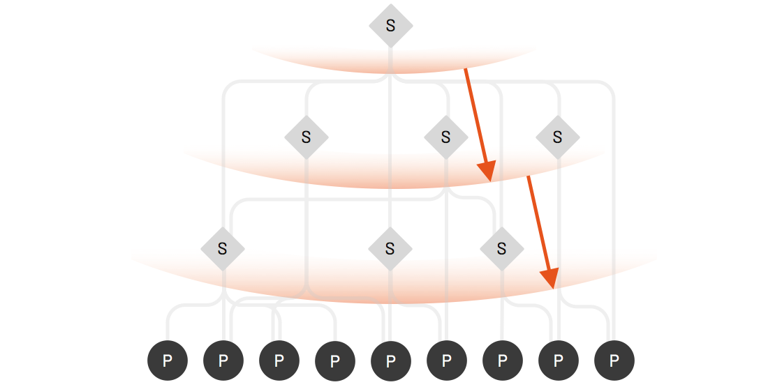
One system supporting approximately 25 teams deliberately instanced their core-ui architecture into a sibling sales-ui repository dependent on core-ui's components and style. The sales-ui catalog expanded rapidly relative to the slower-evolving core. Controls were loose. Delivery deadlines were met. Some saw a mess.
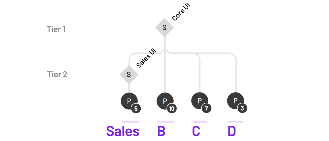
Yet the system team saw opportunity. There were clear candidates to promote from sales-ui to core-ui. Tools improving quality (linting, visual regression testing) took hold in a previously ragtag group. Most of all, sales teams integrated core-ui features into everything they did without a second thought. Without realizing, they were now a second tier of that design system.
Takeaway: Business units and product lines are motivated to work fast, meet goals, and reuse with their adjacent squads. System tools can scaffold up rapid, systematic design and development practices to spur groups move forward, without necessarily complicating the system’s core.
When a design system team supports a core, it’s clear that they’ll be responsible to do much of the design, coding and documentation of that core. As a result, they’ll watch proposed contributions that change that core very carefully. However, for any tier below the core, more people need more open permissions to contribute, extend, and maintain assets.
Teams can uses applications like Abstract and Lingo App to distribute Sketch library assets for their system. The kit(s) provides a core’s button, checkbox, and many other components to the entire community, although only core team members (and key partners) have edit access.
Additional kits (such as Products, Account, Gifting, and Checkout) could organize a second tier of subgroups by experience. These subgroups can extend components like card and forms and also include assets (like images) and components (like Account Header) only relevant to their team. While every kit is visible to the entire design community, each kit’s edit privileges are limited to designers in that business unit plus the core team.
Takeaway: Model permissions to maximum visibility and minimize risk. The more designers and developers can see work being done in other groups, they can form connections, reduce redundancy, and join an experiment.
Once a system encourages contributions from diverse groups, it can become the wild wild west. You’ve got to keep your eye on the prize: a library sharing an architecture without conflict and collisions. Nobody needs checkbox-button, action-button, and box-with-checkmark-in-it-button rolling around.
That requires governing the namespace to ensure that new features:
Naming is hard. We all get that. But renaming later can really gunk up the works. A system establishes a shared space requiring a vocabulary across developers and designers. Therefore, as a system spreads features across sets, you must normalize what each thing is named and how it’s grouped.
Takeaway: Carefully curate the names of sets and features, especially components. Be clear about who curates naming and reviews proposed names as they emerge. This may even be a specific person or small group who are really talented and/or passionate about it.
Just as teams start to make distinct feature sets, others will want to use those feature sets they are interested in. They won’t want to see feature sets they aren’t interested in, either. This impacts how features are presented in documentation and tools, such as:
Takeaway: Adding sets beyond a core is an information architecture challenge for tools and documentation. It forces questions of classification, organization, and priority. Envision a target state, and then build tools towards it incrementally, one feature at a time.
A core’s features must be highest quality. As tiers emerge, quality below the core will vary. Atlassian’s Atlaskit code packages hint at a second tier of feature groups for both business units (bitbucket) and features across groups ( editor, home, search, and navigation), where the quality of some may be lower than what comes with core. IBM Carbon’s site documentation belies two tiers: an implicit core and an “Experimental” second tier:
    <div class="escom-pull-quote escom-pull-quote--light">
        <div class="escom-pull-quote__the-quote">
            Experimental components, designs, and other resources are presented for testing and feedback. They are not intended for production use.
        </div>


        <div class="escom-pull-quote__attribution">
            <a href="https://medium.com/eightshapes-llc/www.carbondesignsystem.com/experimental/about/overview">IBM Carbon</a>
        </div>

    </div>
Feature quality should improve the higher a feature ascends. As a result, a system must clarify for makers how well each feature must be made, and to users how well each feature has been made. It’s up to a system with two or more tiers to differentiate and clearly communicate quality at each level.
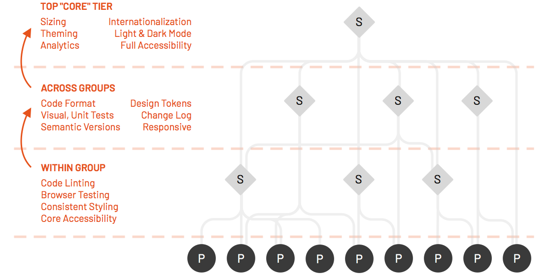
One model tightens quality control based on how widespread the feature will be used across business units:
Running a system today and barely meeting “Within Group” tier quality? I’m not judging you. Your adopters might be, however. So consider what quality is needed and chart a path to get there.
Takeaway: Identify clear and attainable criteria to place features. For those running fast and loose, establish minimum expectations to not slow them down. As use of a feature increases (and confidence soars), clarify what steps are next to harden it for promotion. For others peeking in and interested in non-core features, ensure they know what they are getting into.
Tiers provide a hook to talk about how features promote from narrow experiments to widespread use using clear criteria. That feature will need to go somewhere, and tiers provide guardrails in conversations like:
Why? Because systems offer an architecture to design more consistently, build more efficiently, and achieve higher quality. There’s no reason to limit that value of making things well to only the system team.
Takeaway: You can map “contribution” opportunities as promotion through tiers of a system. Those contributors need a system’s architecture to build with and system team members to identify opportunities and shepherd the process.
Tiers will succeed when a community adopts a language and architecture for sharing. Tooling will expand to welcome more participants, and activity will be evident within and across business units. We’ll be watching.
EightShapes can energize your efforts to coach, workshop, assess or partner with you to design, code, document and manage a system.